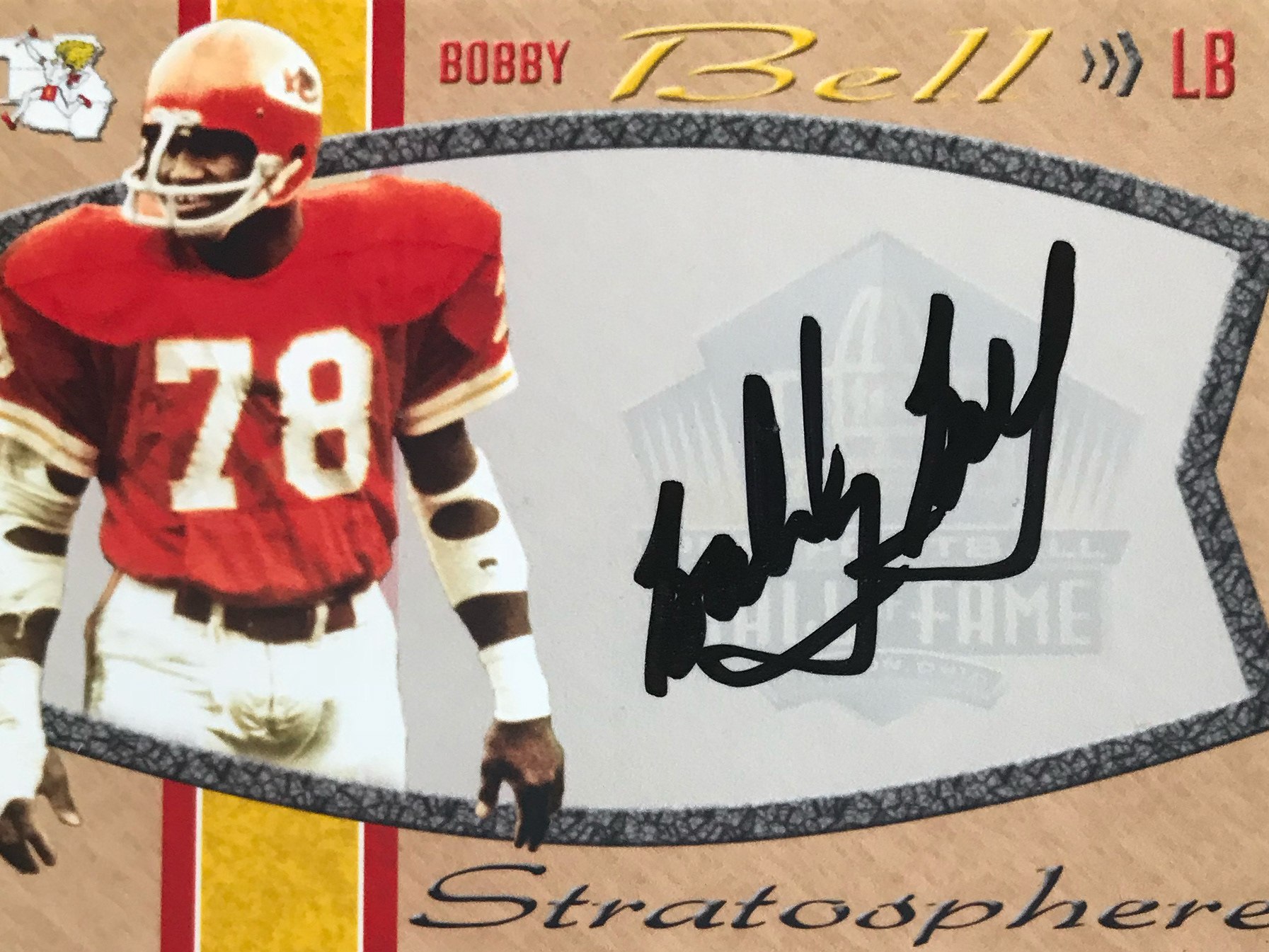
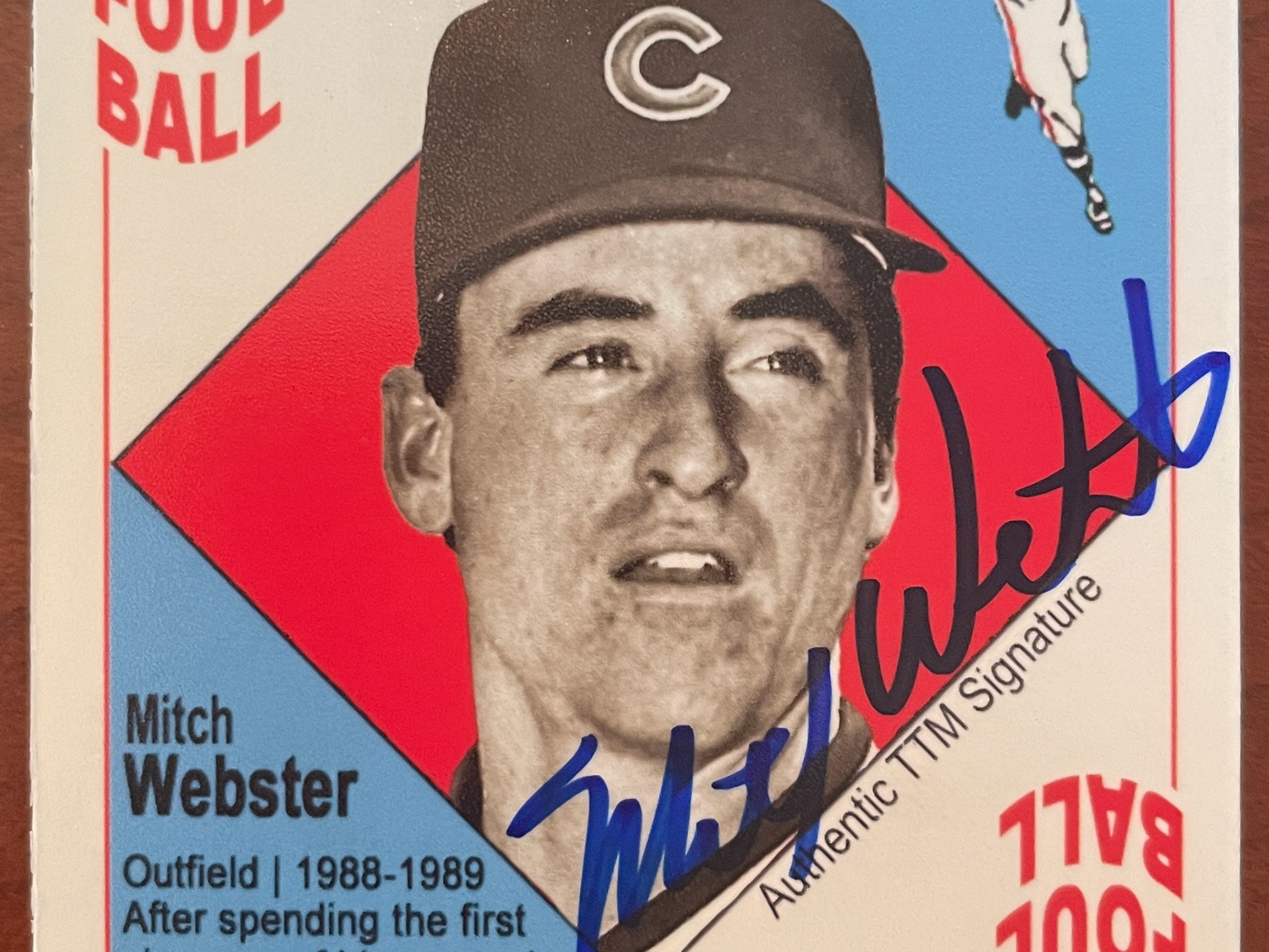
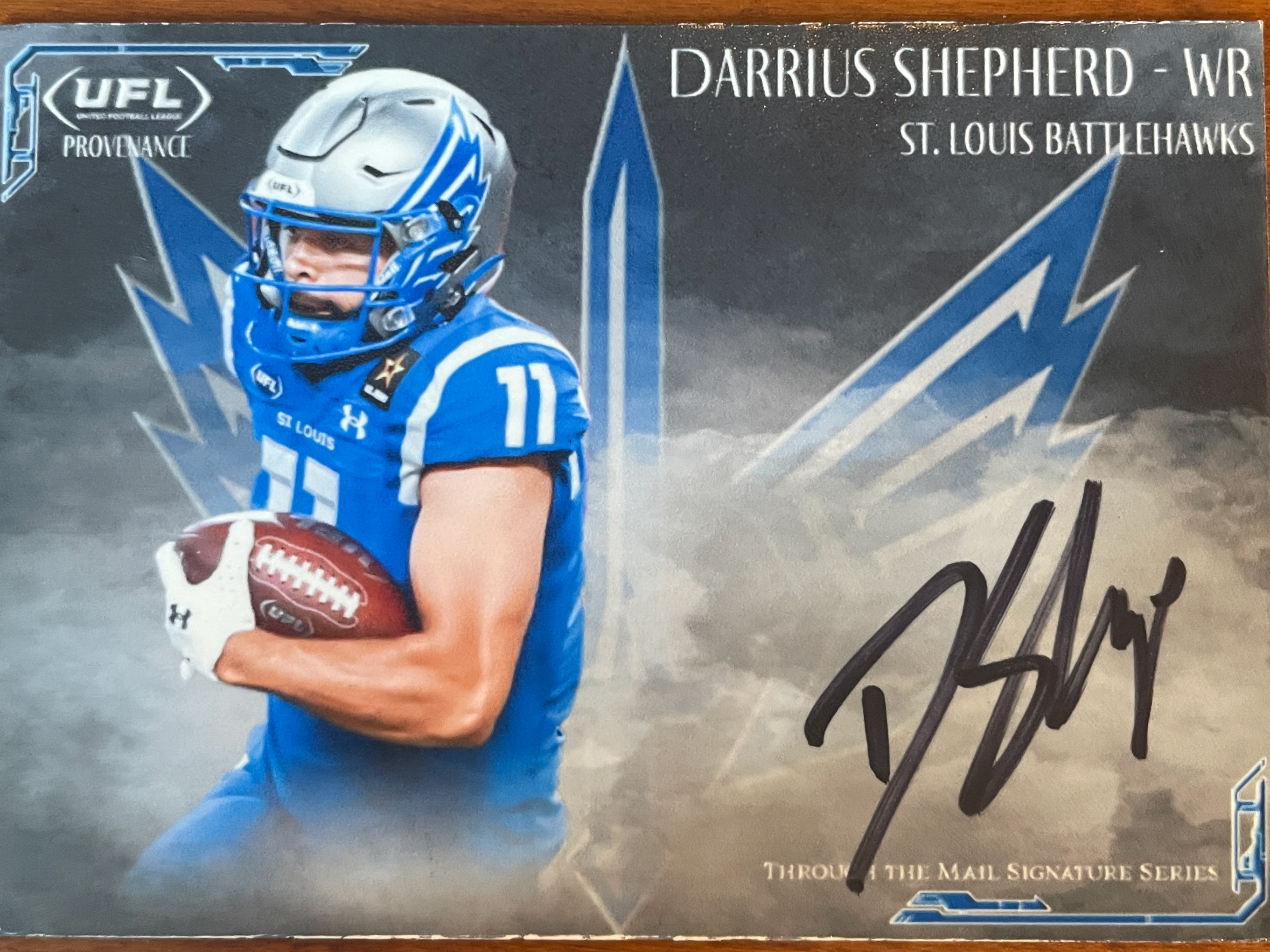
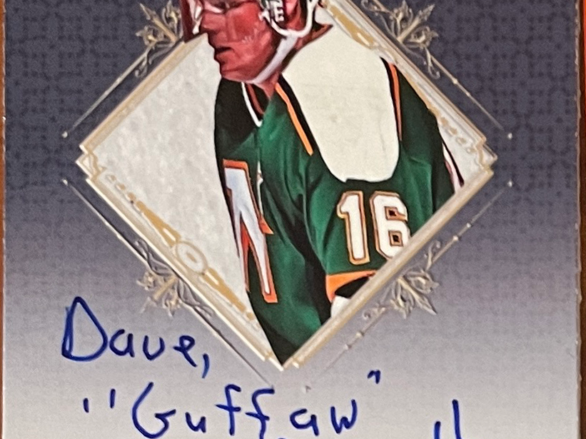
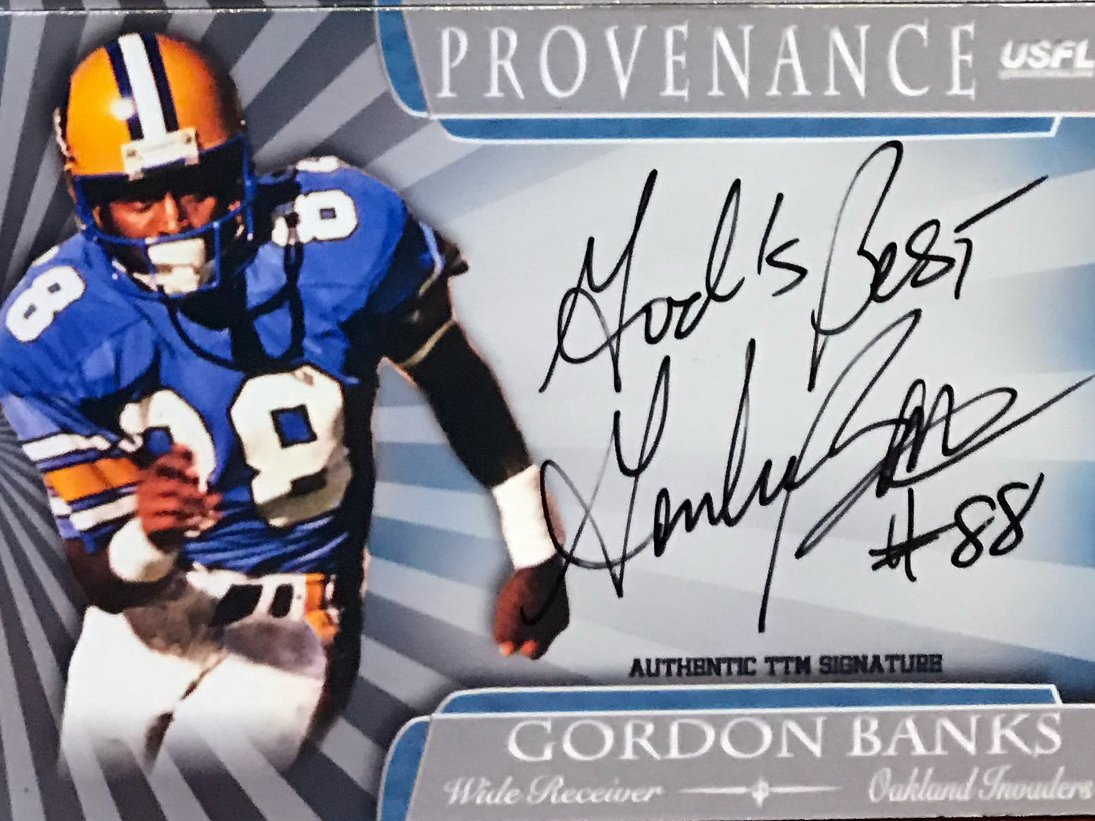
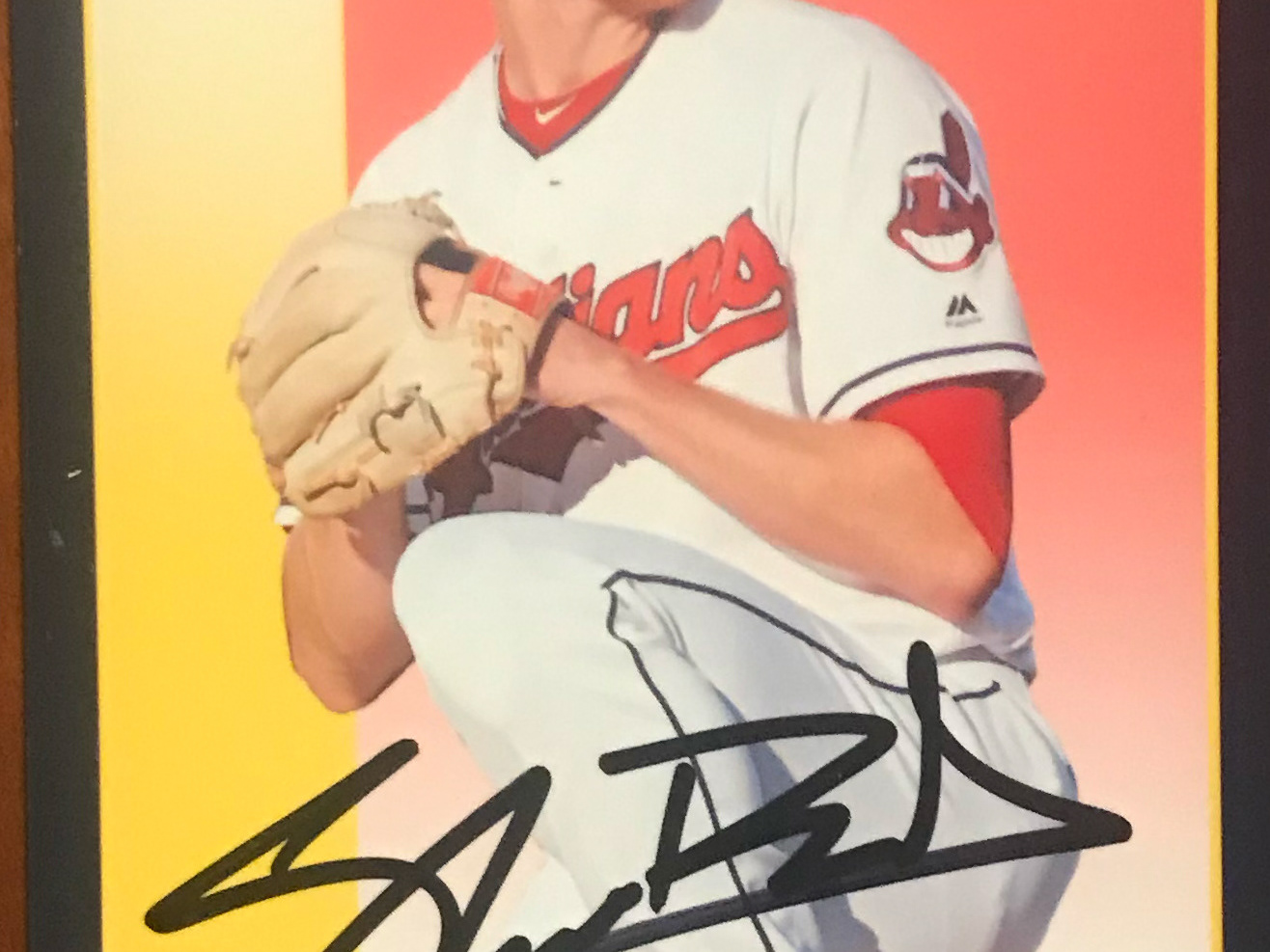
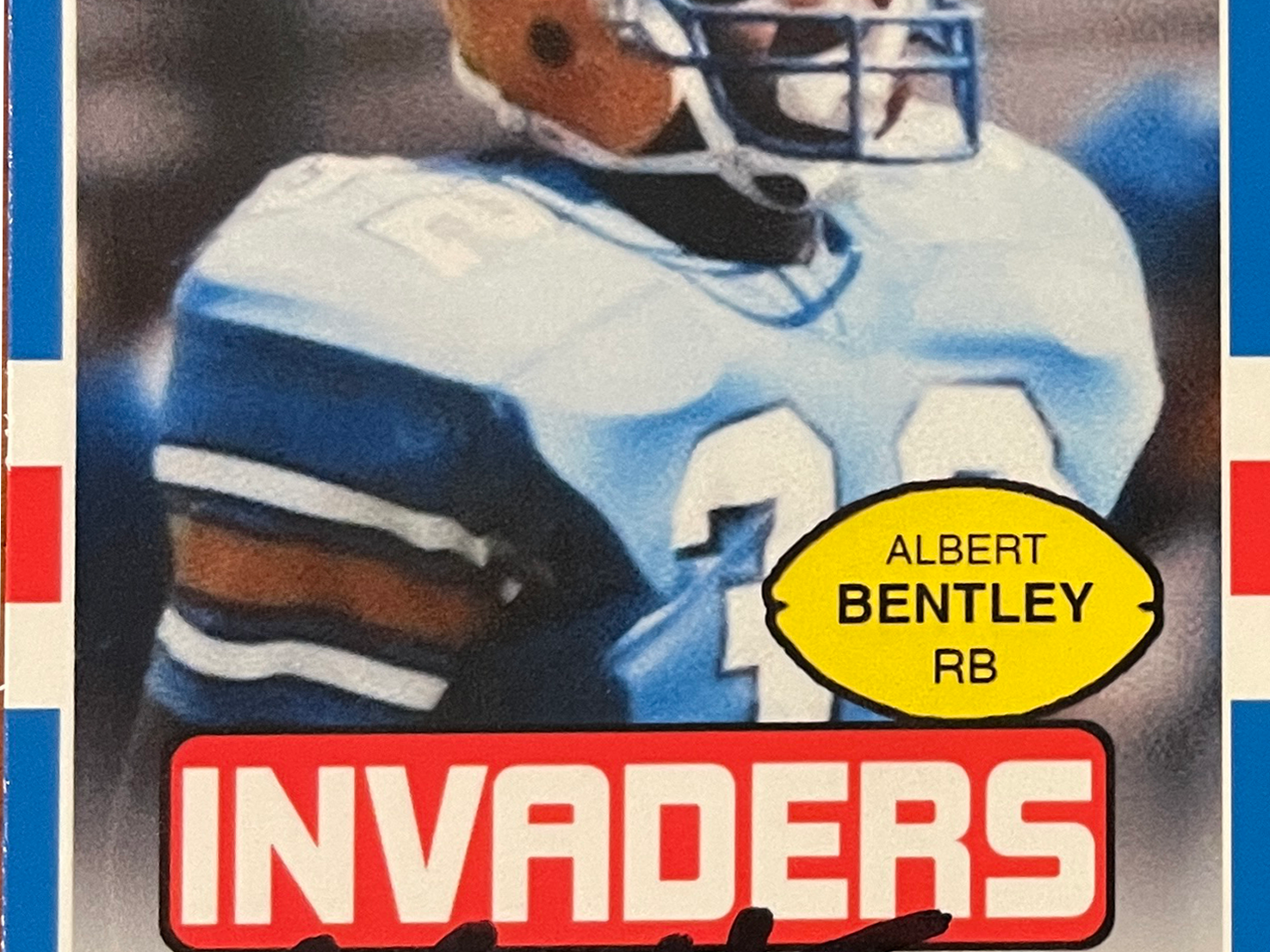
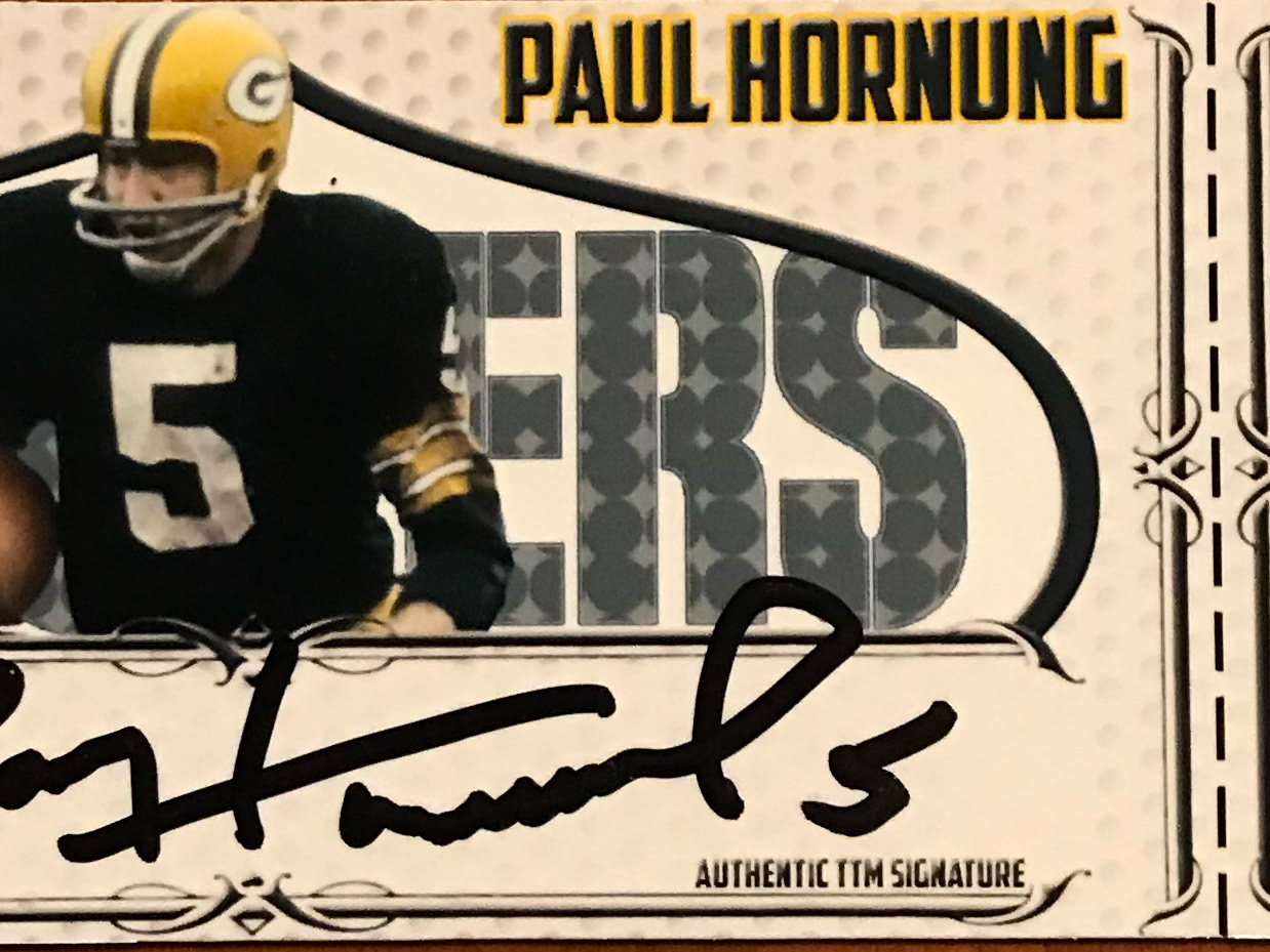
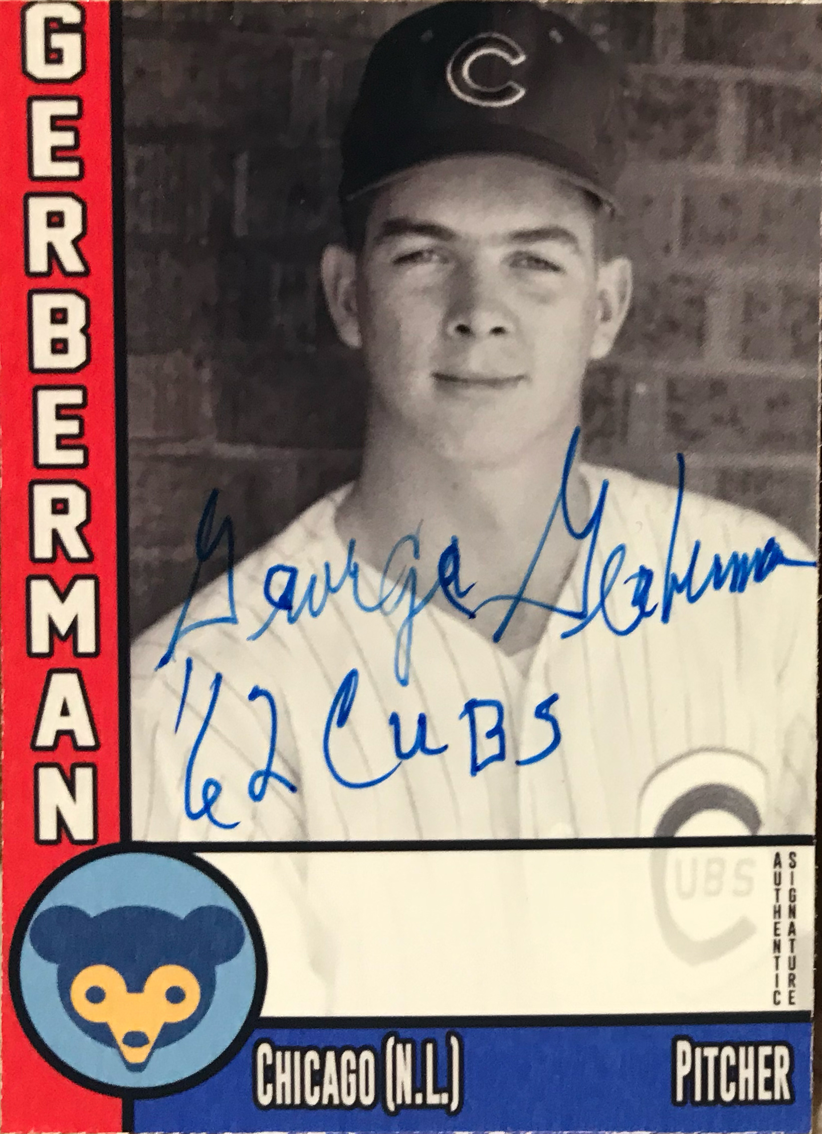
This is a set I originally designed in 2013 for Chicago Cubs players. I redesigned the set prior to the 2015 National Convention, adding a back and giving it classic vintage look. I then redesigned it in January 2017 to continue my Cubs collection. It has now taken on a life of it's own as I attempt to collect signatures of living Cubs alumni.
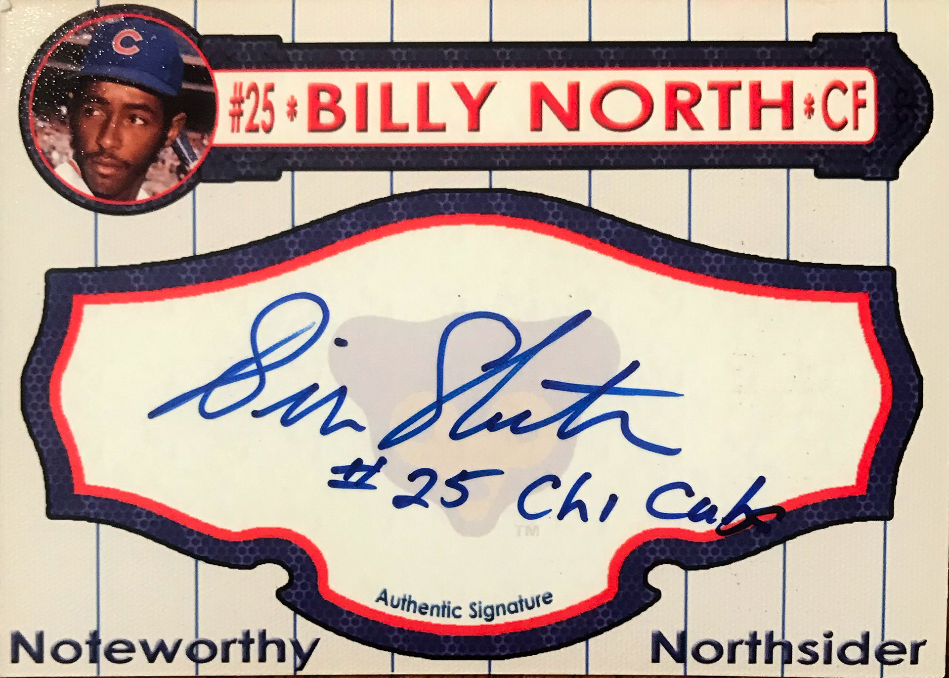
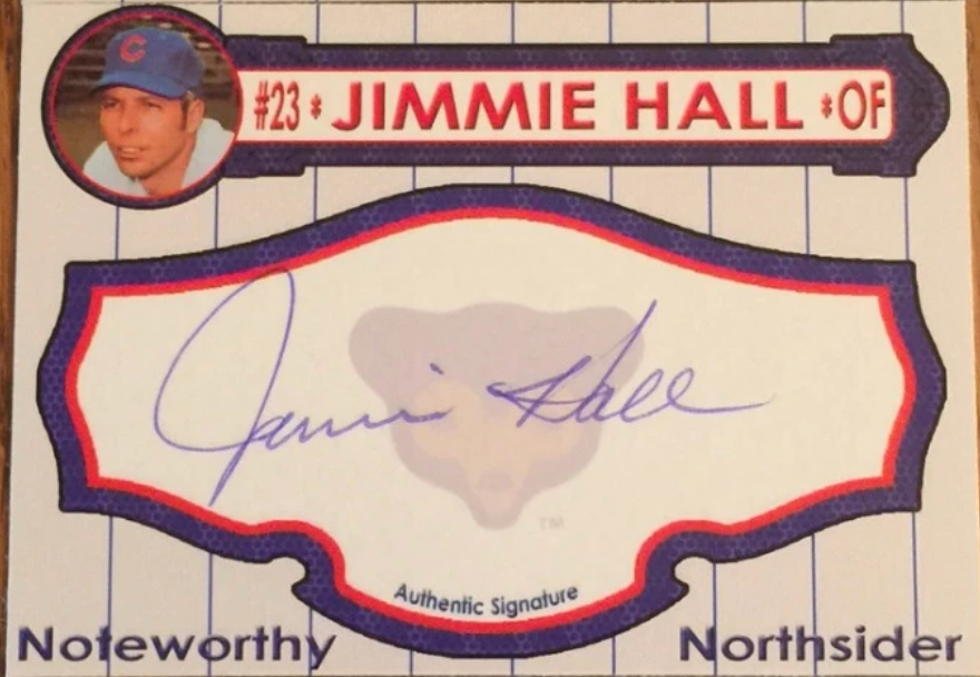
2013 Version (V..5): This version is a horizontal card with a pinstripe background and a small player picture in top right corner.
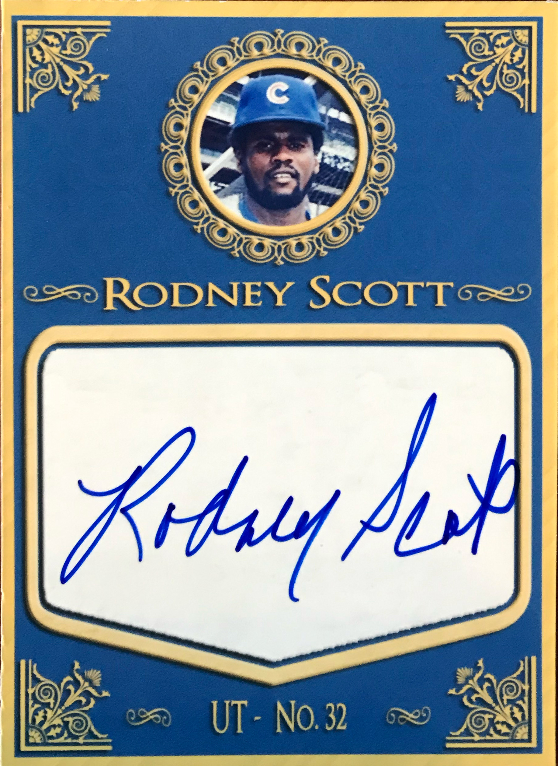
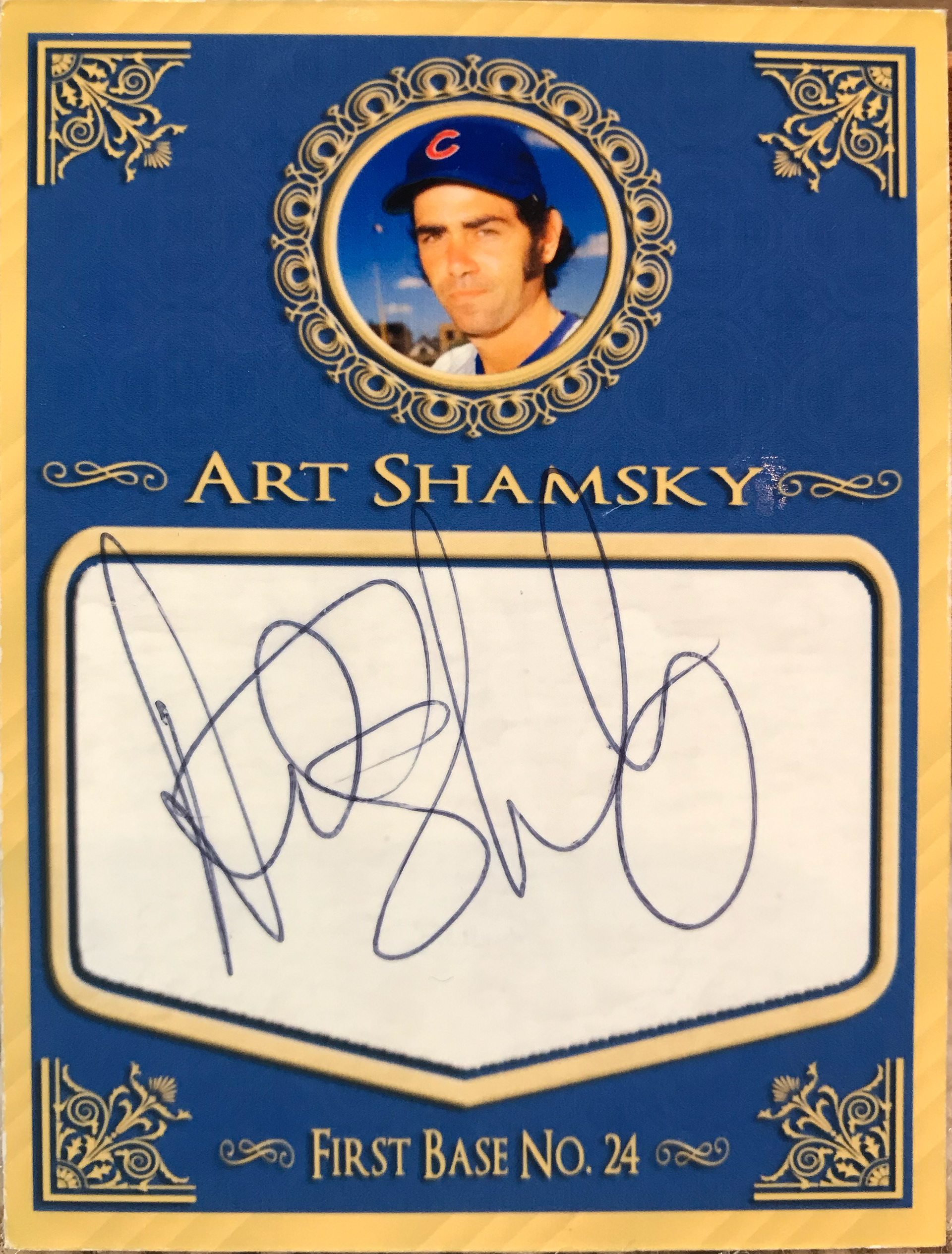
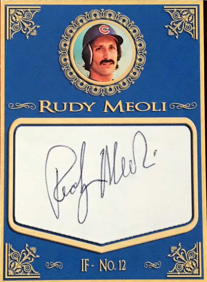
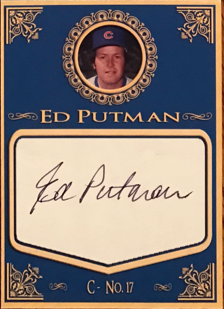
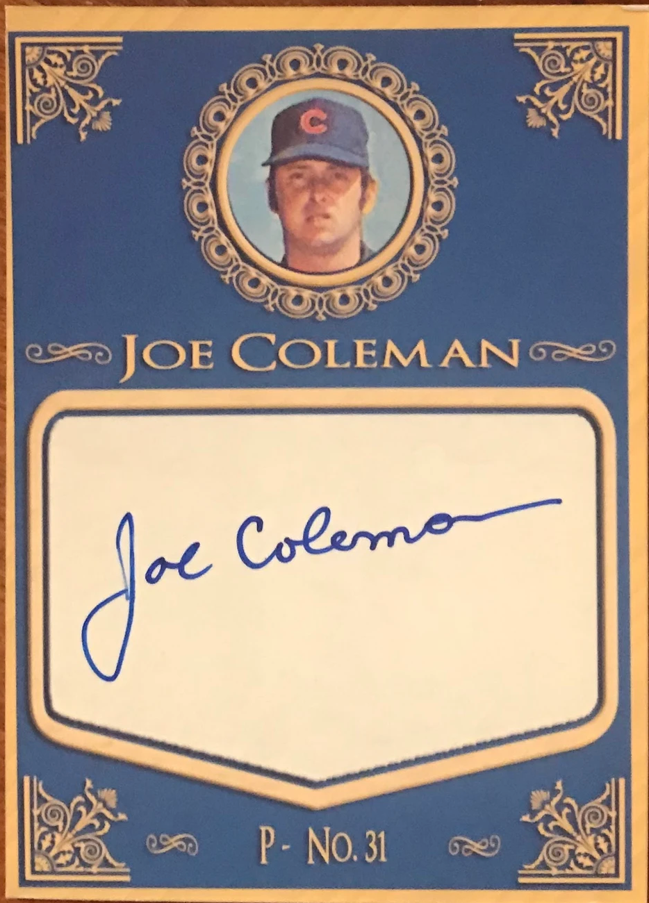
2015 Version (V.1.0): This version has the yellow border to it with a more formal look, again, I was going for a vintage style.
2017 Version (V.2.0): This version is a cleaner, more modern take. I wanted a different style of signature area & love how it worked.
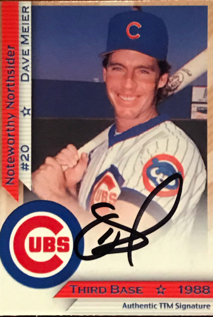
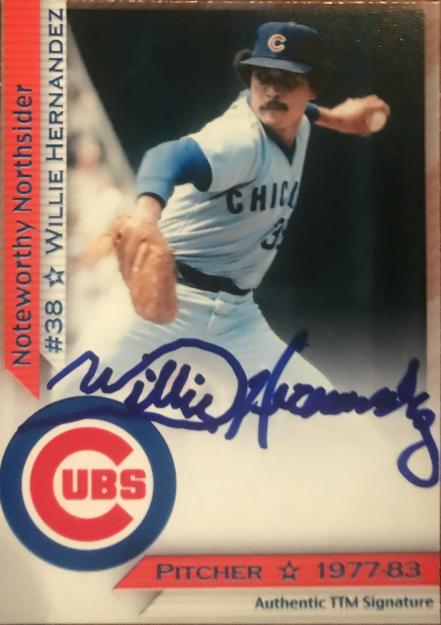
2018 Version (V.3.0): This version is out a year sooner than I thought it would be, but I had a creative spurt. This set has more of a traditional card look to it, and features a full photo, which I needed to use as it's really difficult to find pictures of some of the players in a high enough quality.
2019 Version (V.4.0): I was going to run with the 2018 version for awhile, but I got an itch & rebuilt the set again. I thought the card had a late-1980's, early 1990's feel to it when I put it together. This is a set design I still go back to from time to time.
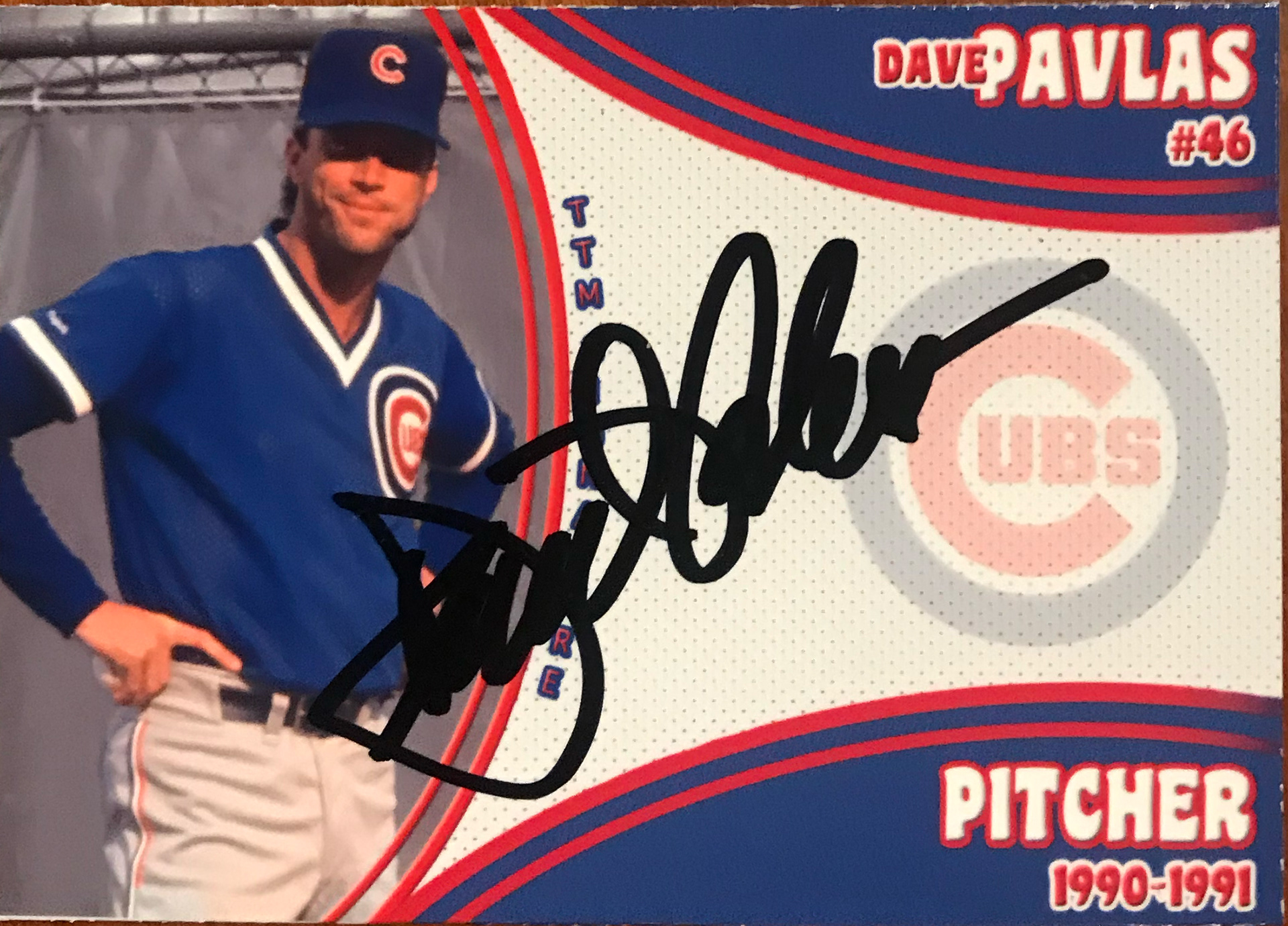
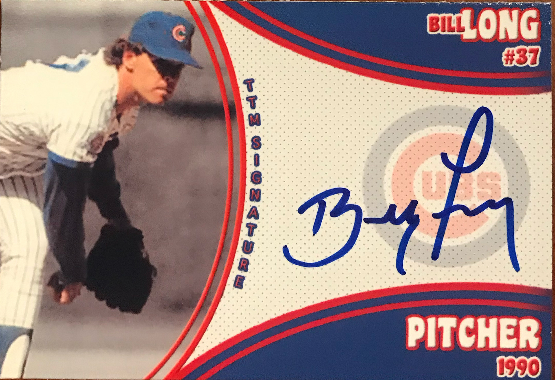
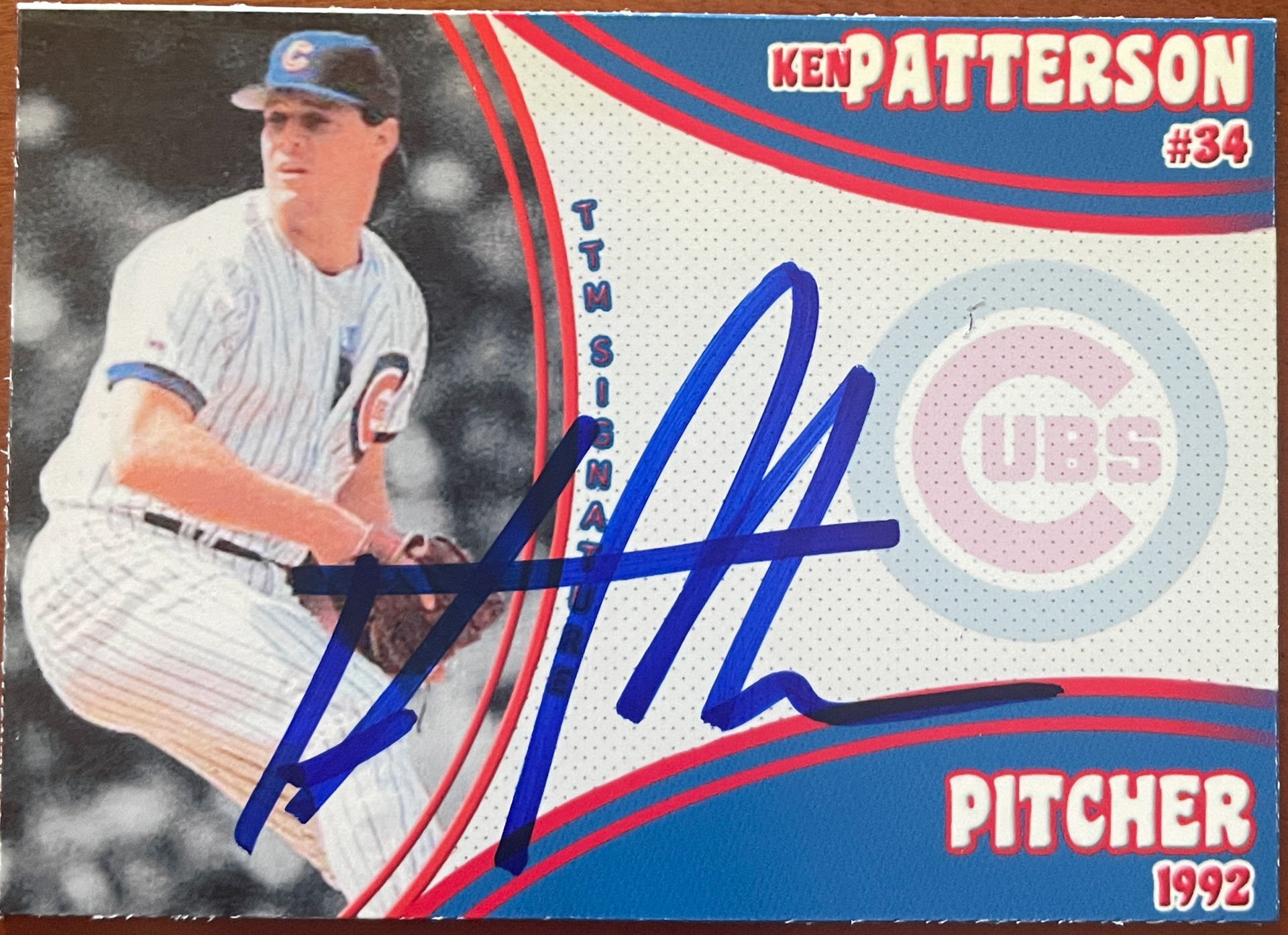
2020 Version (V.5.0): I really liked the 2019 version of this run, but got hit with a creative bug and came up with a new design sooner than I thought. Went back to a horizontal design, but tried to spotlight the player against a black & white background for their picture.
Early 2021 Version (V.6.0): This set parallels the Commit to the Indian and Monsters of the Midway sets I created around the same time. Horizontal fronts and vertical backs with some more advanced design elements. Lots of great returns here.
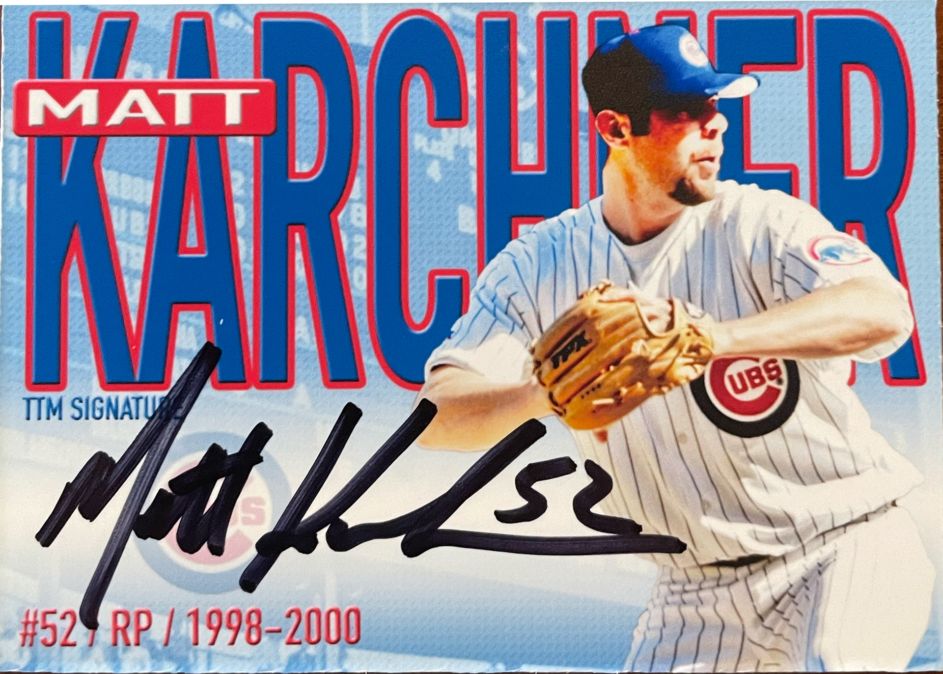
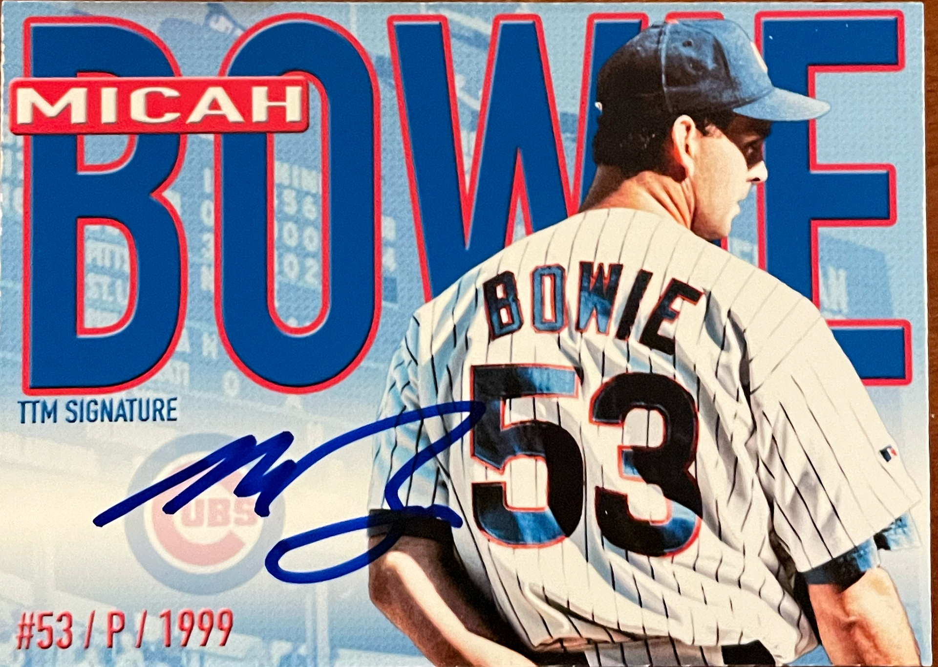
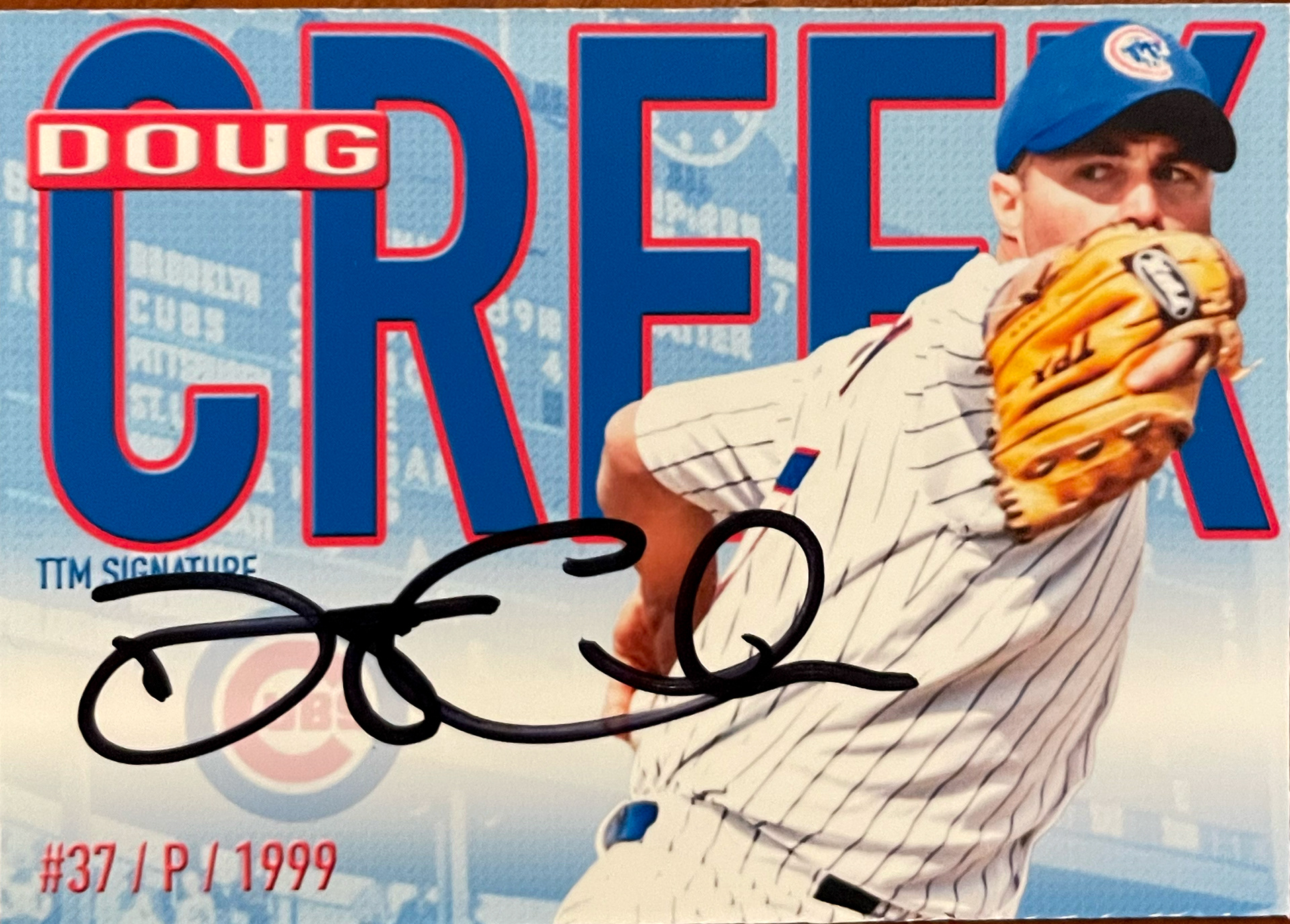
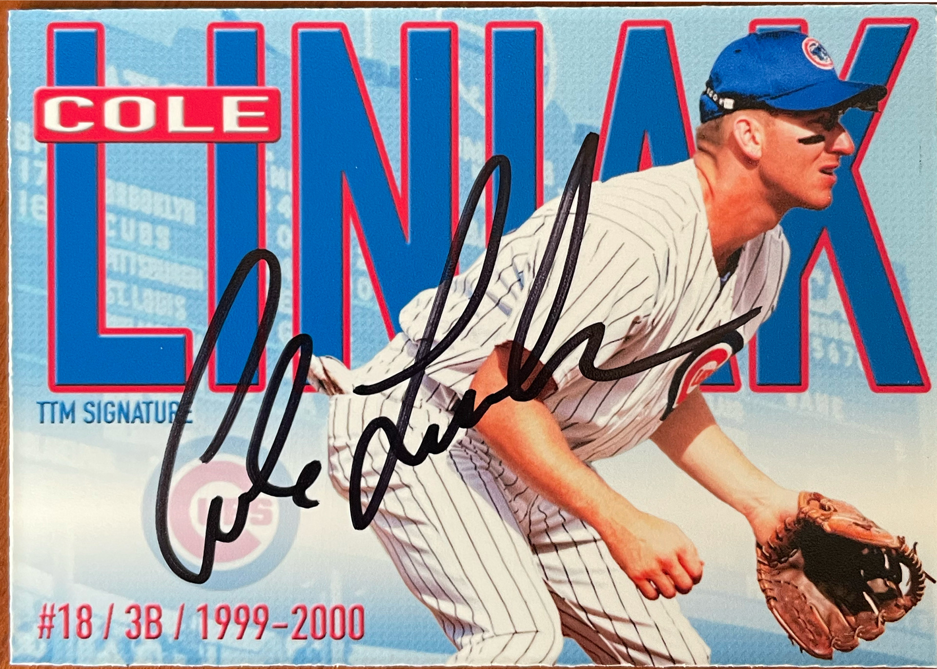
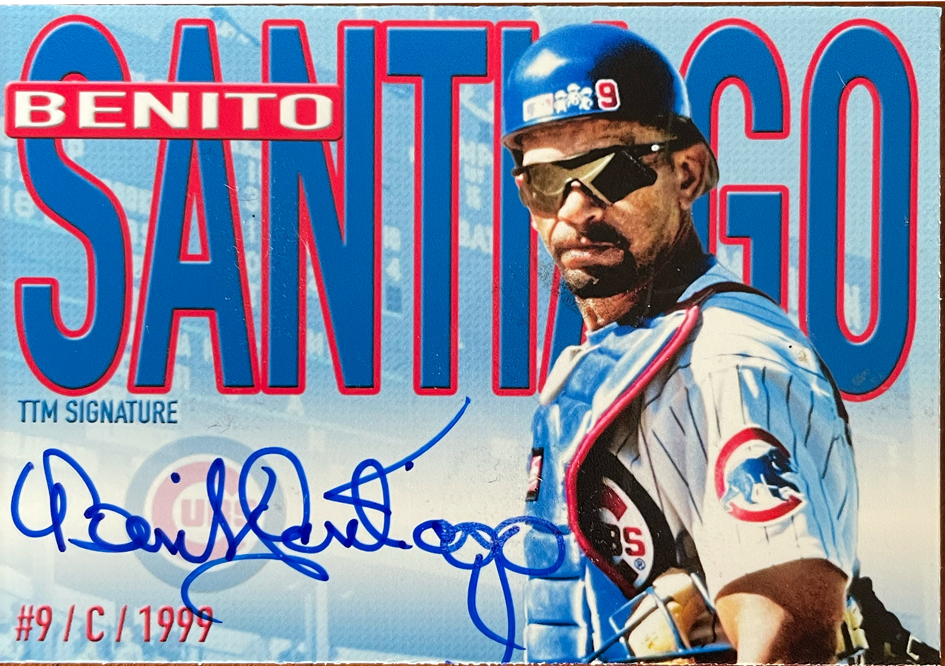
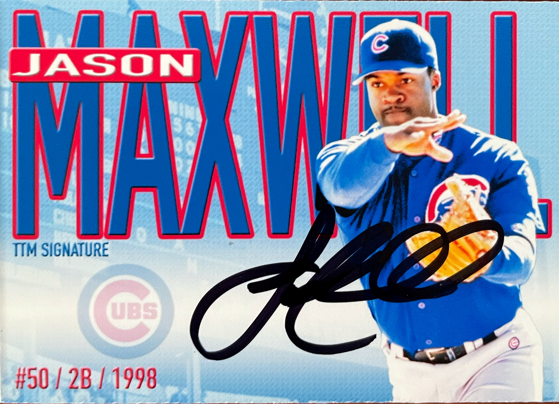
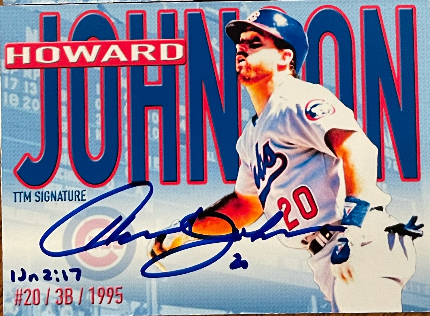
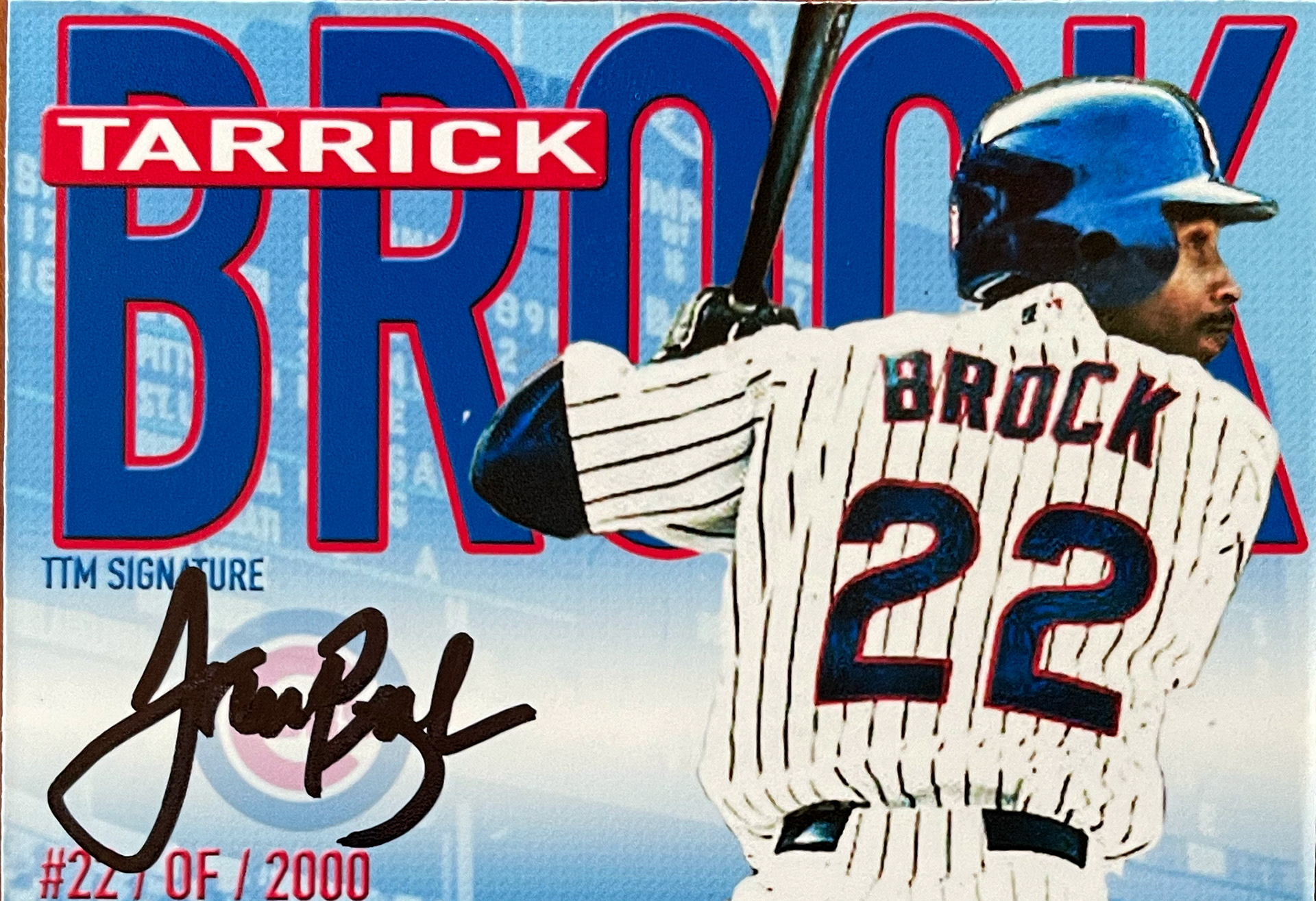
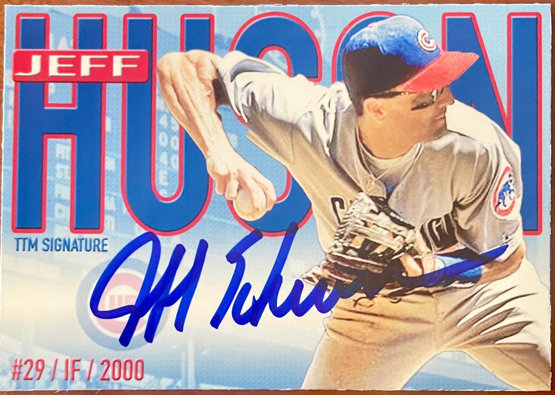
Late 2021 Version (V.7.0): Just had a stroke of Bold creativity. I moved back to a horizontal design, with a cut out of the player in front of his name in bold lettering and the iconic Wrigley Field scoreboard in the back. This is a set I still send out time to time.
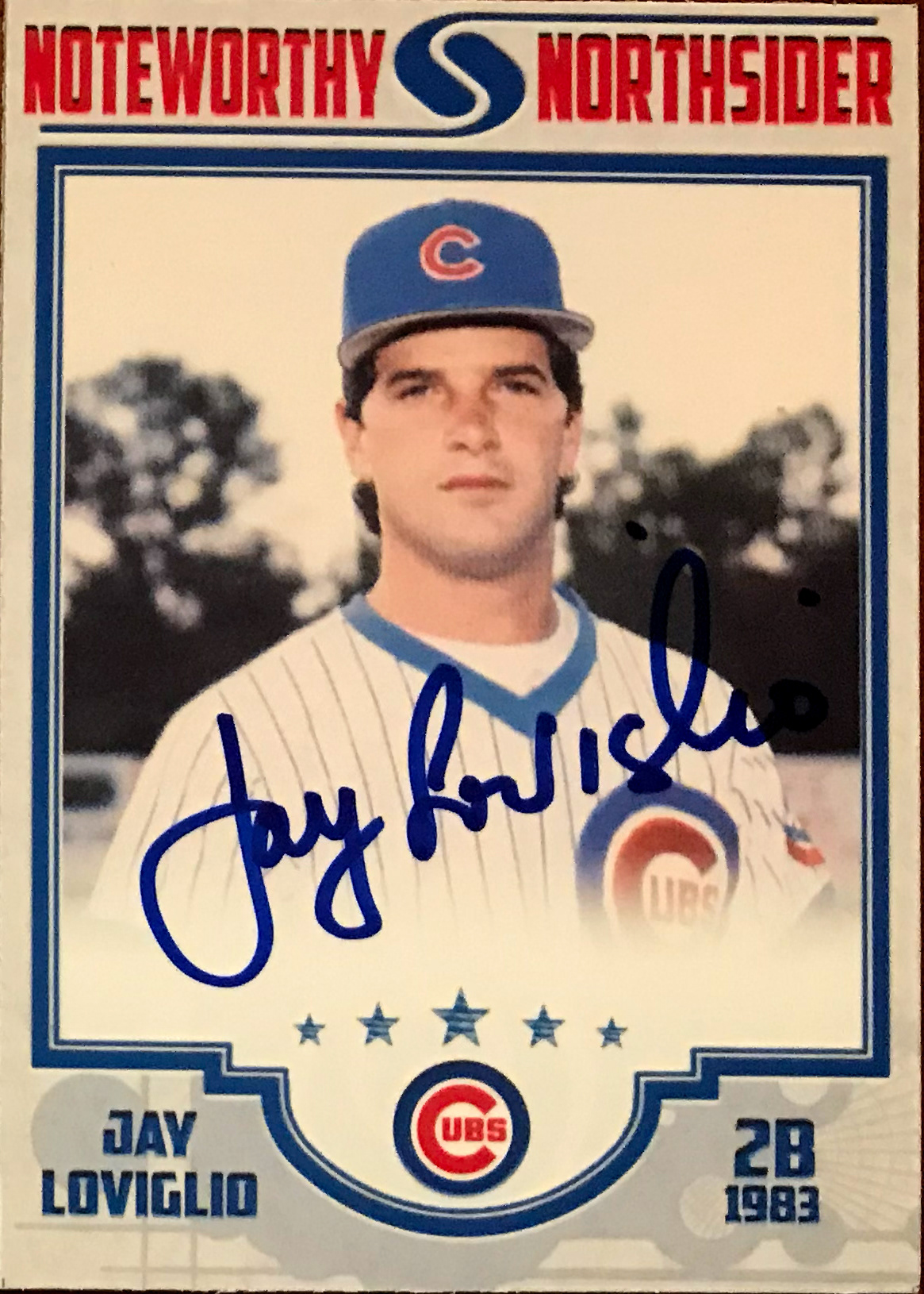
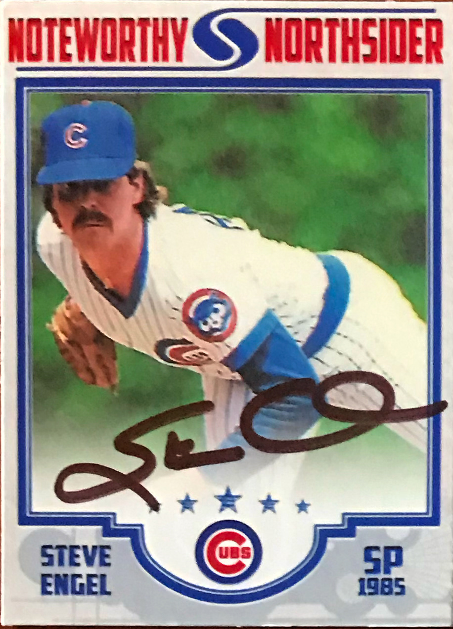
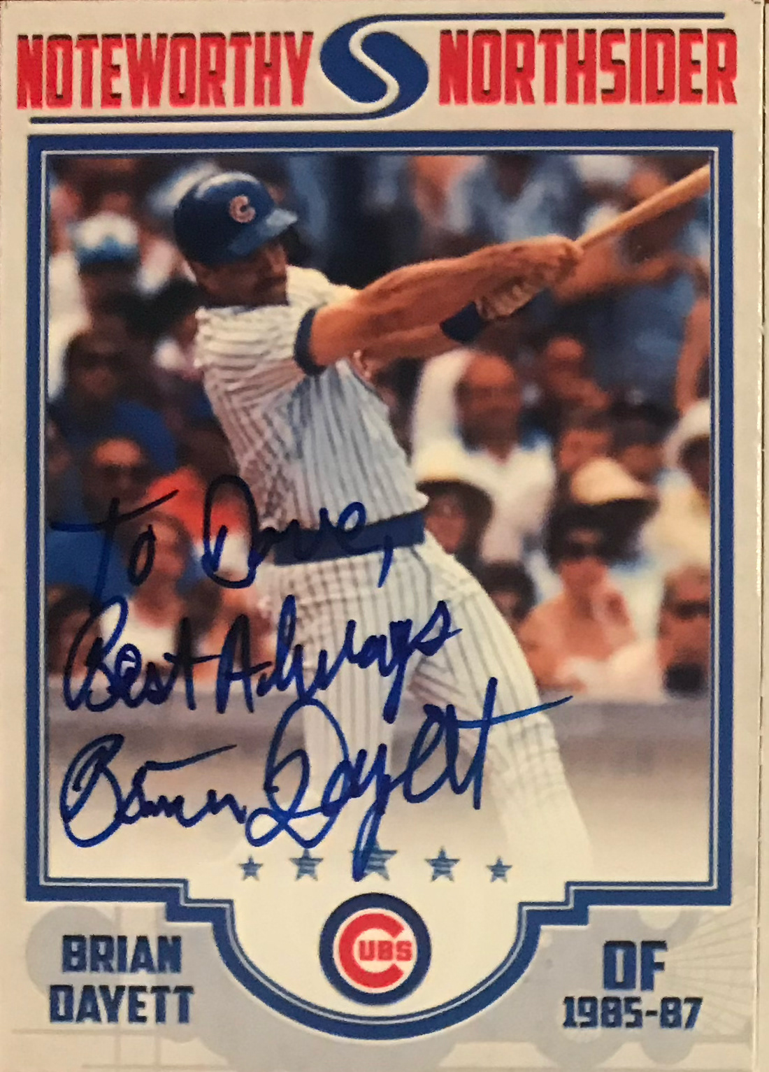
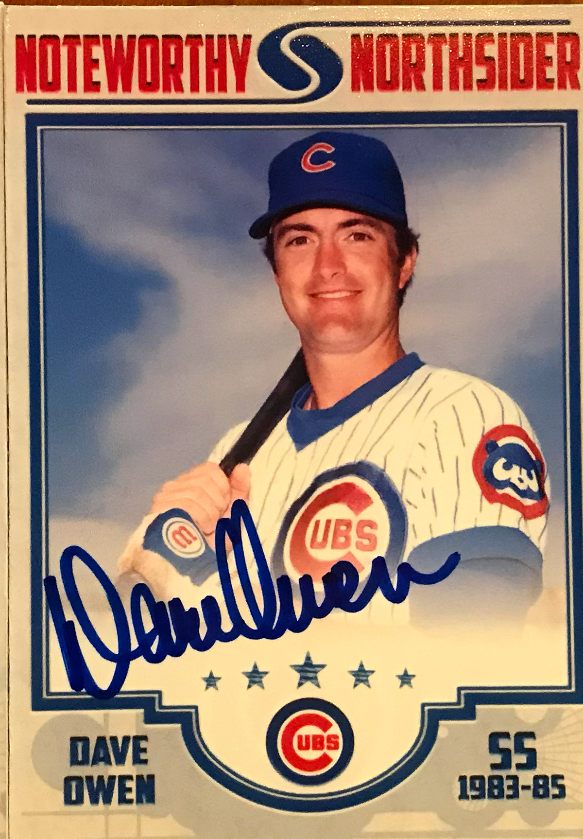
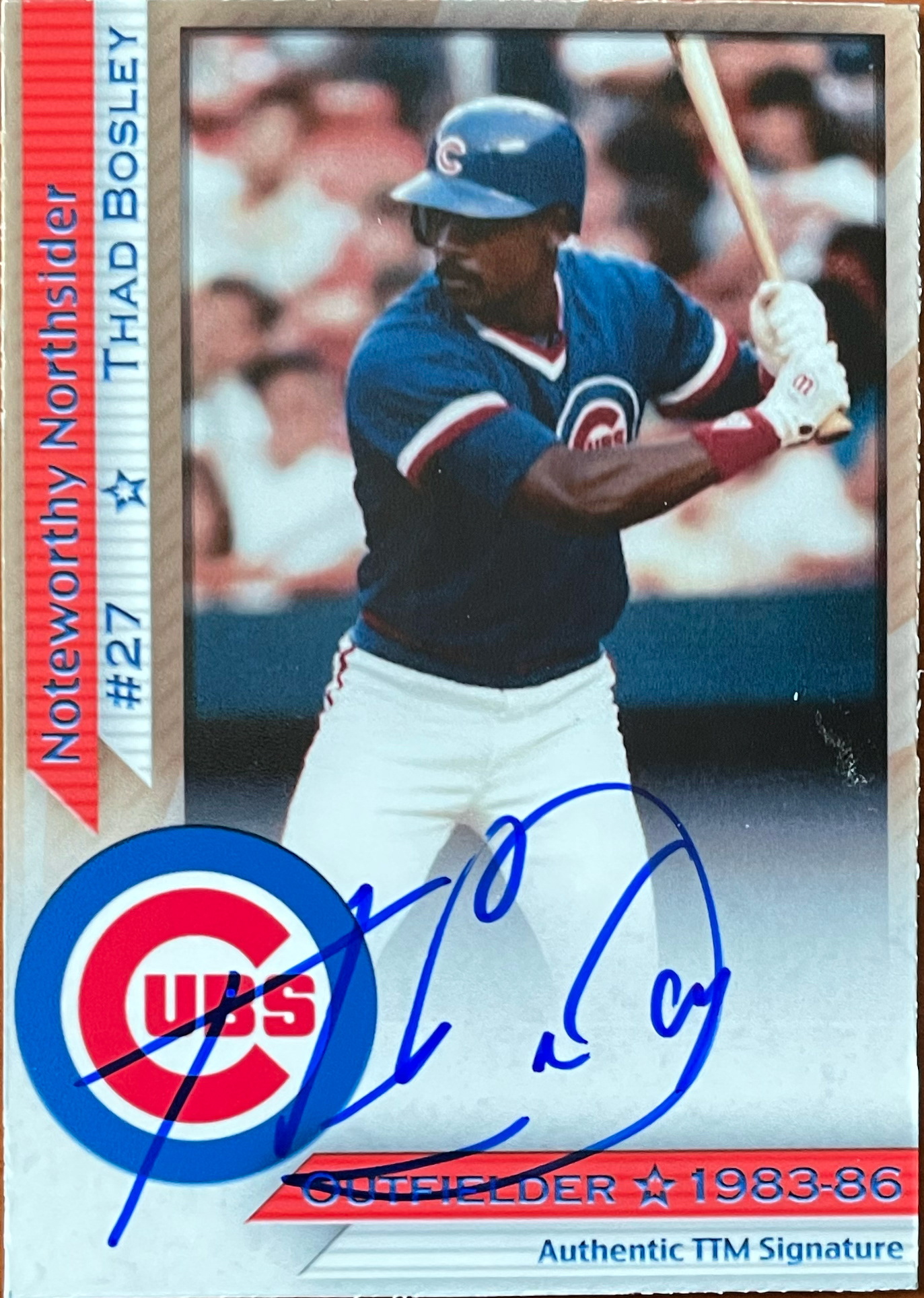
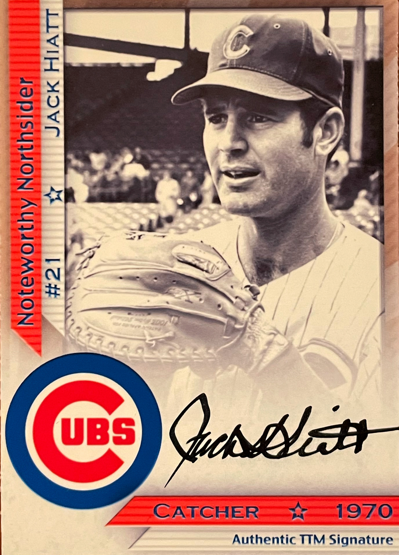
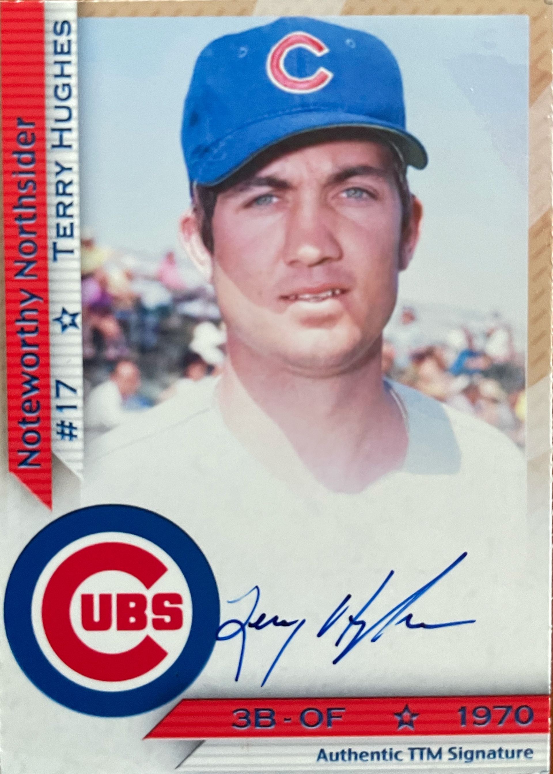
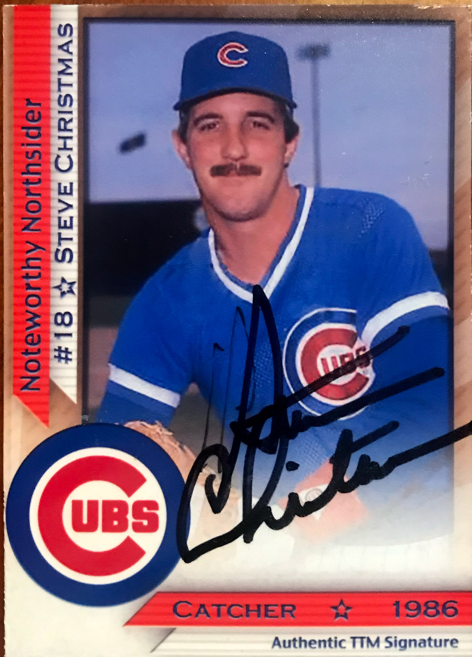
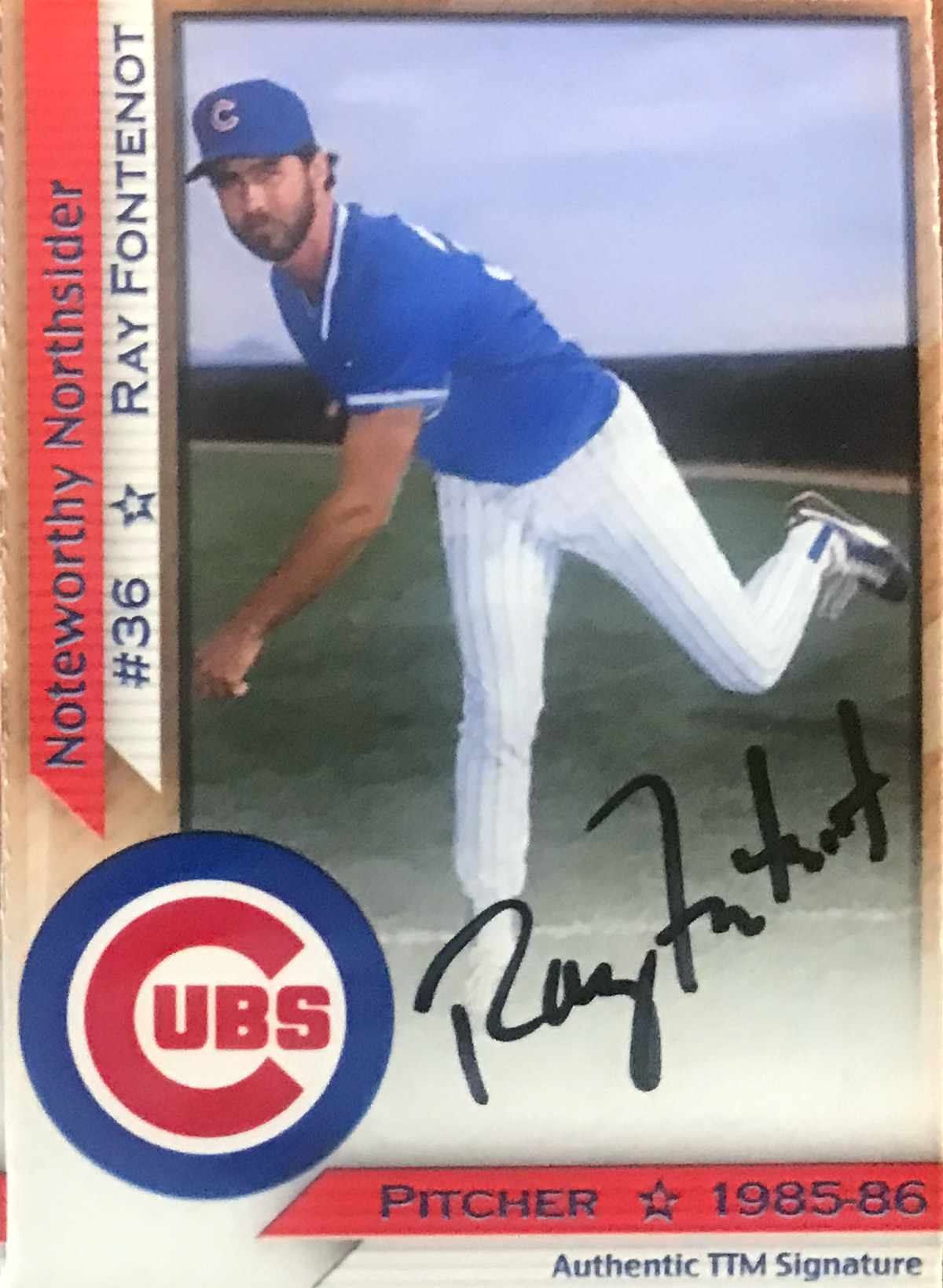
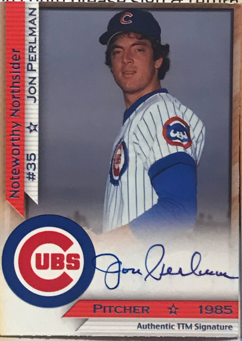
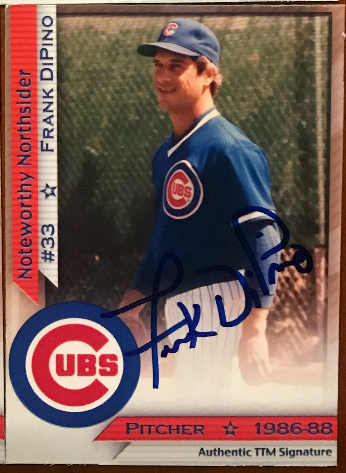
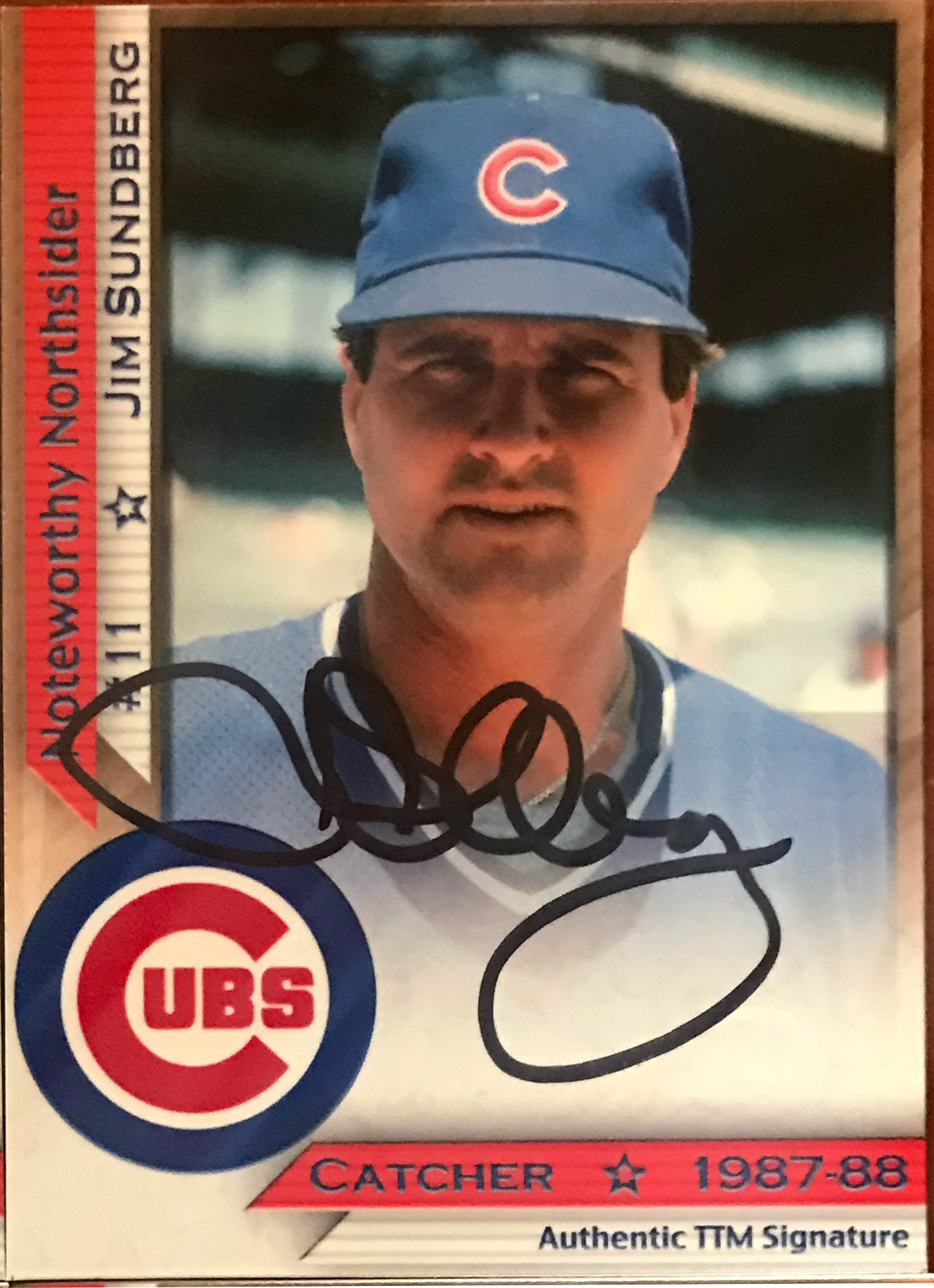
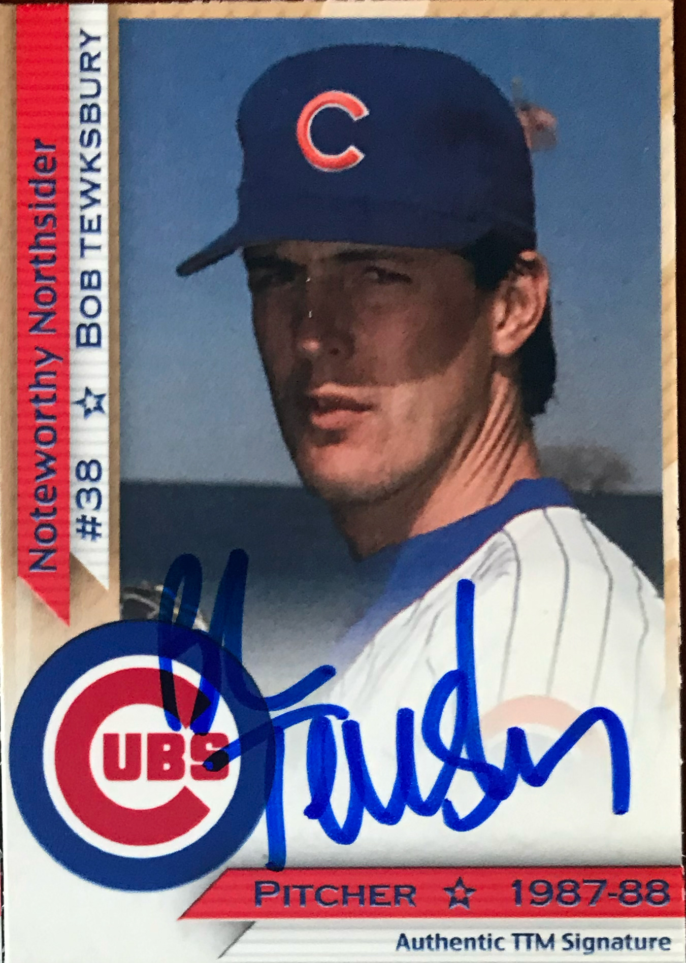
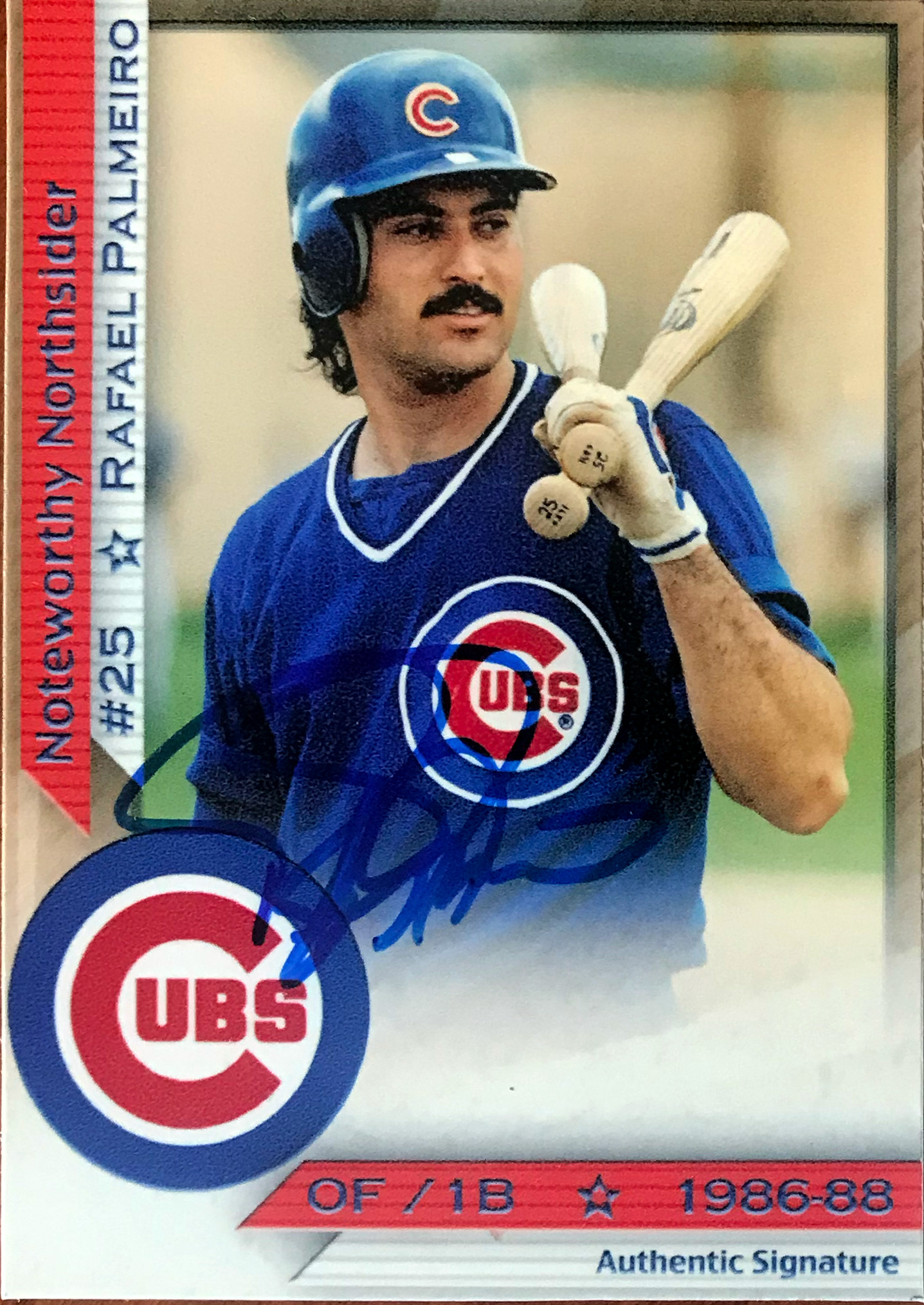
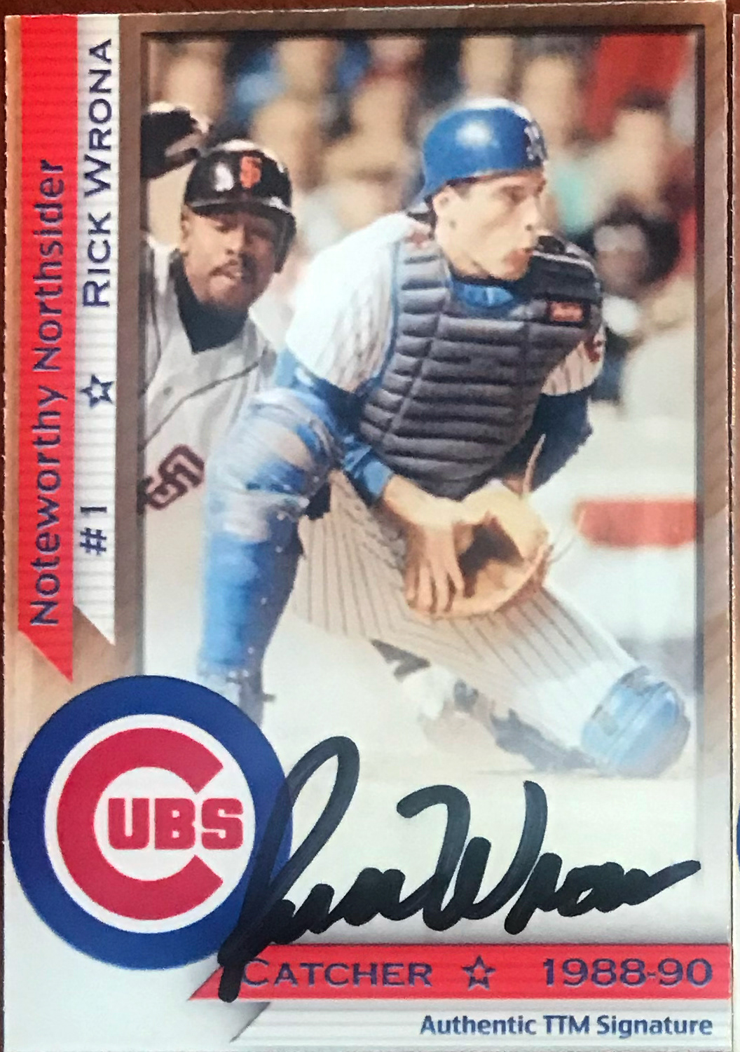
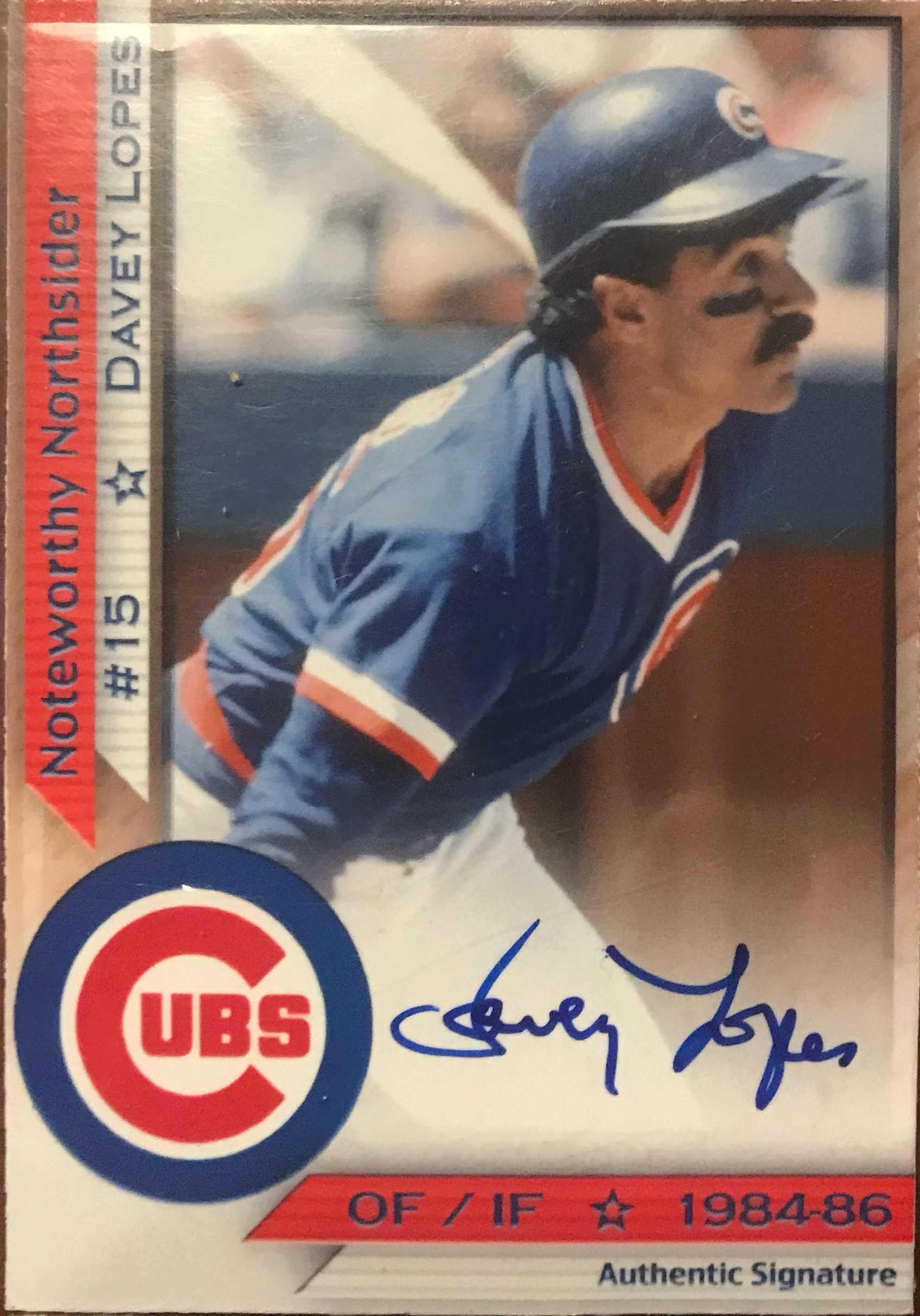
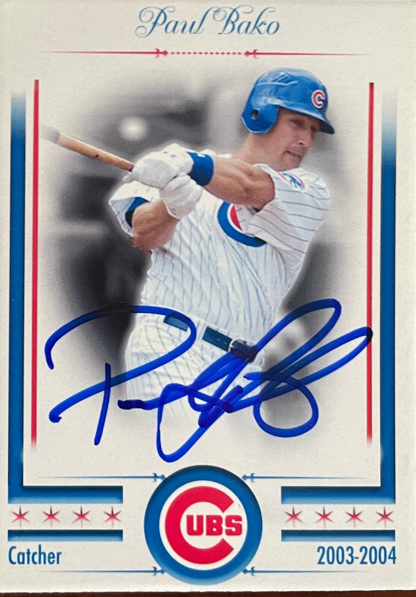
Early 2022 Version (V.8.0): One of my favorite versions I created. I mocked it off a team set that the Cubs created in the Mid-Eighties, but wanted to include the 4 stars of the Chicago flag, and then added some elements similar to what one would find in some of the upper-tier Topps print runs. Had another solid response from the players.
Early 2023 Version (V.9.0): I really enjoyed the 2022 Topps Stadium Club look and wanted to parallel it a bit. Full bleed pictures that were faded into the background with the player popping in front. Another or my faves.
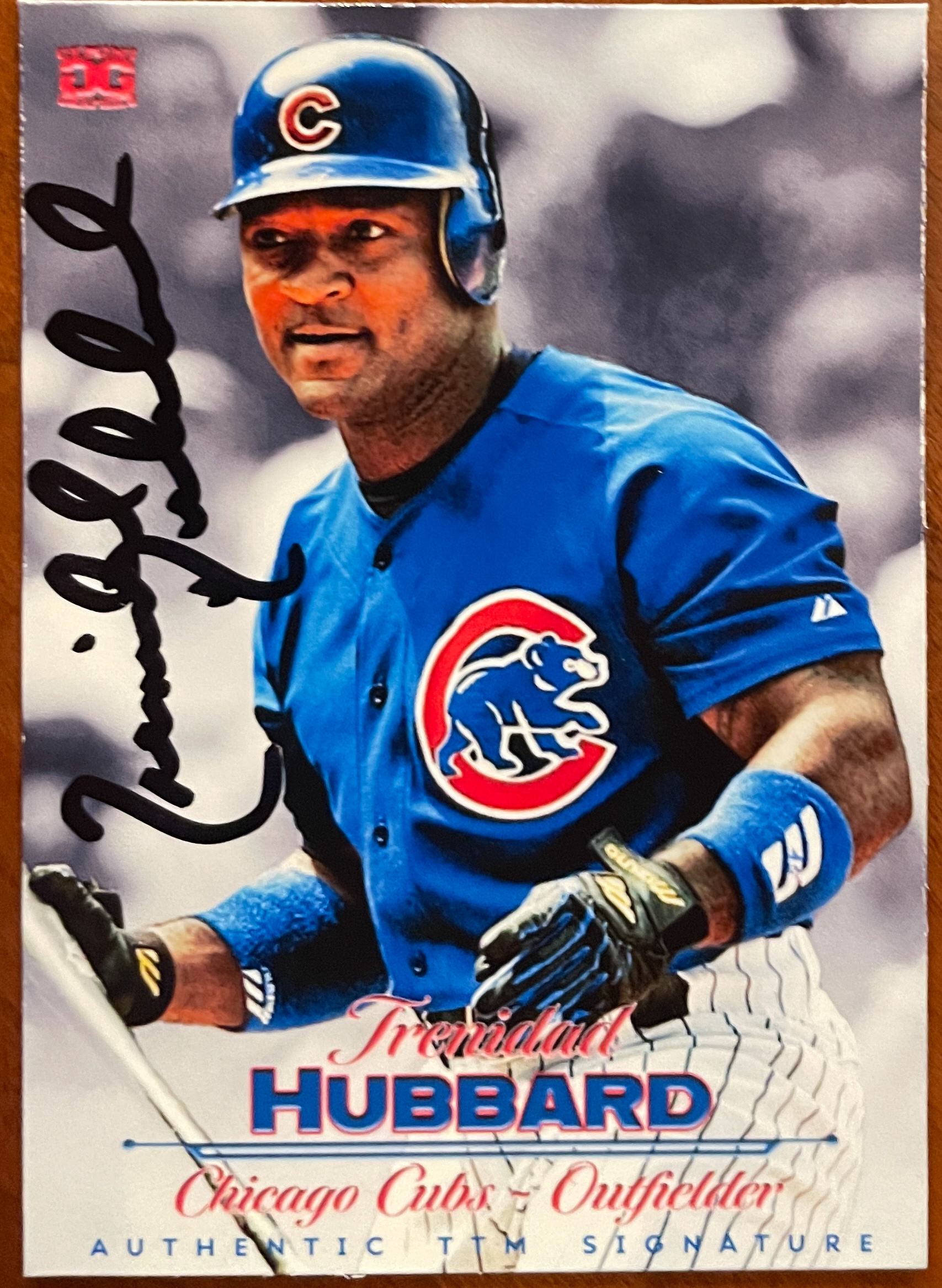
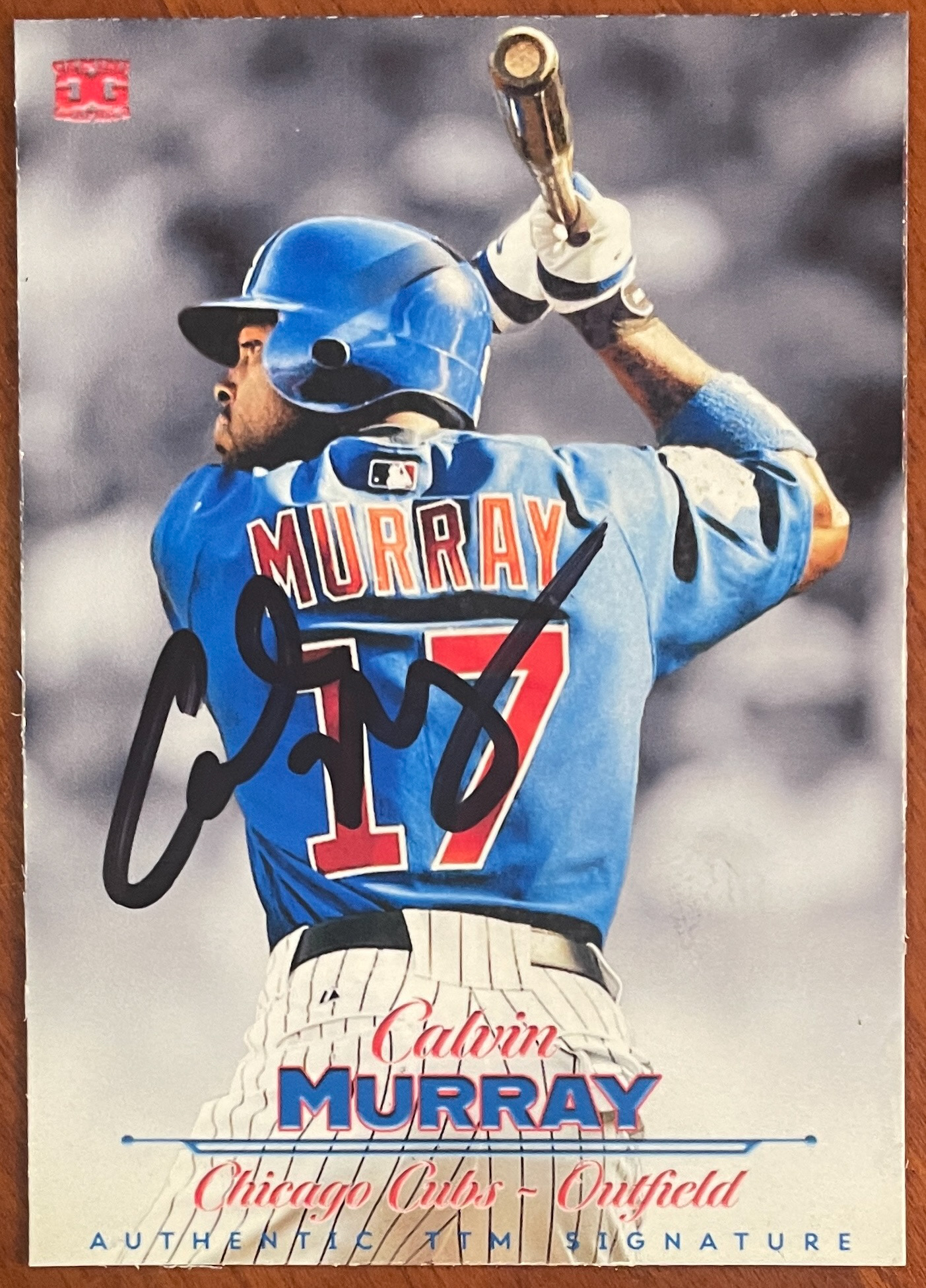
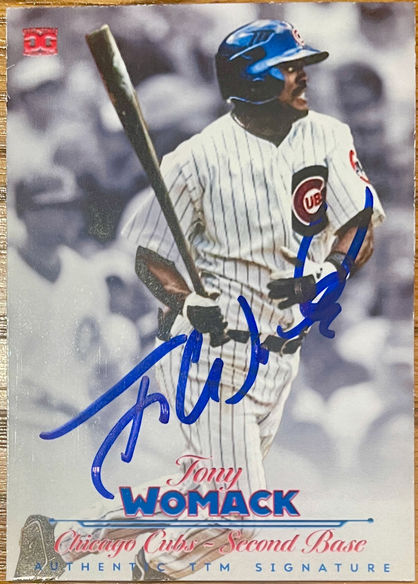
Mid 2023 Version (V.X): For the tenth edition, I went with a front that I thought was very clean and simple, and super simplified the back to mock the 1984 Topps Football All-Pro Backs.
Late 2023 Version (V.X1): Another fave. The Chevrons were the inspiration on a Topps Inception style background. These just developed smooth and natural. I kept the simplistic design for the back.
Early 2024 Version (V.12.0): I went back to a horizontal format for the fronts of these cards, I originally had it vertical, with the framing of the player at the top, but flipped it and I thought it just looked better. I continued with the simplistic design on the back, which I really think leaves the card looking clean.
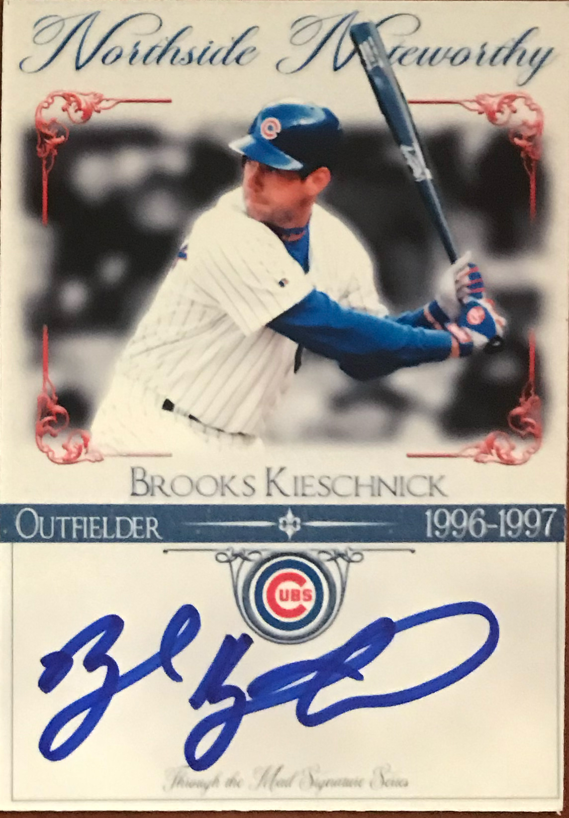
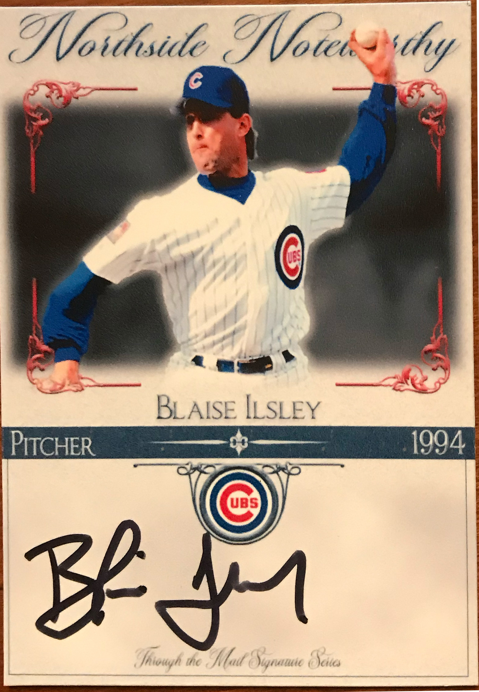
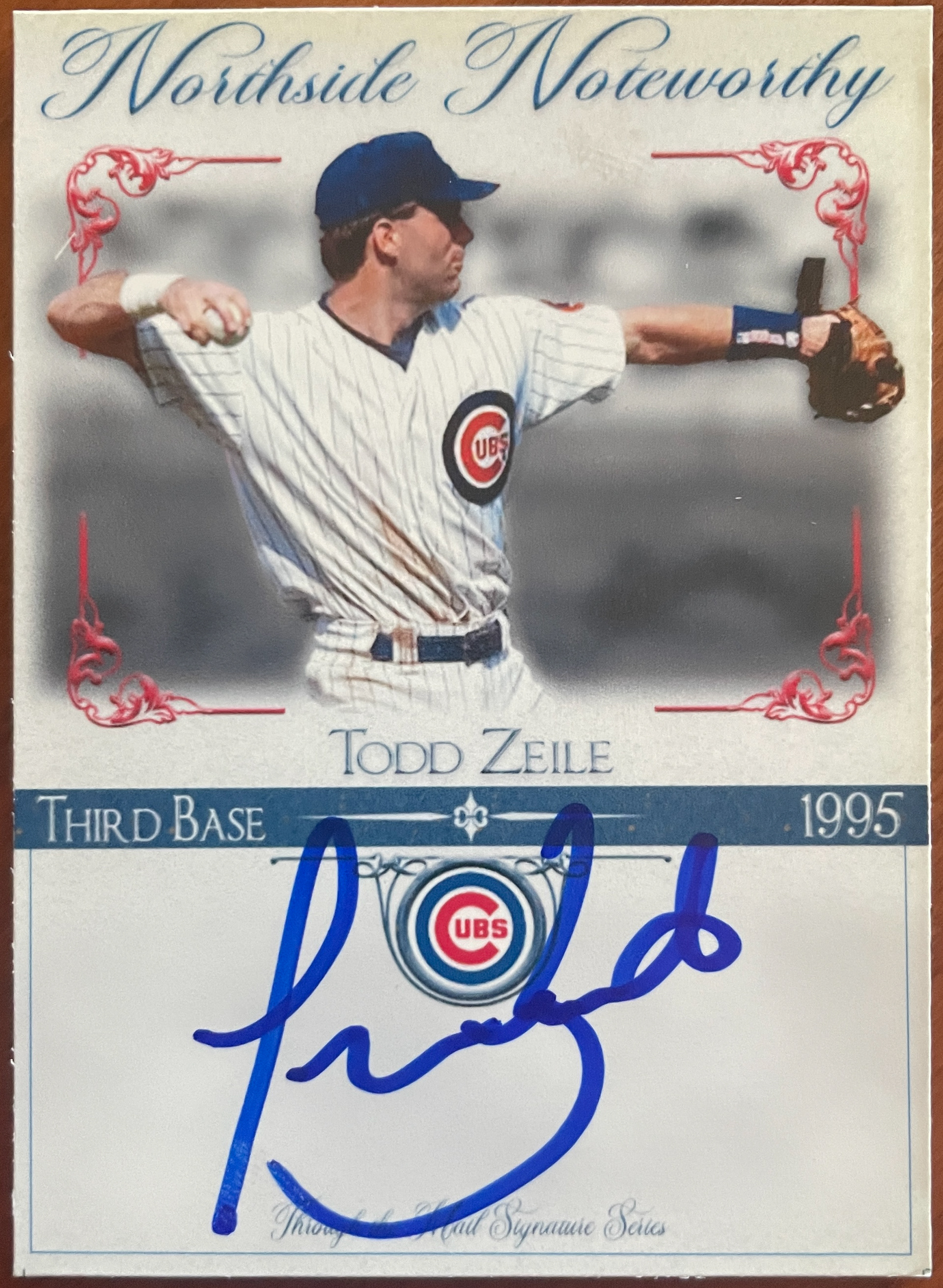
Mid 2024 Version (V. 13.0): I got a bug in me and mimicked a Panini Hockey Enshrinements design on the front. I was looking for something with a bit more balance on the front between player and autograph. Don't know if it's a fave, but I liked the design. It's also good for getting guys that I have a hard time finding pictures or if I have to jersey/hat swap.
2025 Version (V. 14.0): Really enjoyed making this version. I wanted to put more of the focus on these back on the signature, but still wanted the player's picture to pop and I feel like I achieved that. I tried more of a classic, warm look to the front with the tan signing area and it all just came together. I continued with the more simplistic design on the back.
Mid 2025 Version 1 (V.XV): I had a creative spurt with FOUR new designs in mid 2025. The first was my nod to one of my favorite football sets, 1991 Pinnacle. An action and a headshot on the front, just kept it in Cub colors and put a spot at the bottom for them to sign... some did, some didn't.
Mid 2025 Version 2 (V. 16.0): Another nod to the past, I mimicked the 1992 Topps Stadium Club with a full bleed design and a small logo and name stripe on the front. I also took the shield on the back from one of the Topps All-Star sets. I only made about 10 of these, and quite honestly, didn' t like them after I printed them. I'll probably come back to them and clean them up a bit, but then again, I may not.
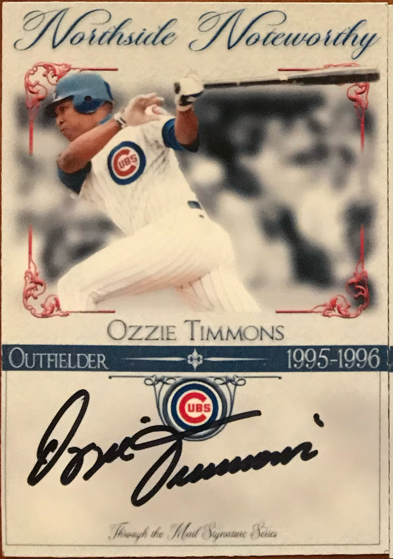
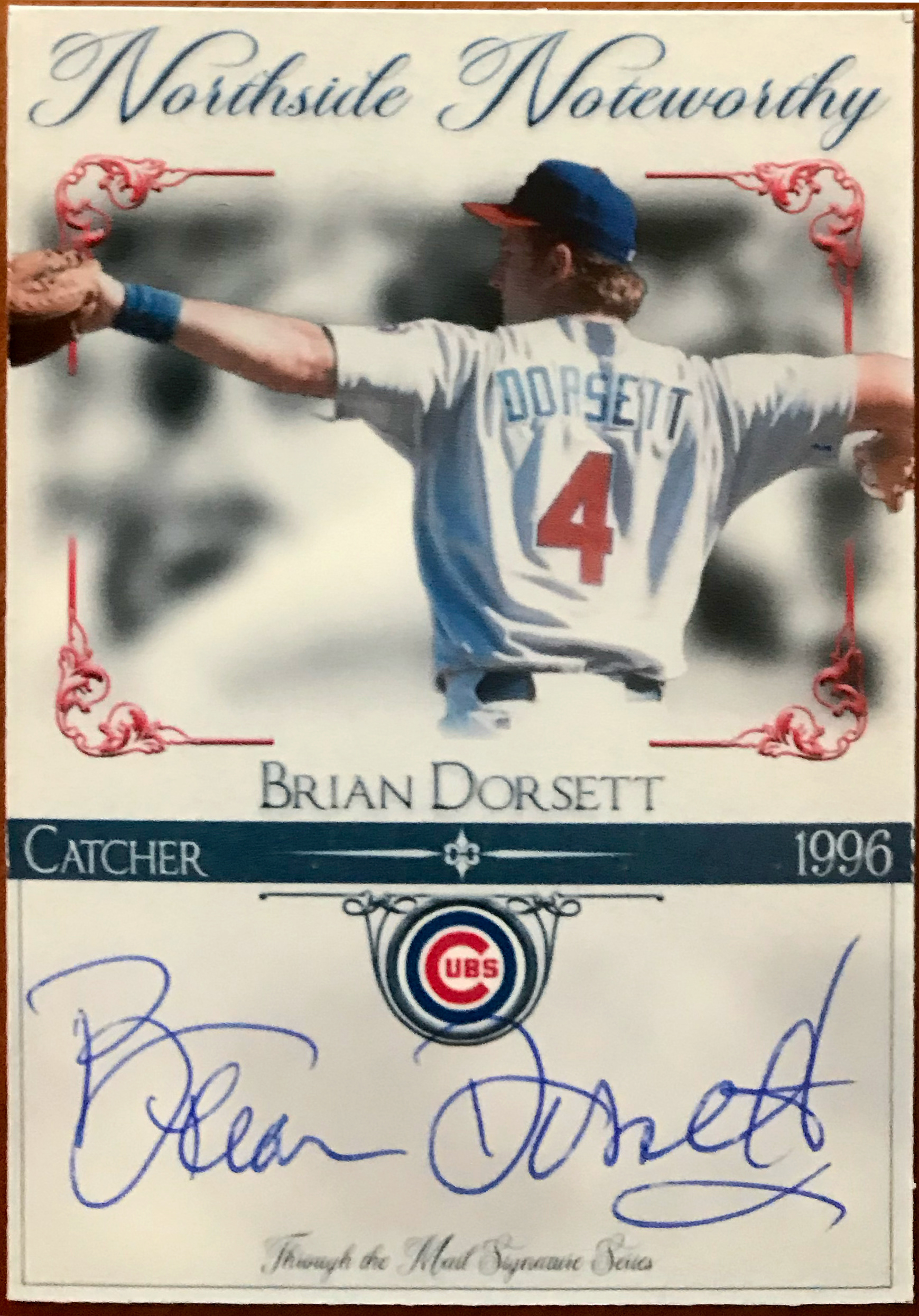
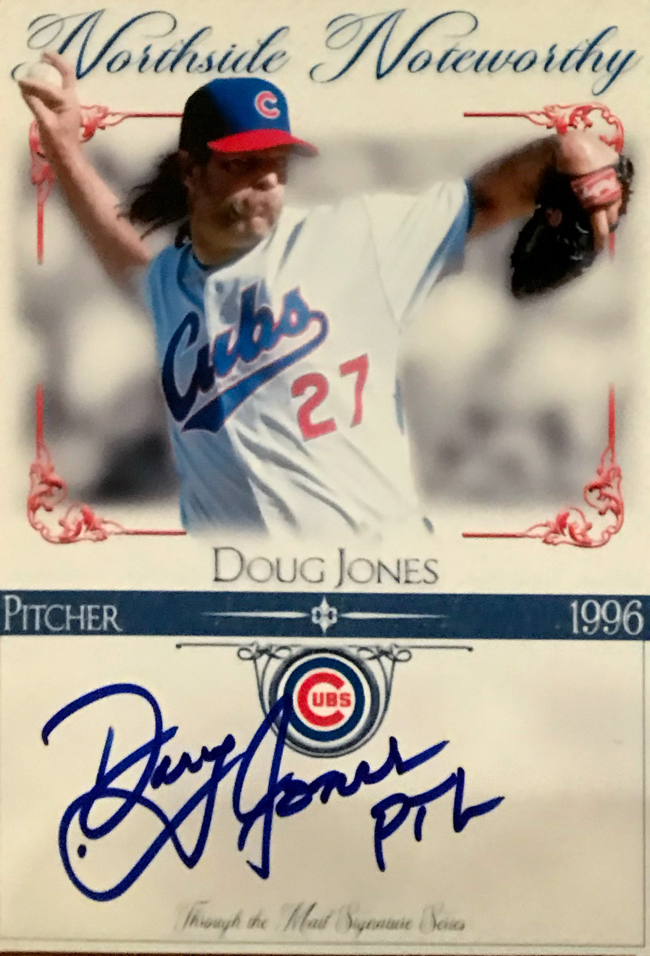
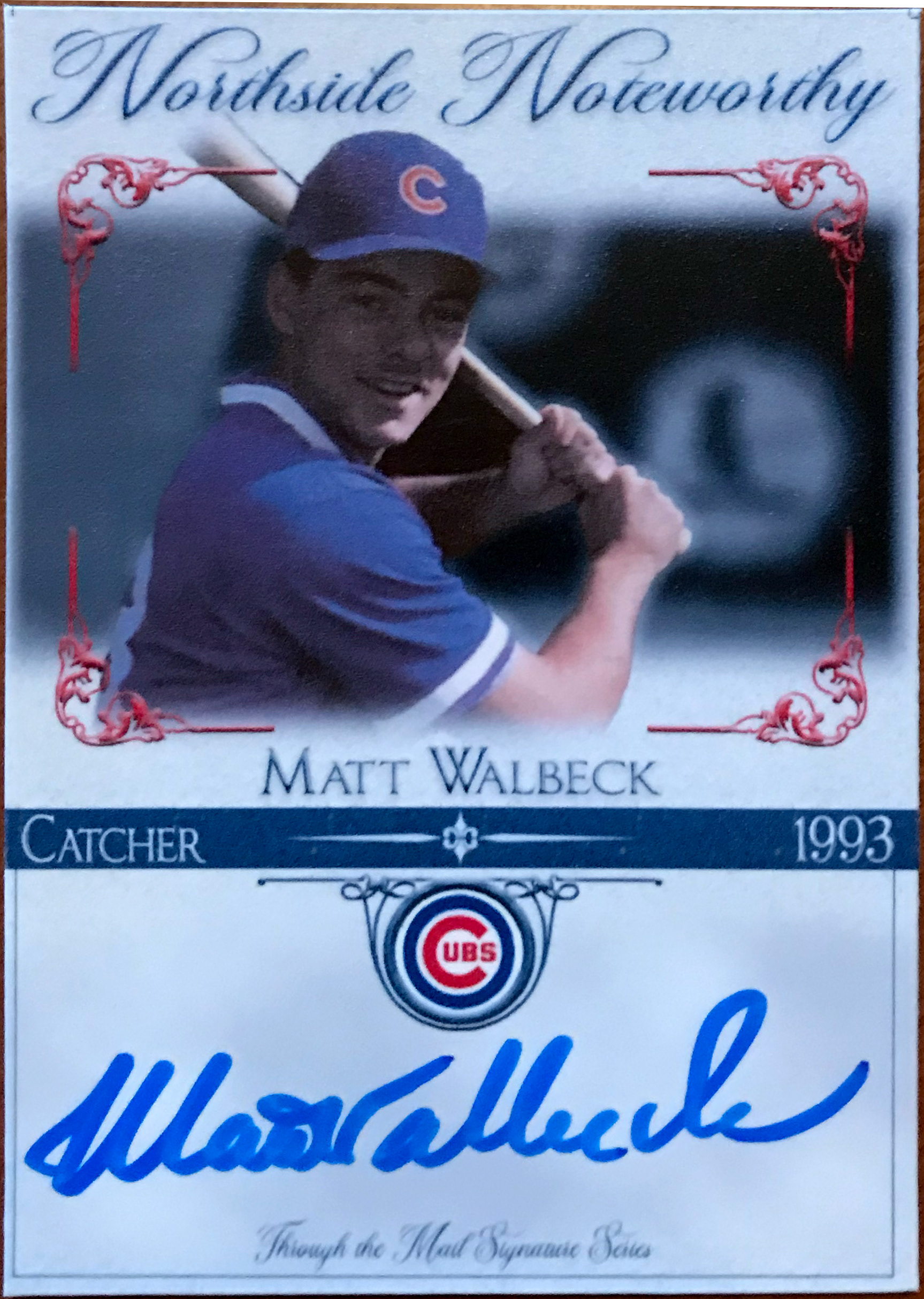
Mid 2025 Version 3 (V. 17.0): Inspired by Topps Tribute, but not necessarily mimicked. I tried to create something clean and classy and love how they turned out. This design will close out the 2010's for my TTM requests... returns have been good so far and the Ryne Sandberg came home two short weeks before his passing.
Mid 2025 Version 4 (V 18.0): Partially inspired by a trip to Wrigley in July of 2025 (and partially inspired by Sandberg's passing) This is a very Wrigley Field inspired design with the divider and font being the same as you'd see in the stadium. I also used the Wrigley Field green color for the background. The backs are pulled off of one of the Topps mail-in sets from the 1980's. I LOVE how these turned out. I'm going to send a few out to some older players I've missed as well as some newer players as well. I think the design plays well with the new influx of alternate jerseys the team has been wearing.
Old School (2011) & 2013 Version (V..5):

2015 Version (V.1):

2017 Version (V.2.0)
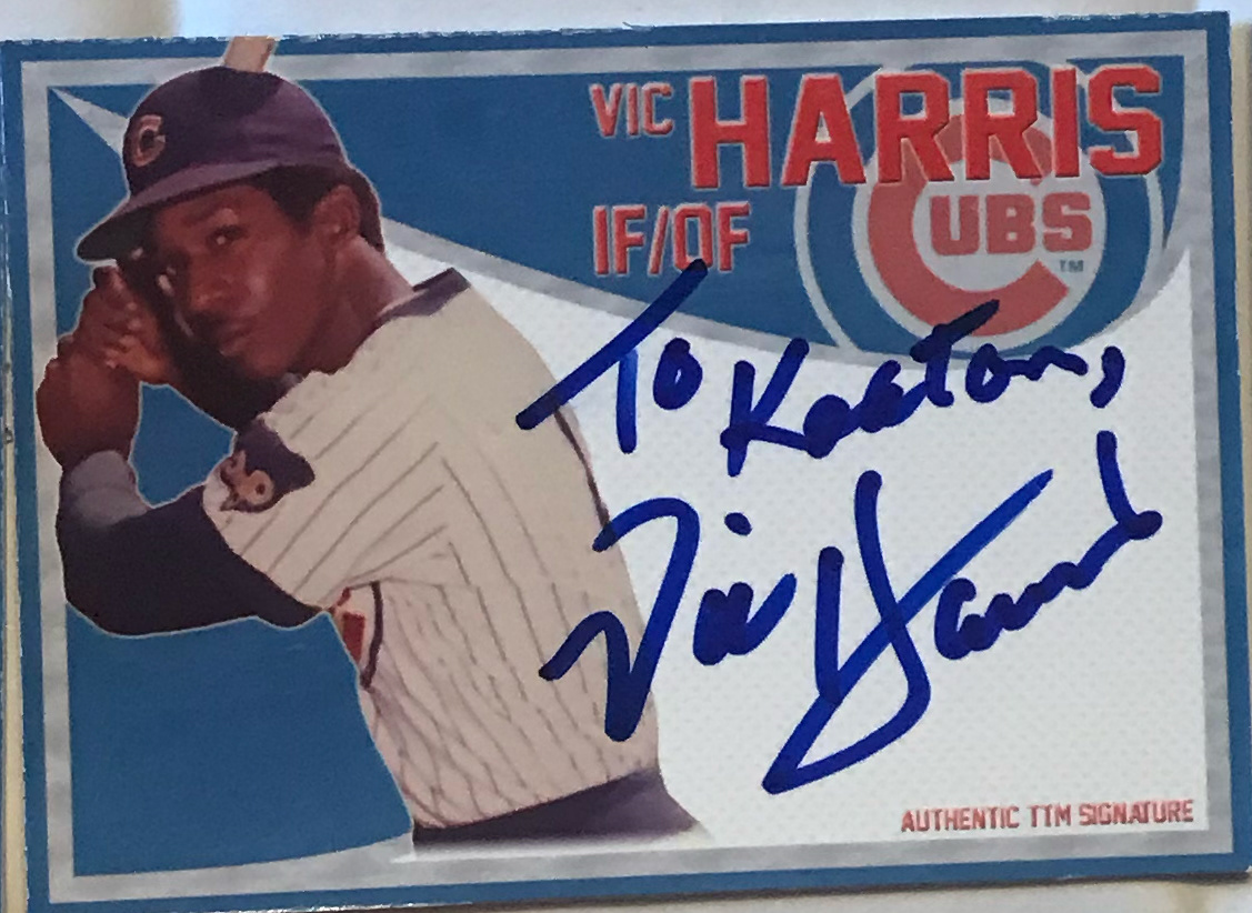
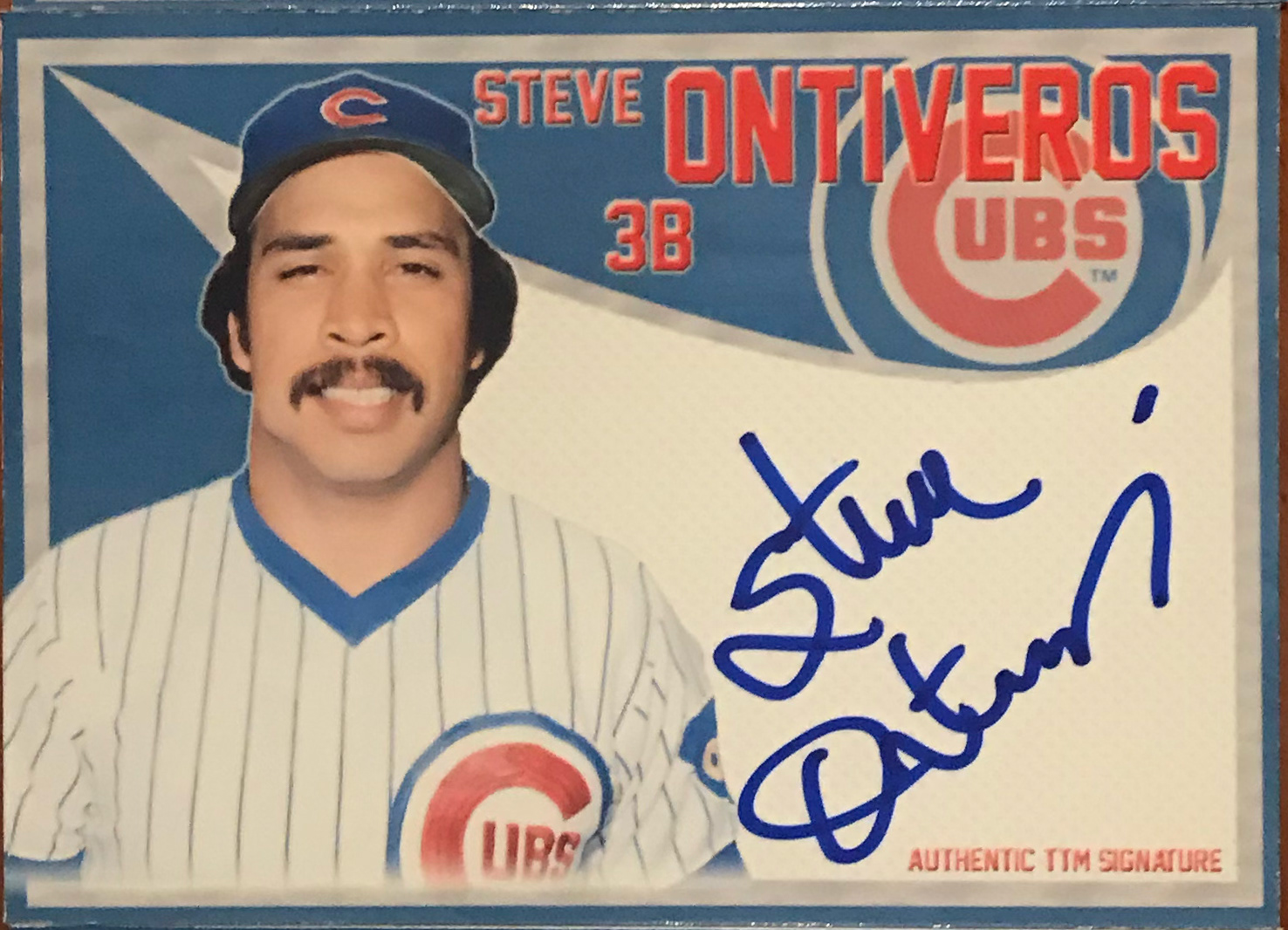
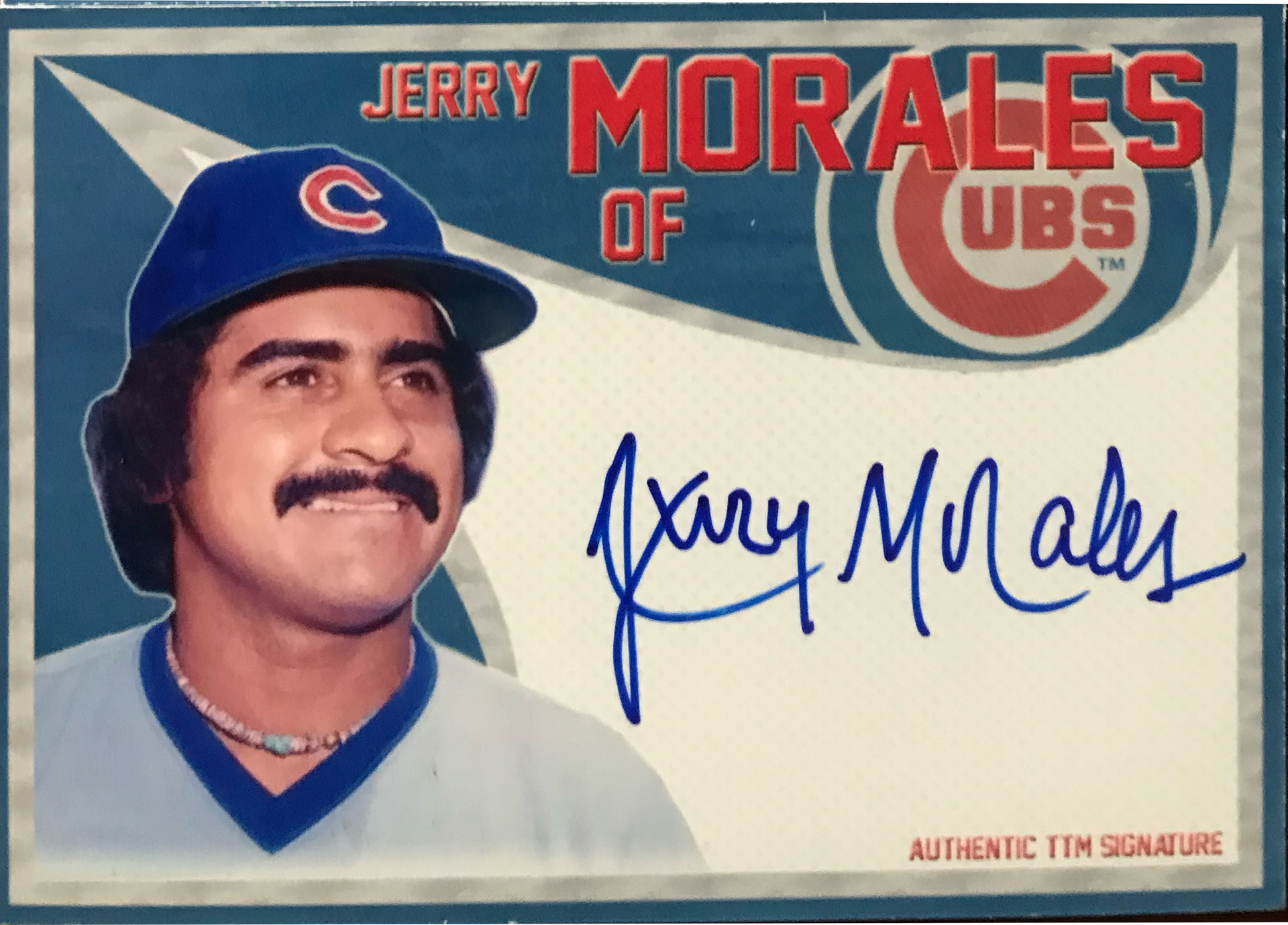
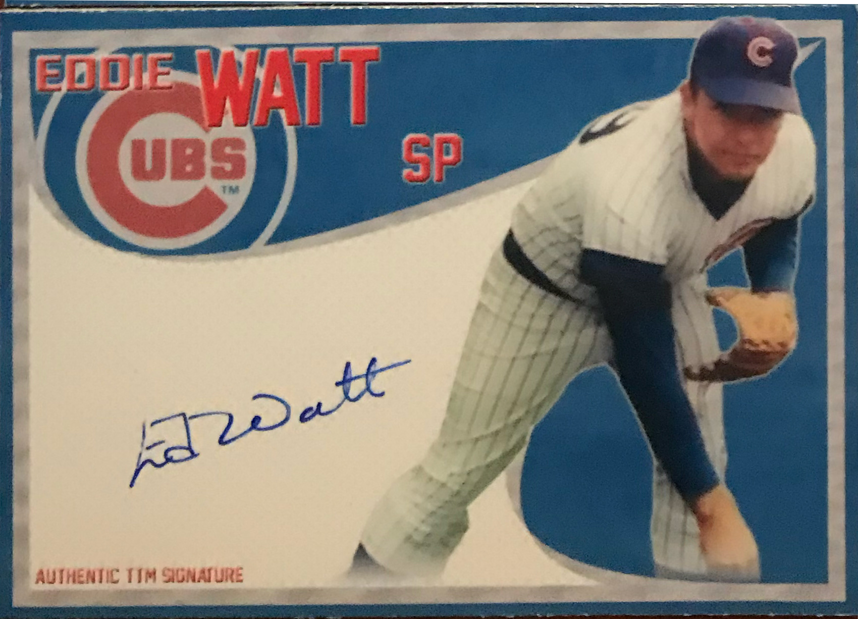
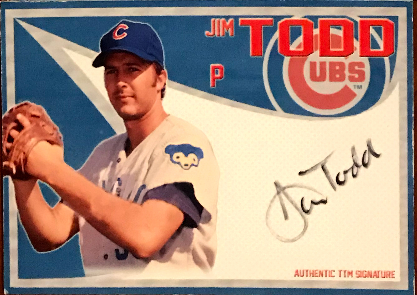
2018 Version (V.3.0)
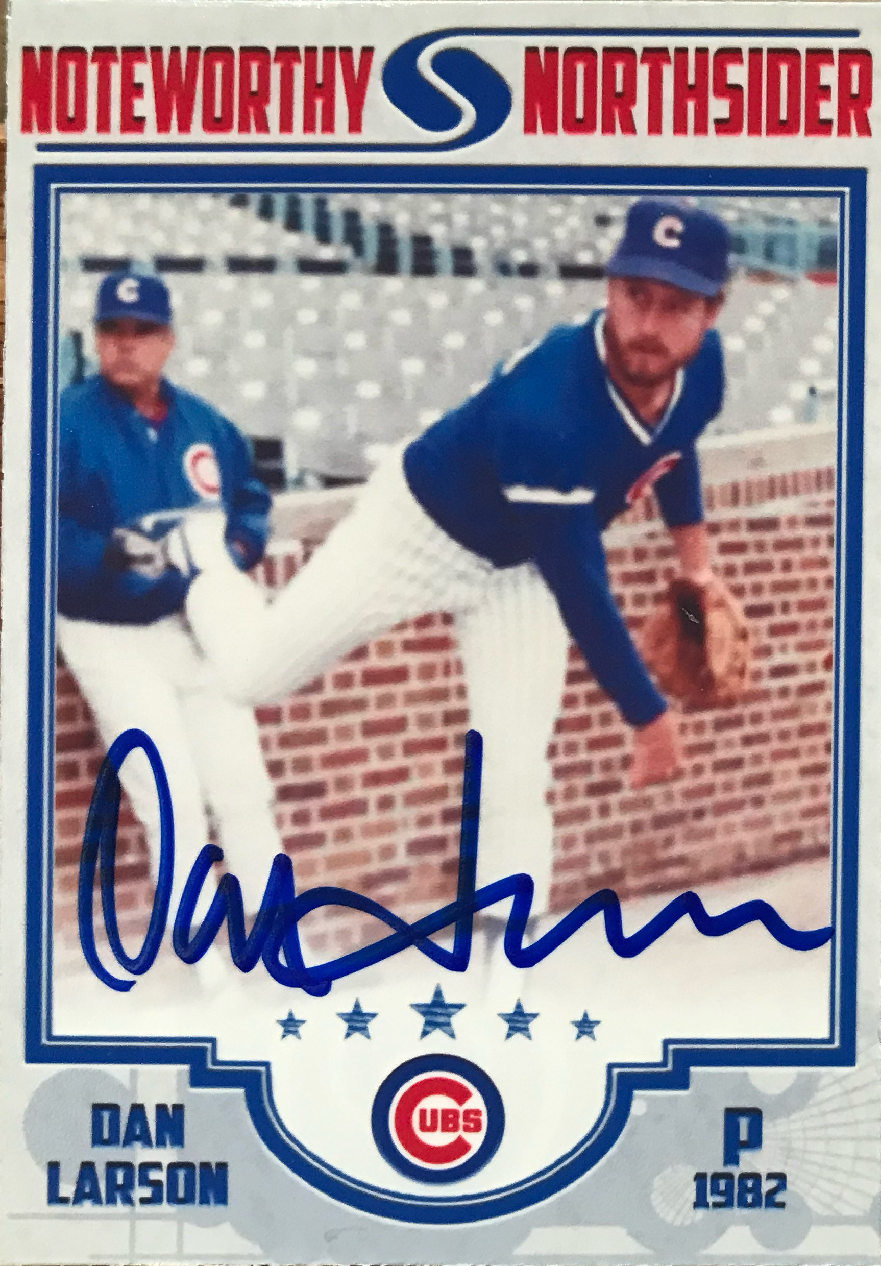
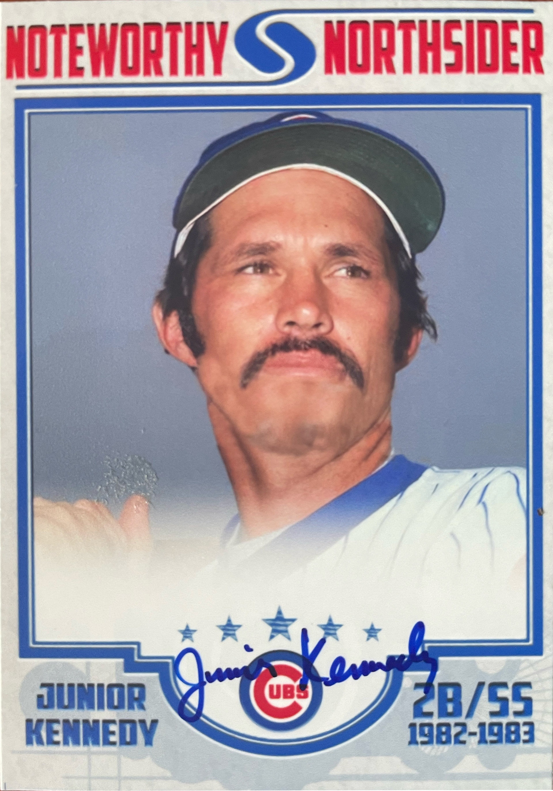

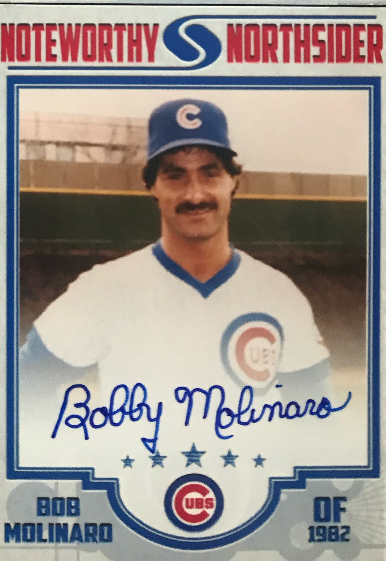

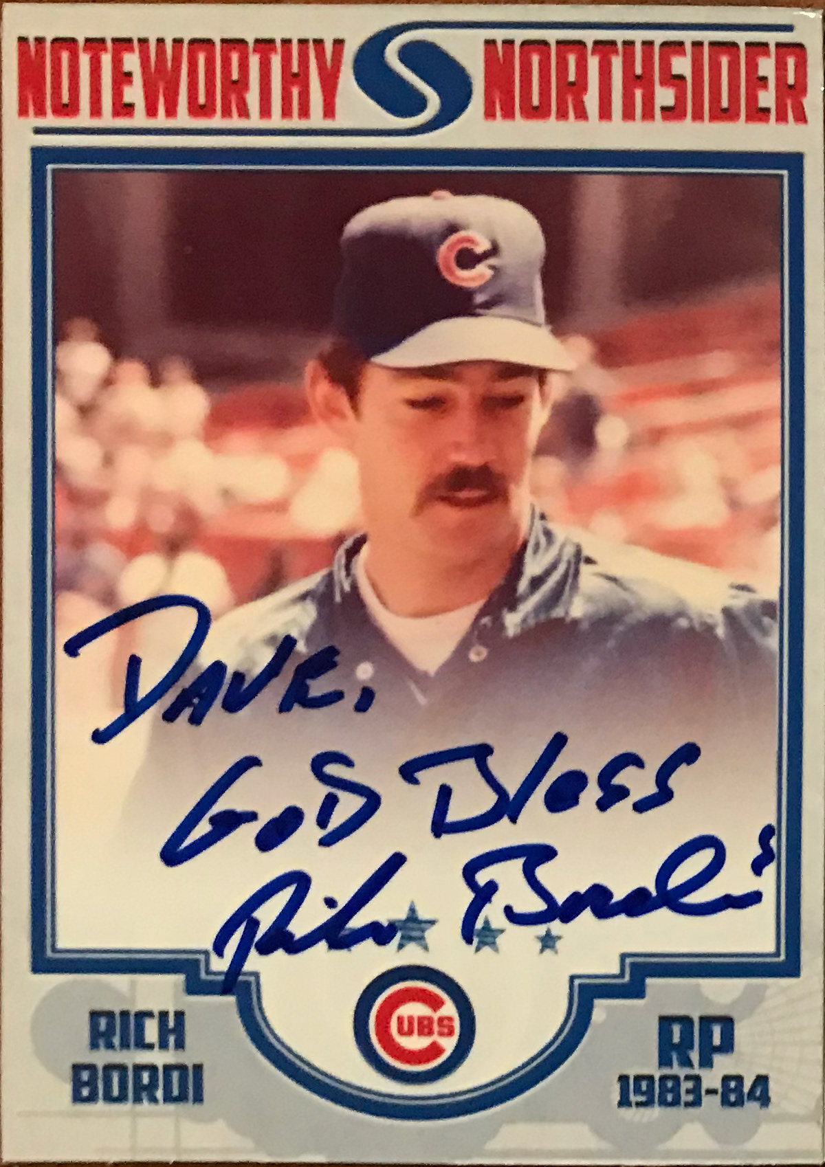
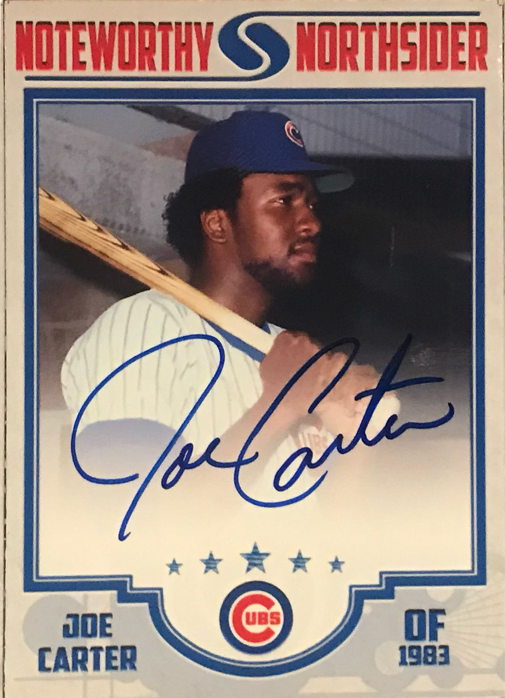
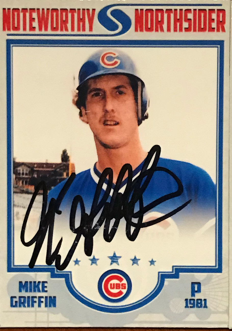
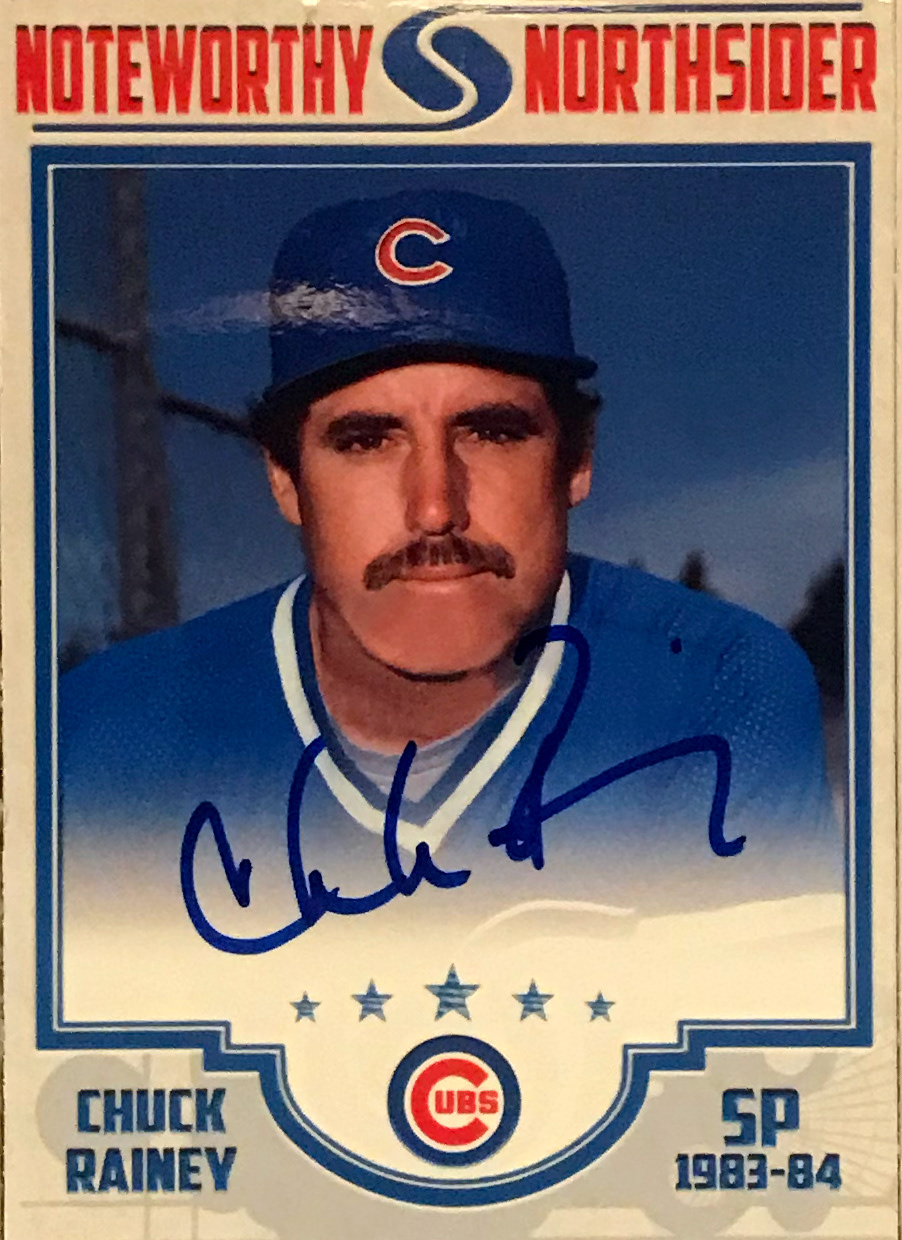
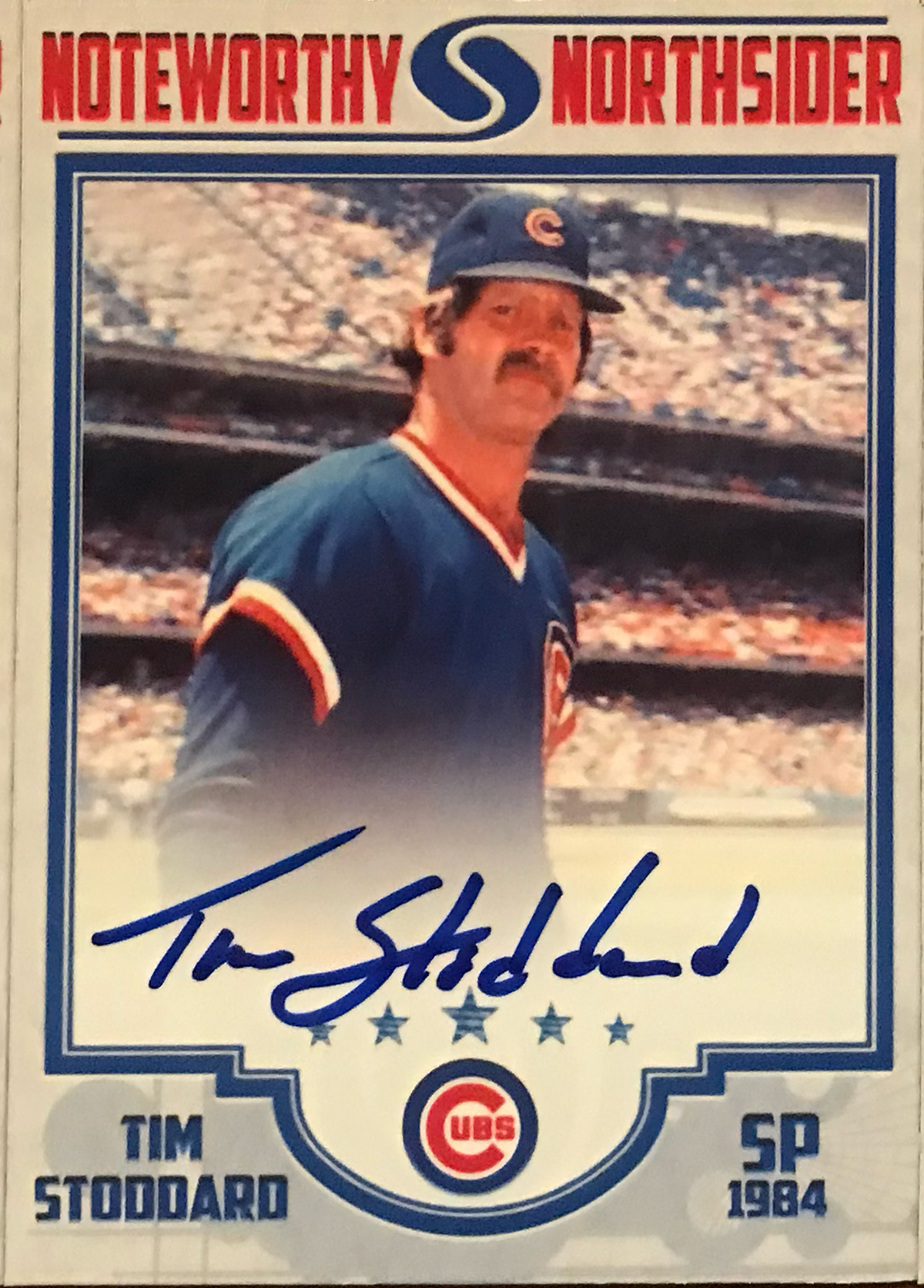
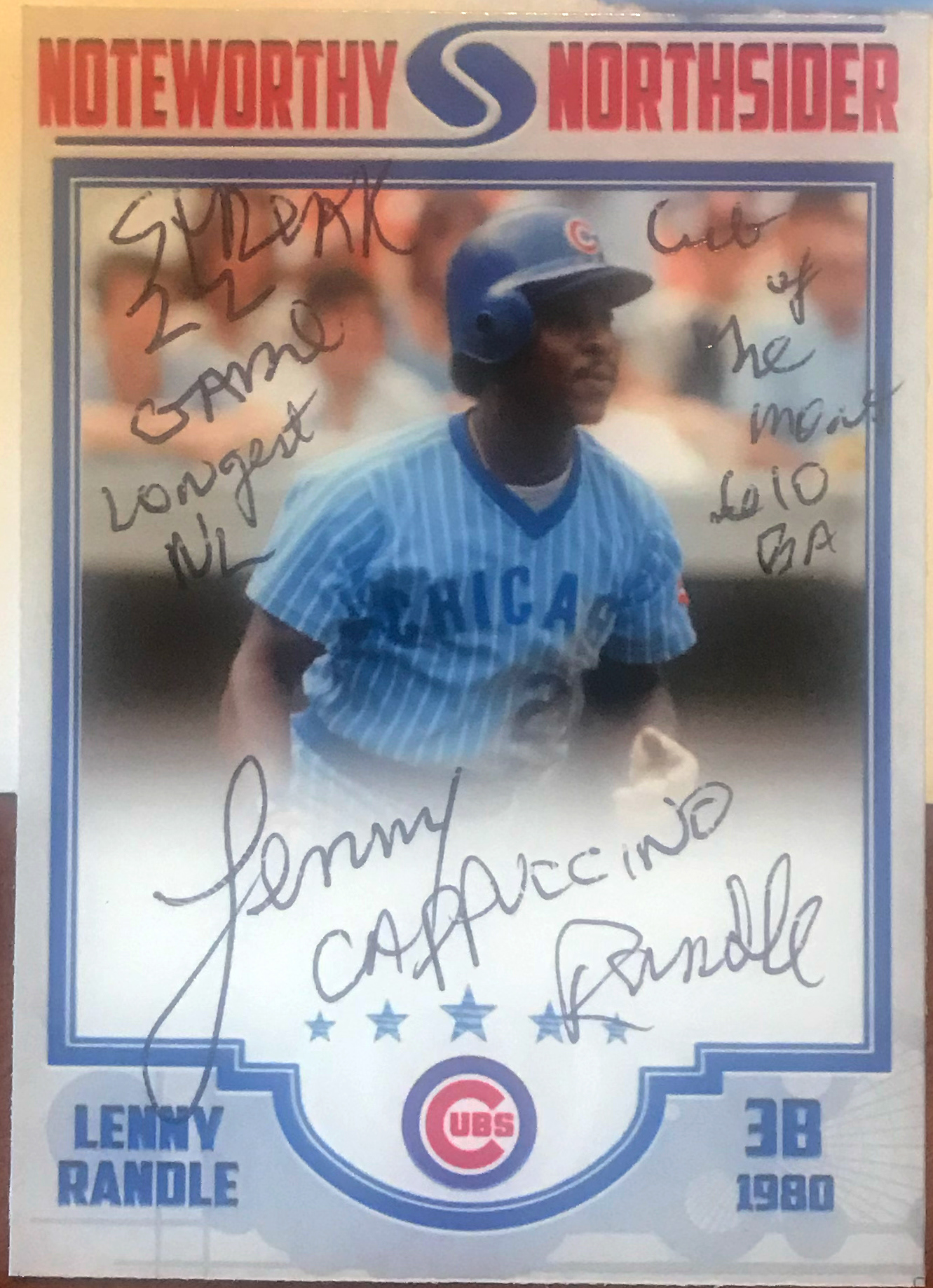
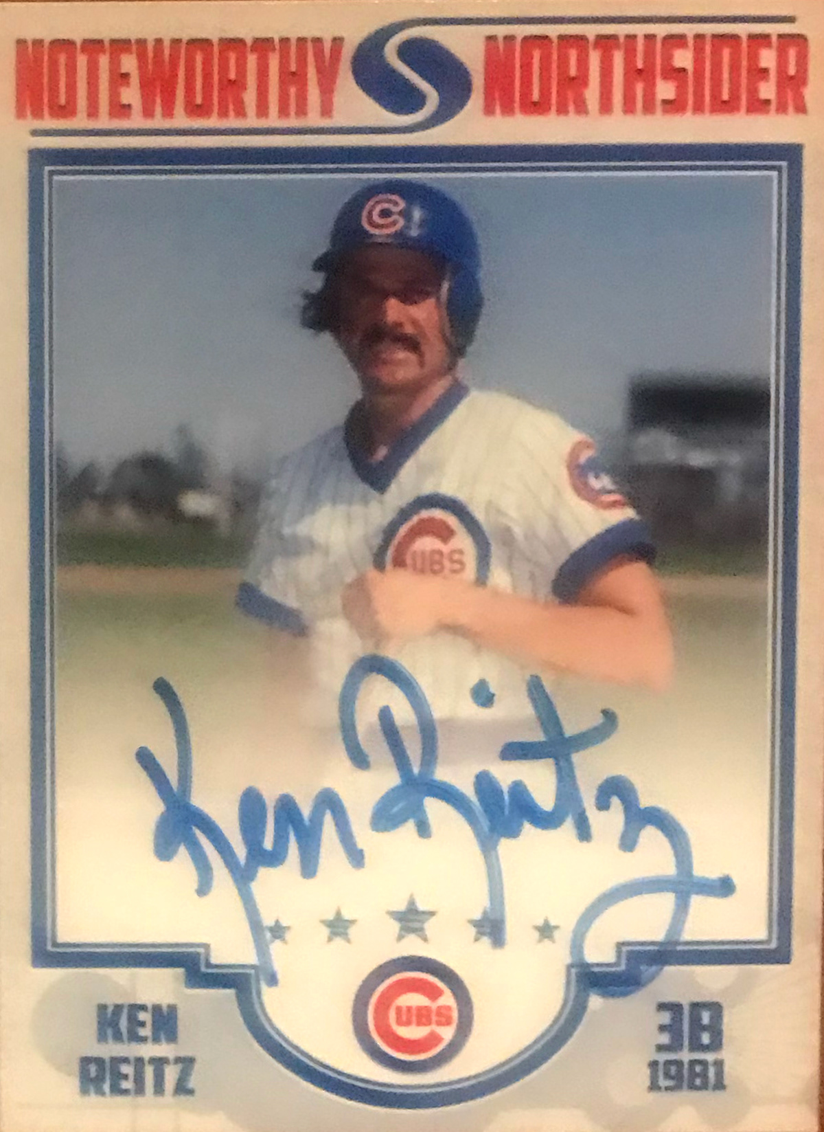
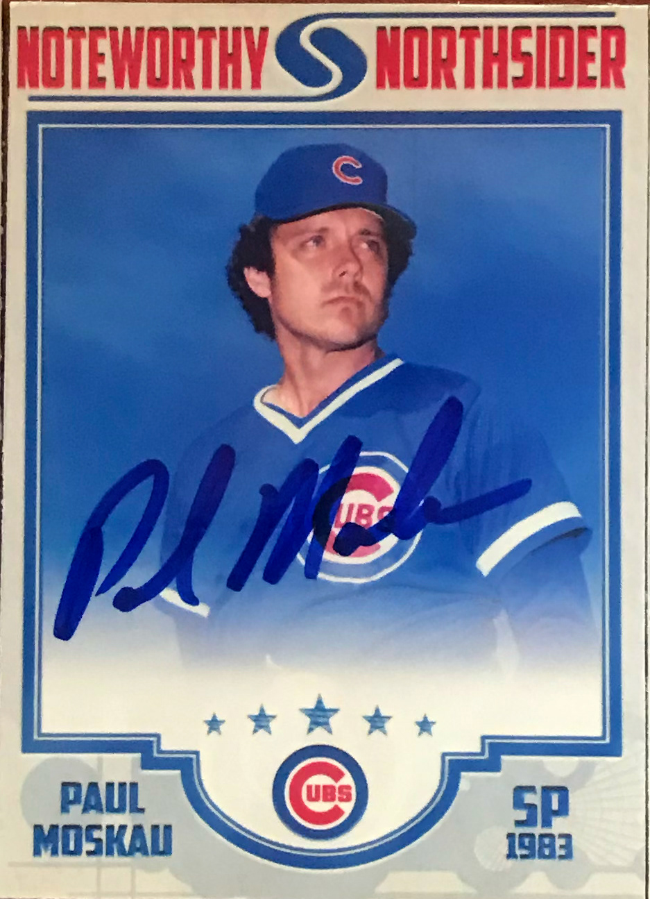
2019 Version (V.4.0)



2020 Version (V.5.0)


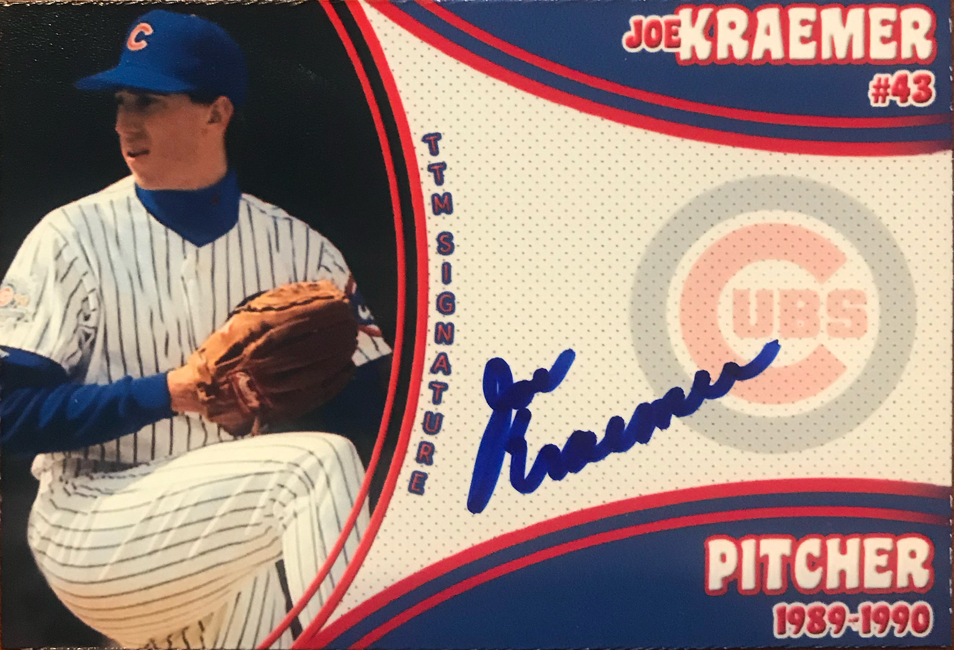
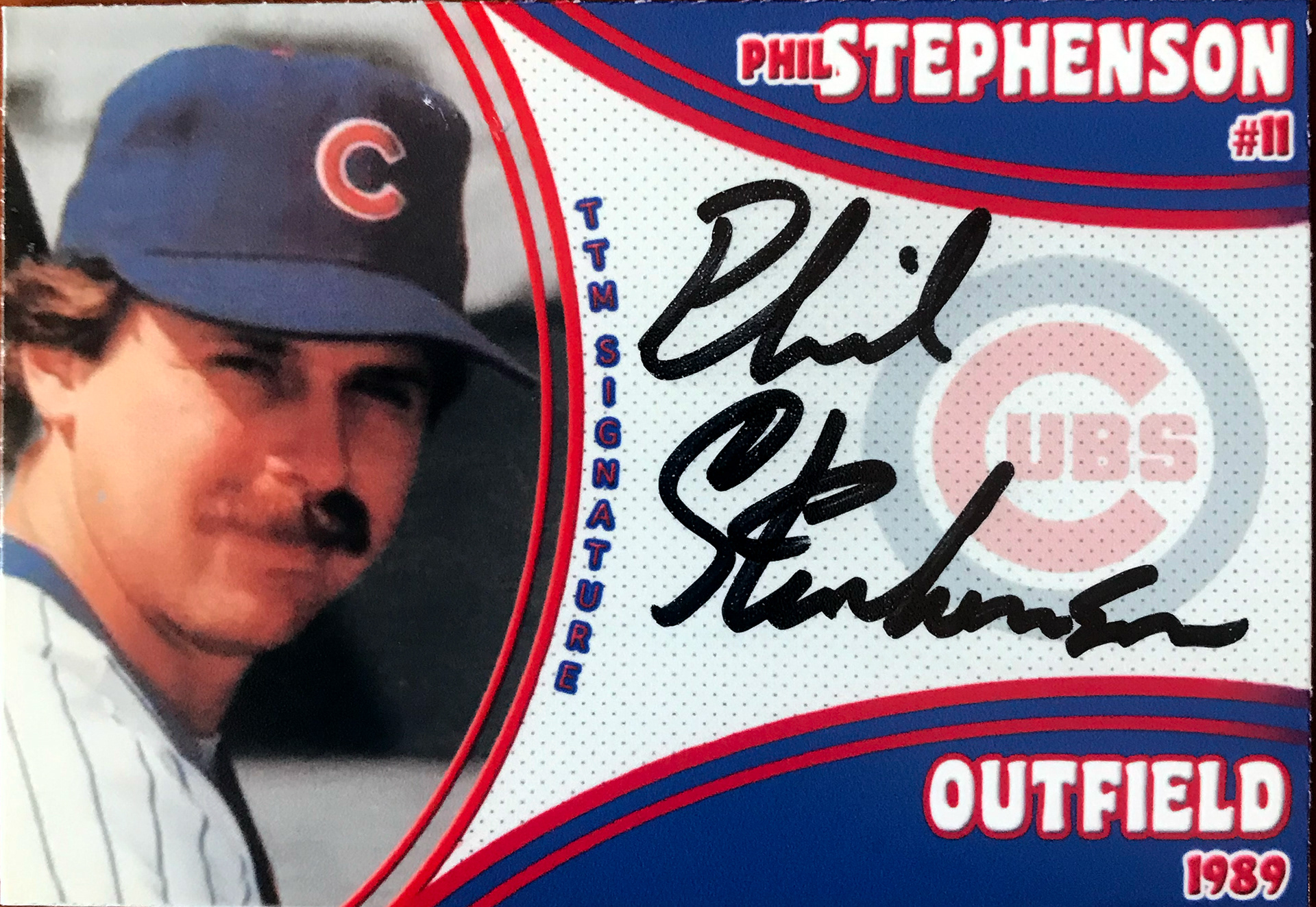
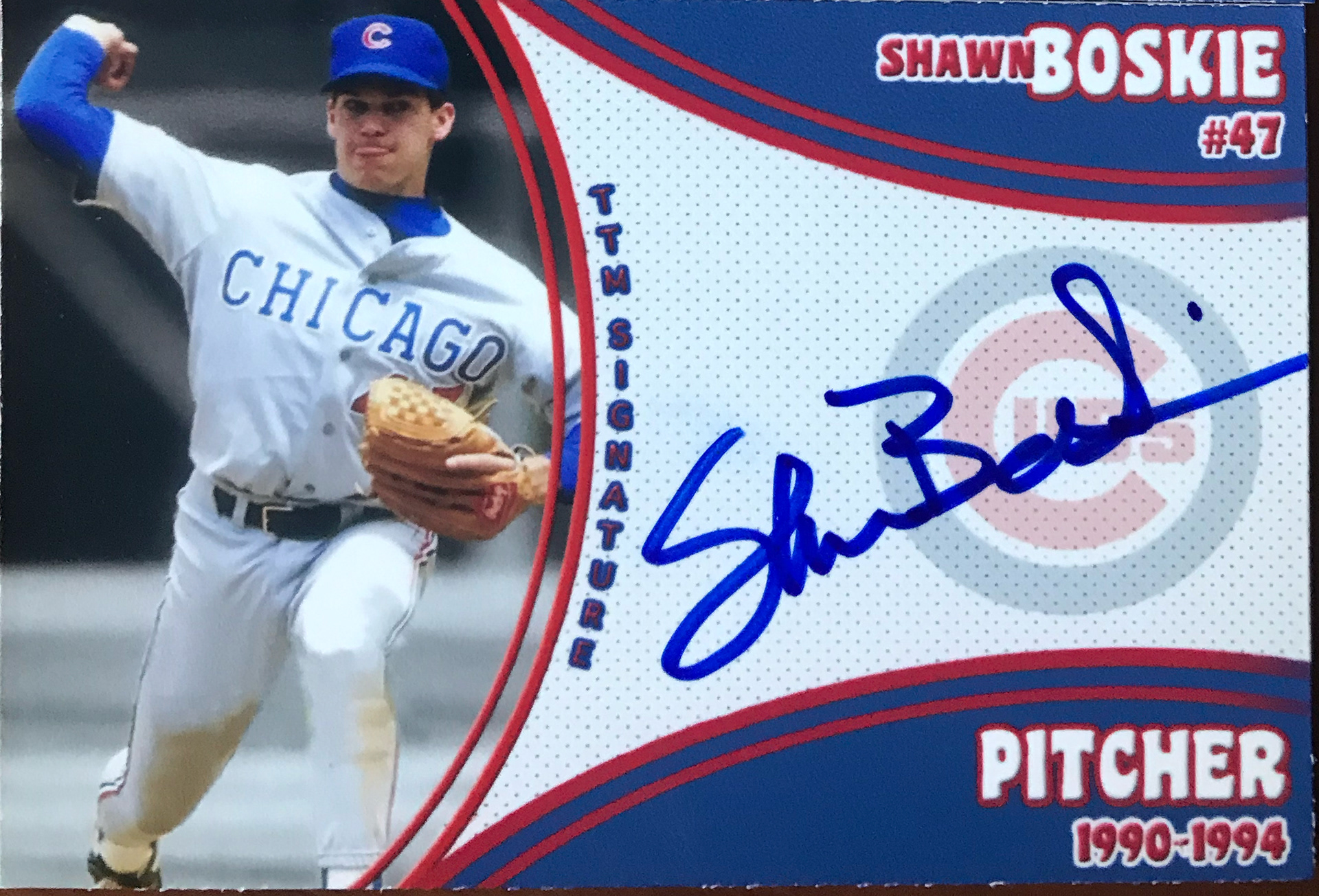
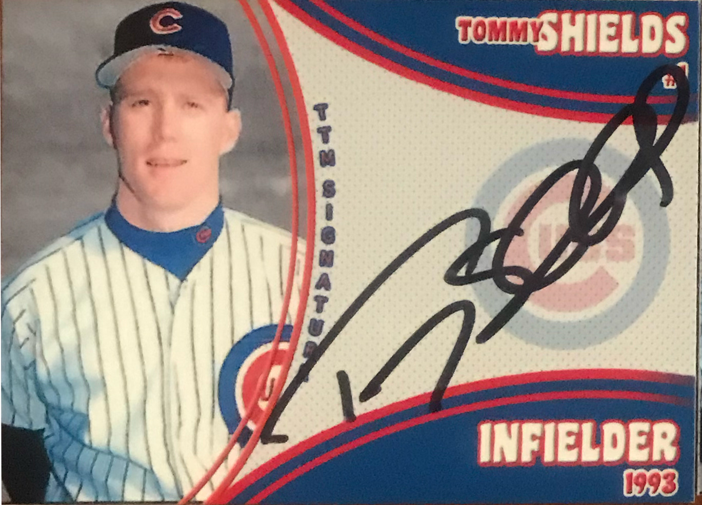
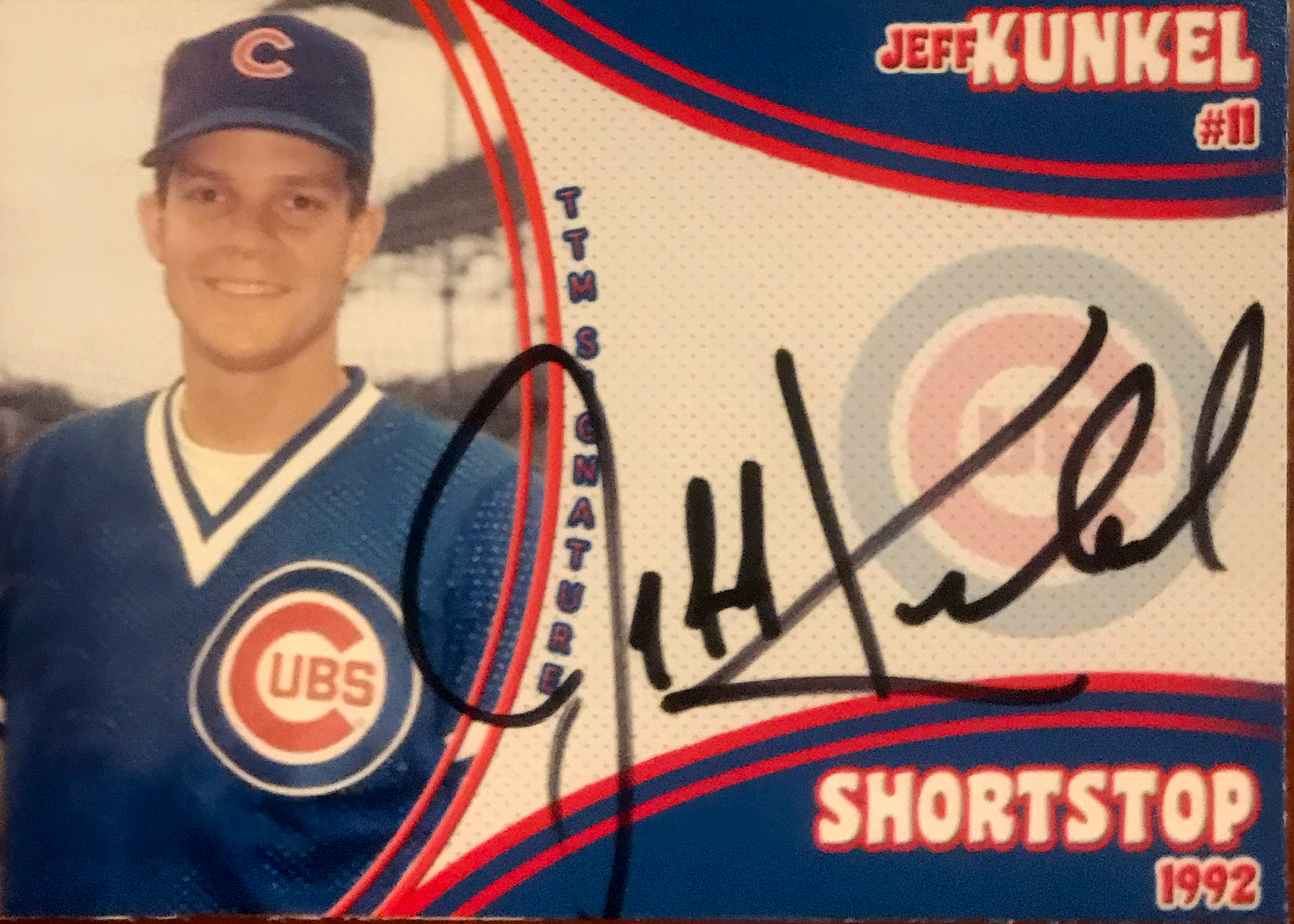
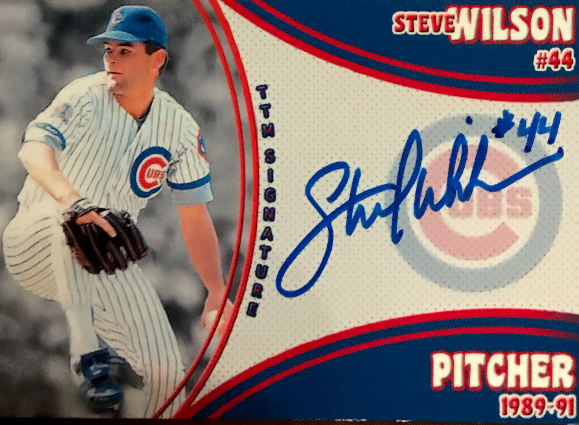
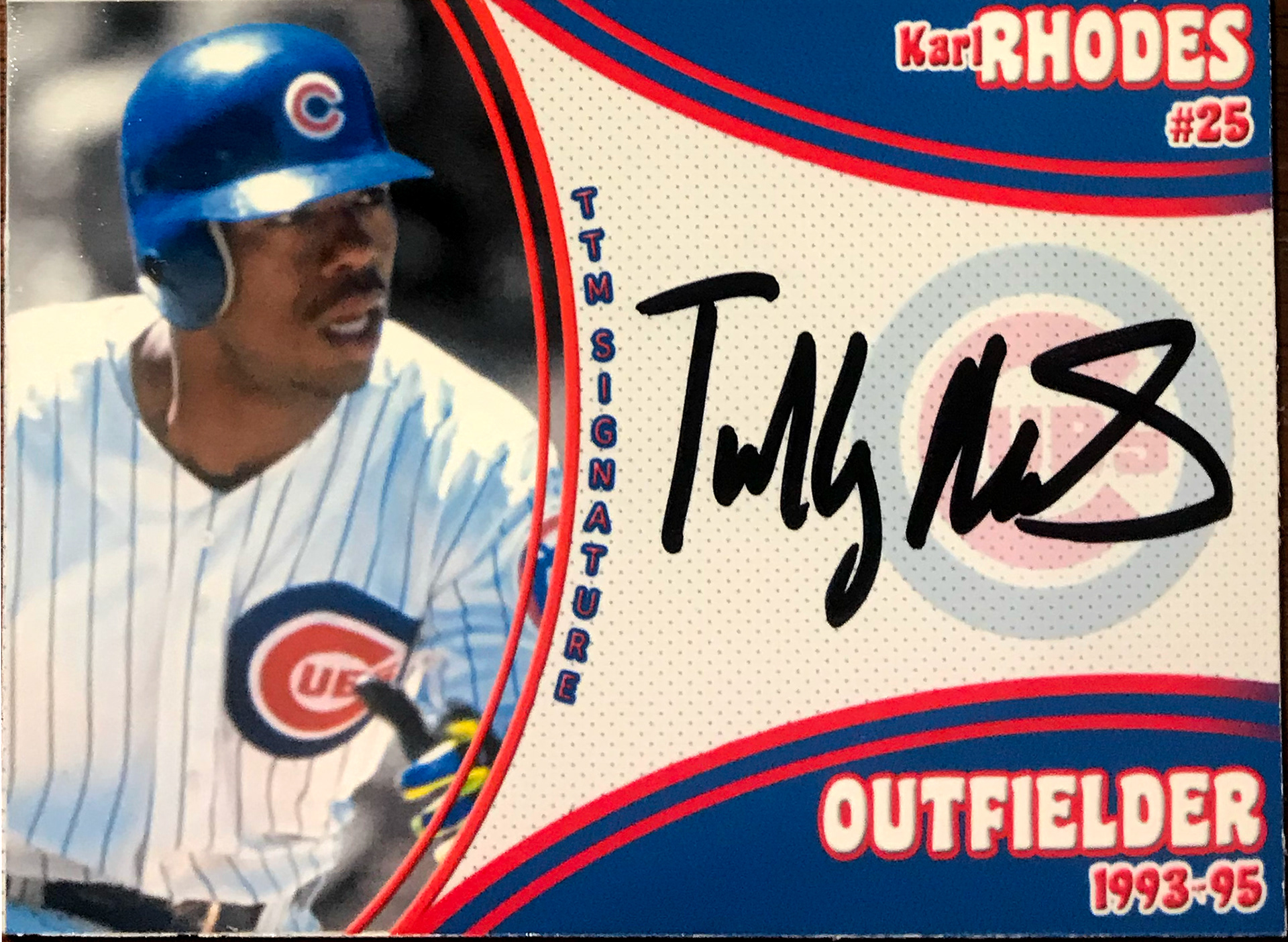
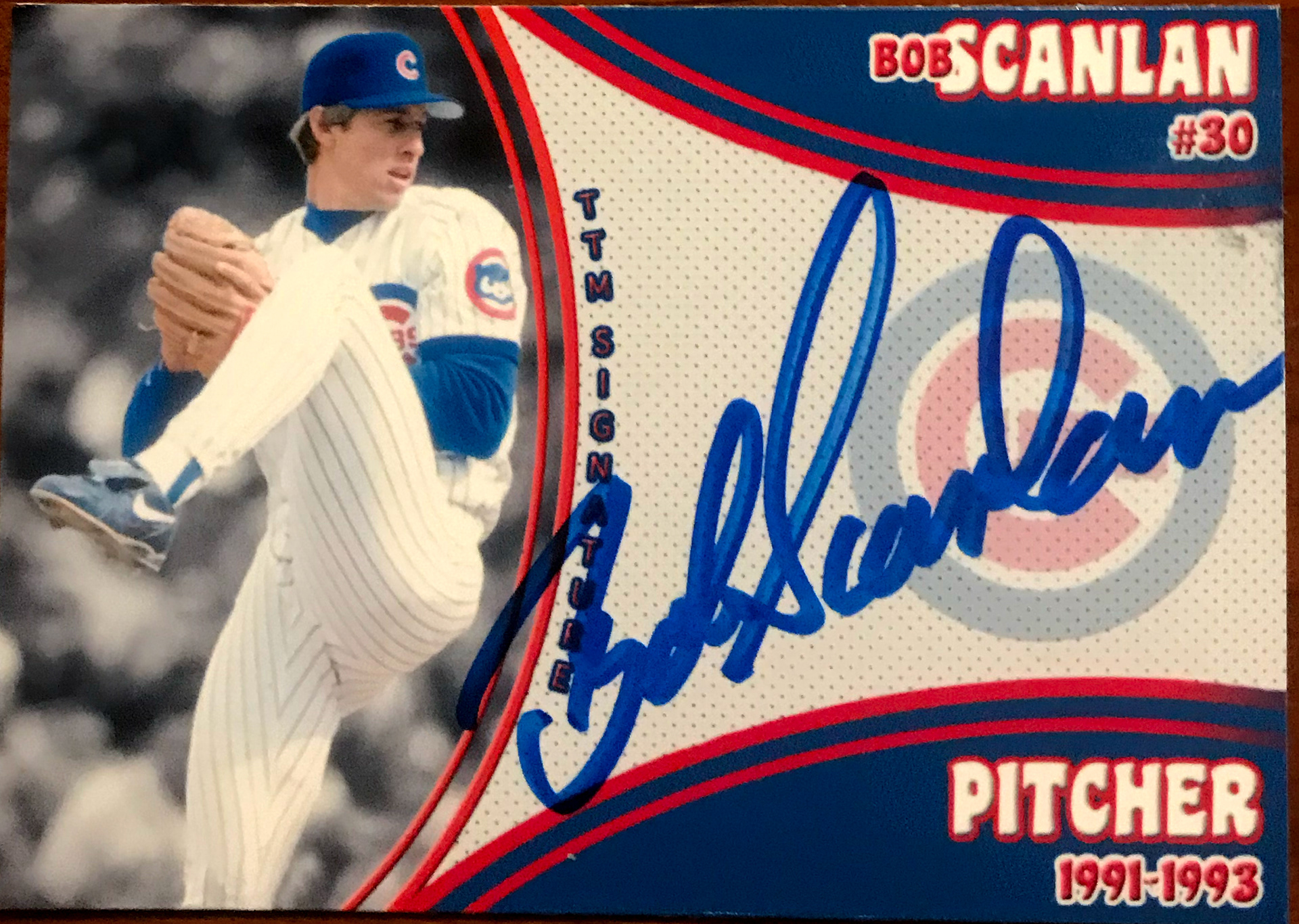
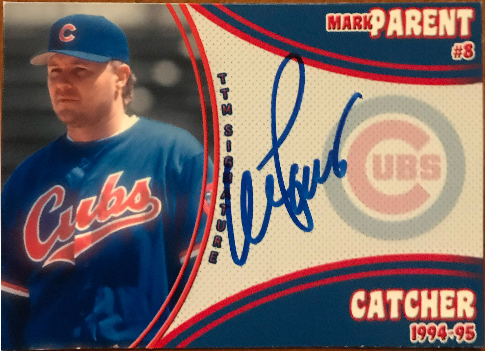

Early 2021 Version (V.6.0)
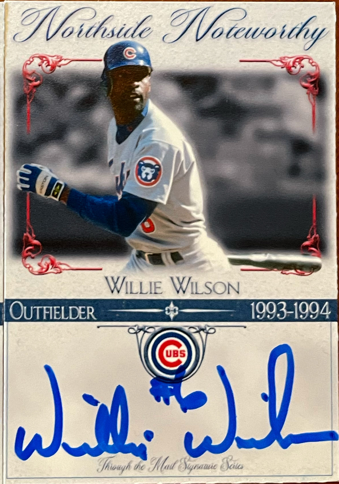


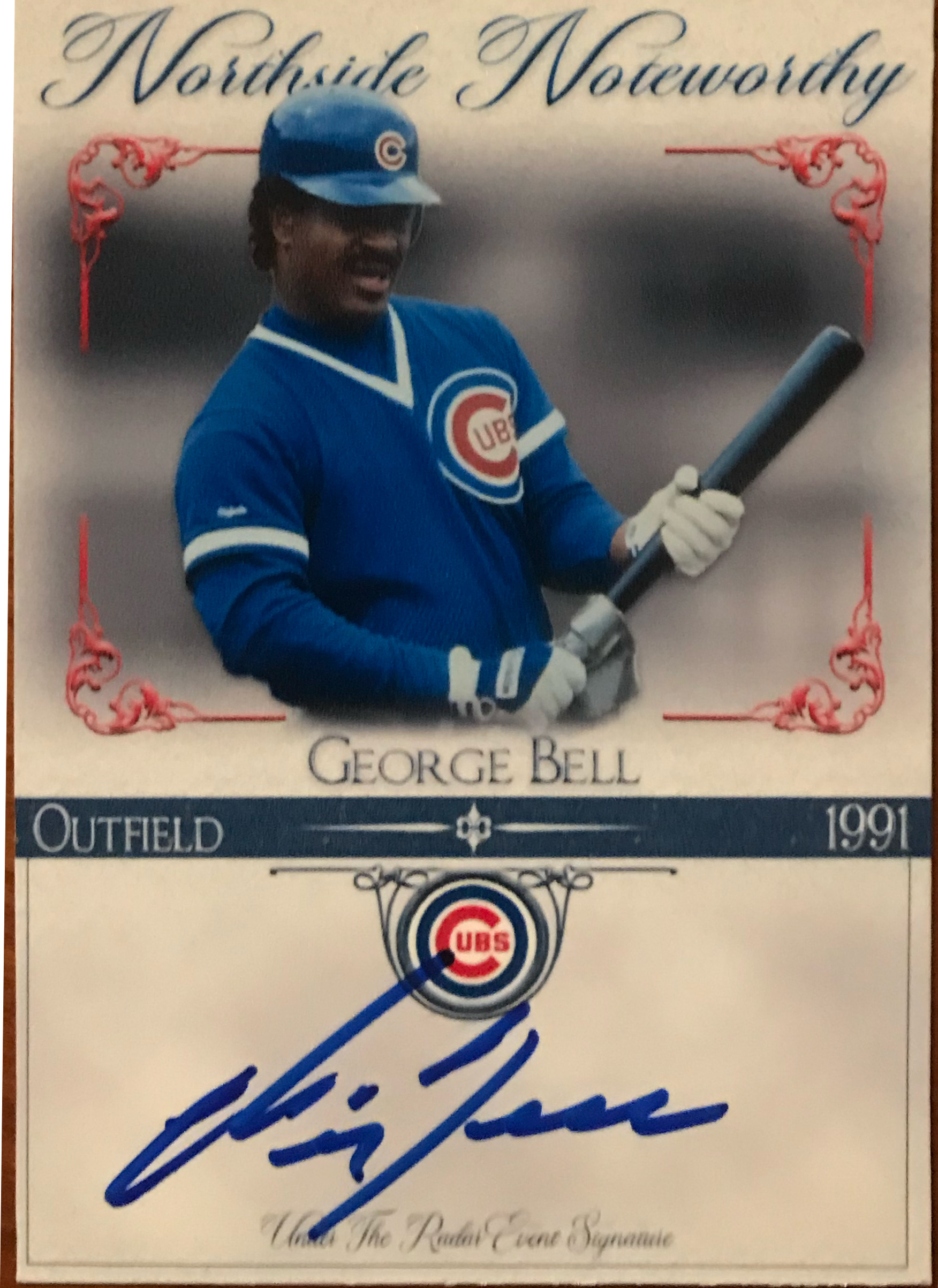


Late 2021 Version (V.7.0)
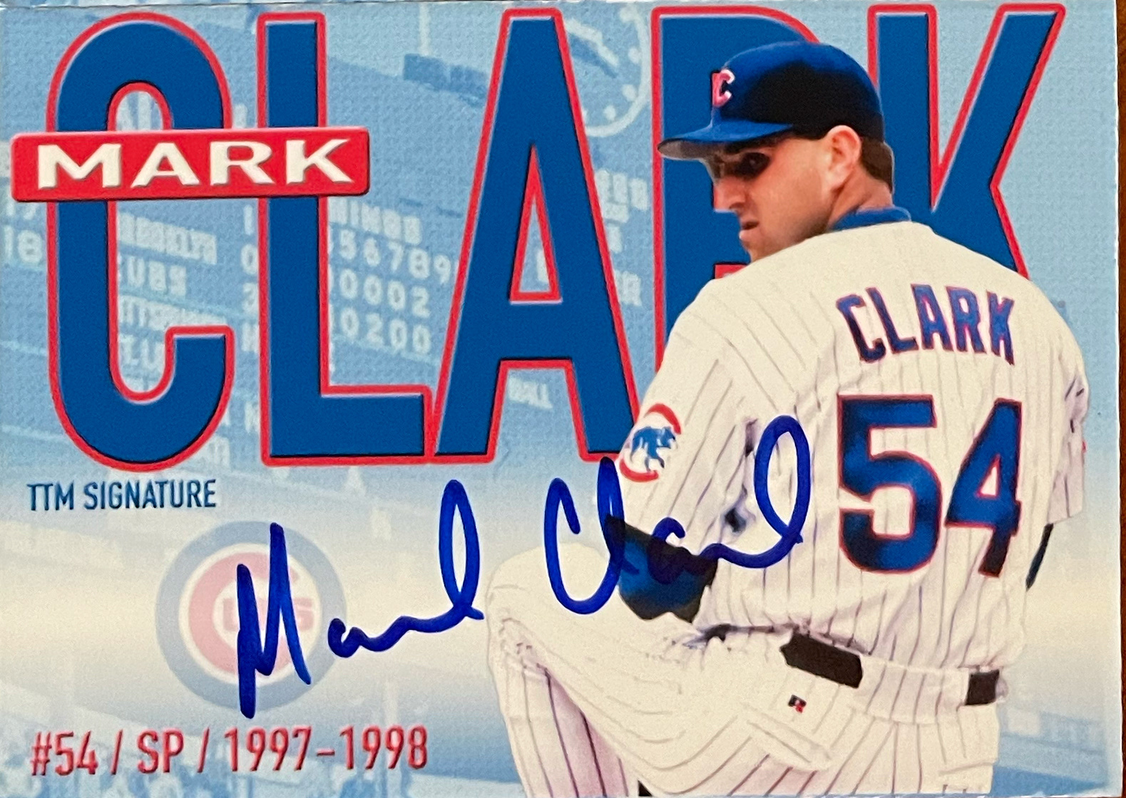
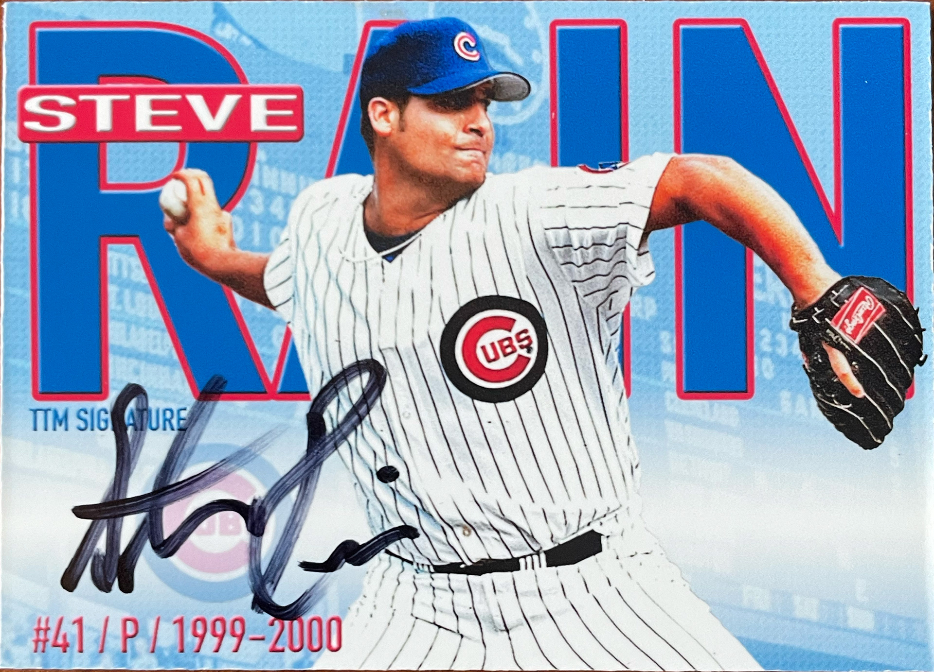
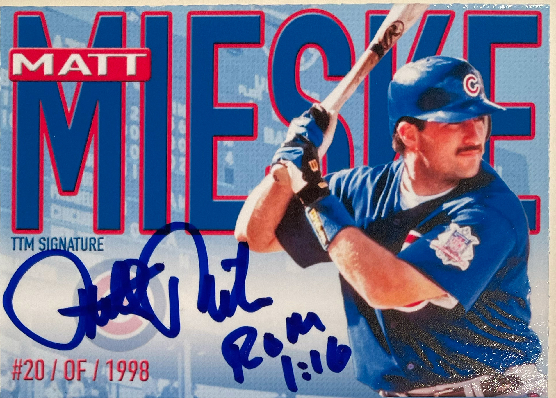
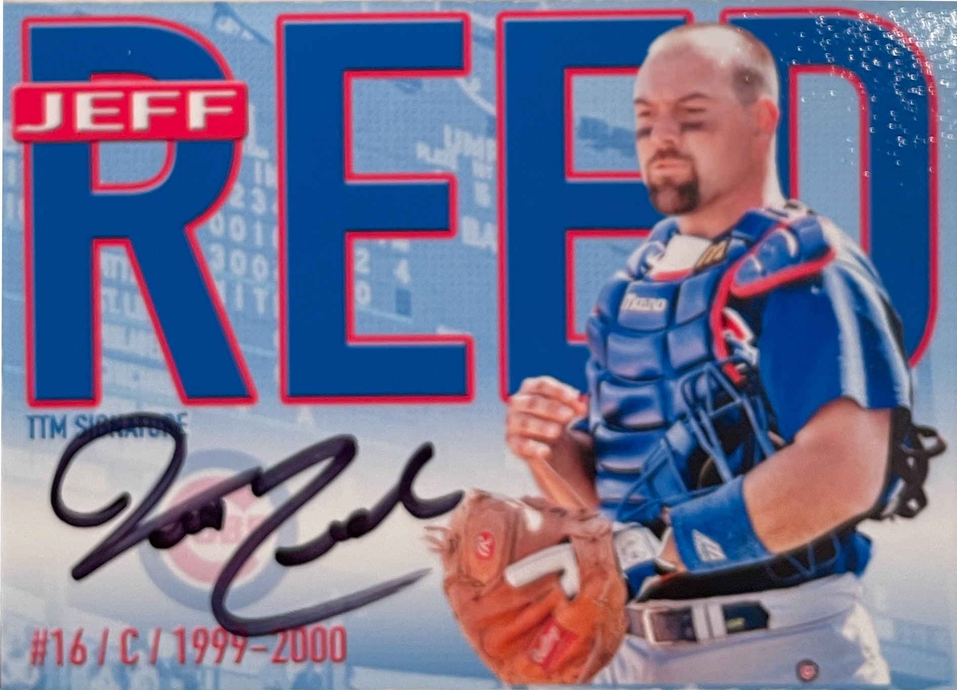


Early 2022 Version (V.8.0)




Early 2023 Version (V.9.0)


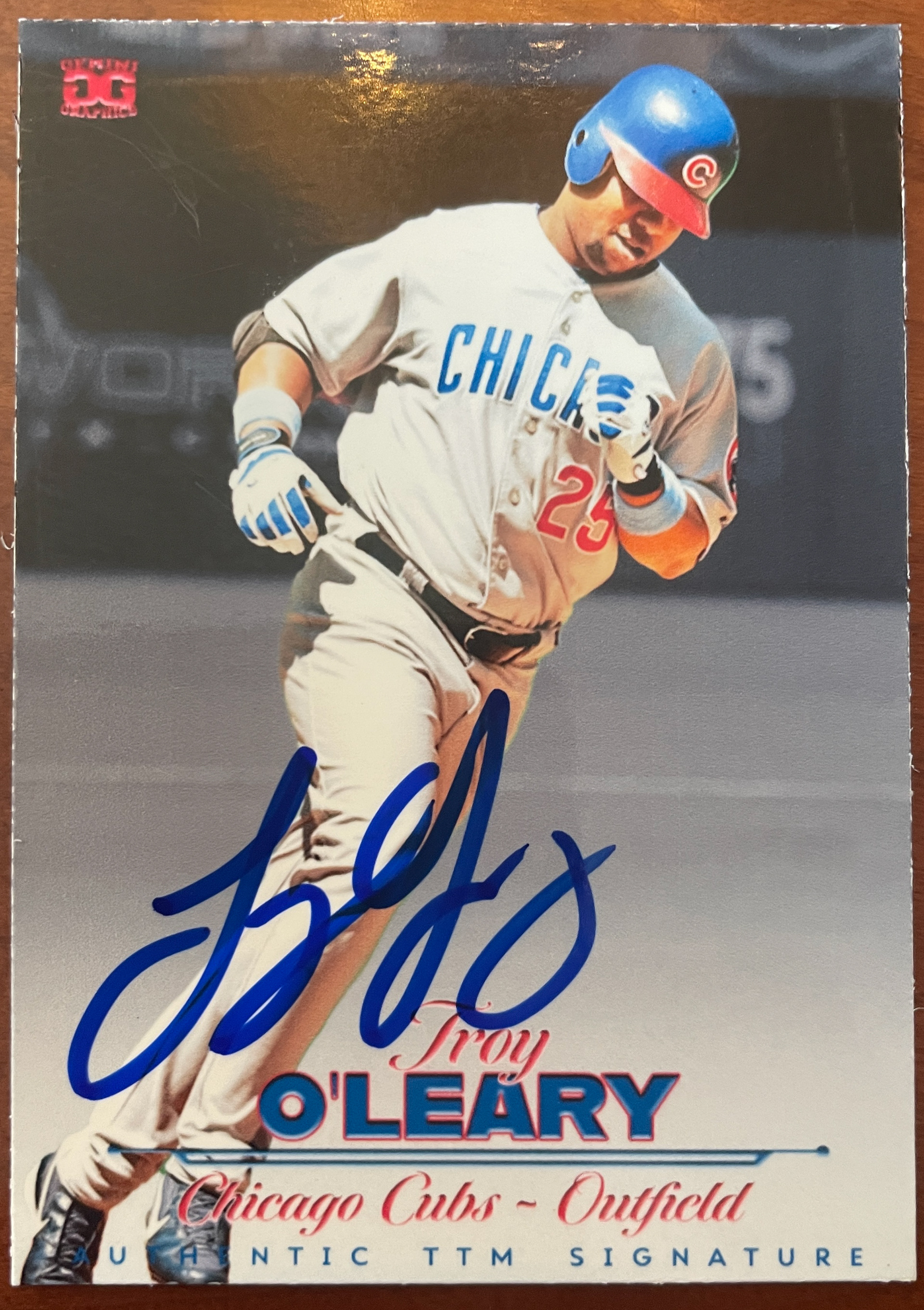
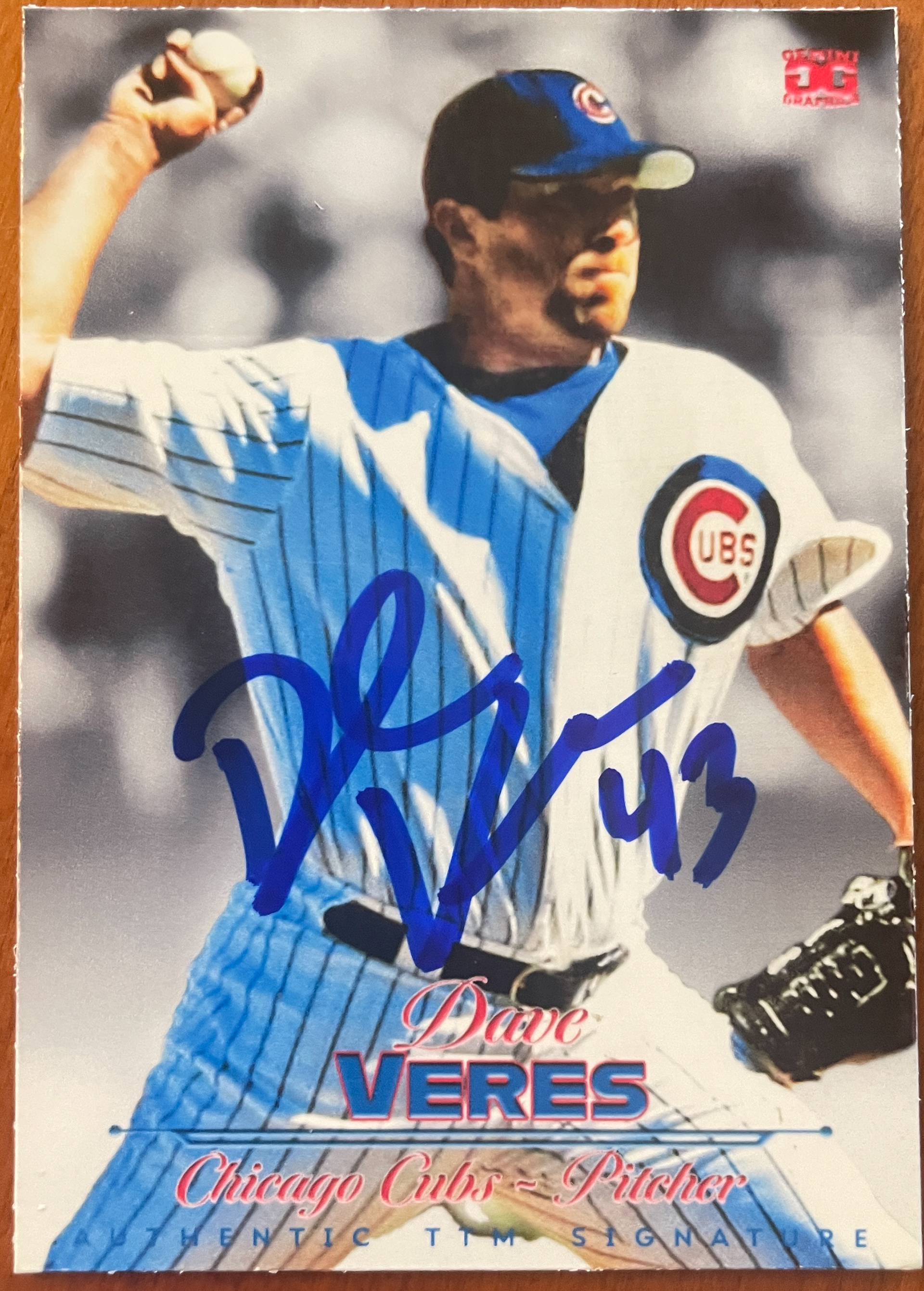

Mid 2023 Version (V.X)


Late 2023 Version (V.X1)


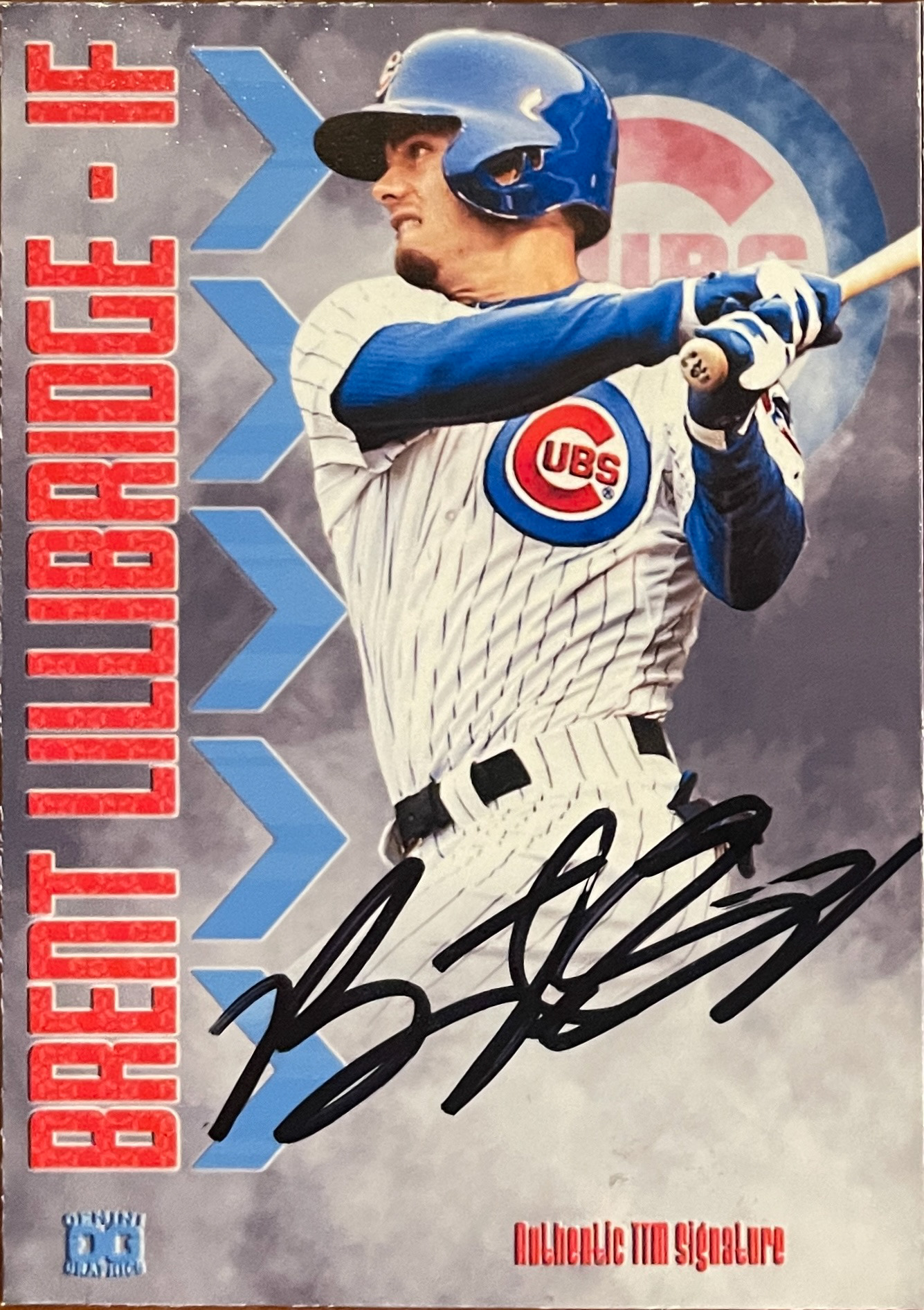
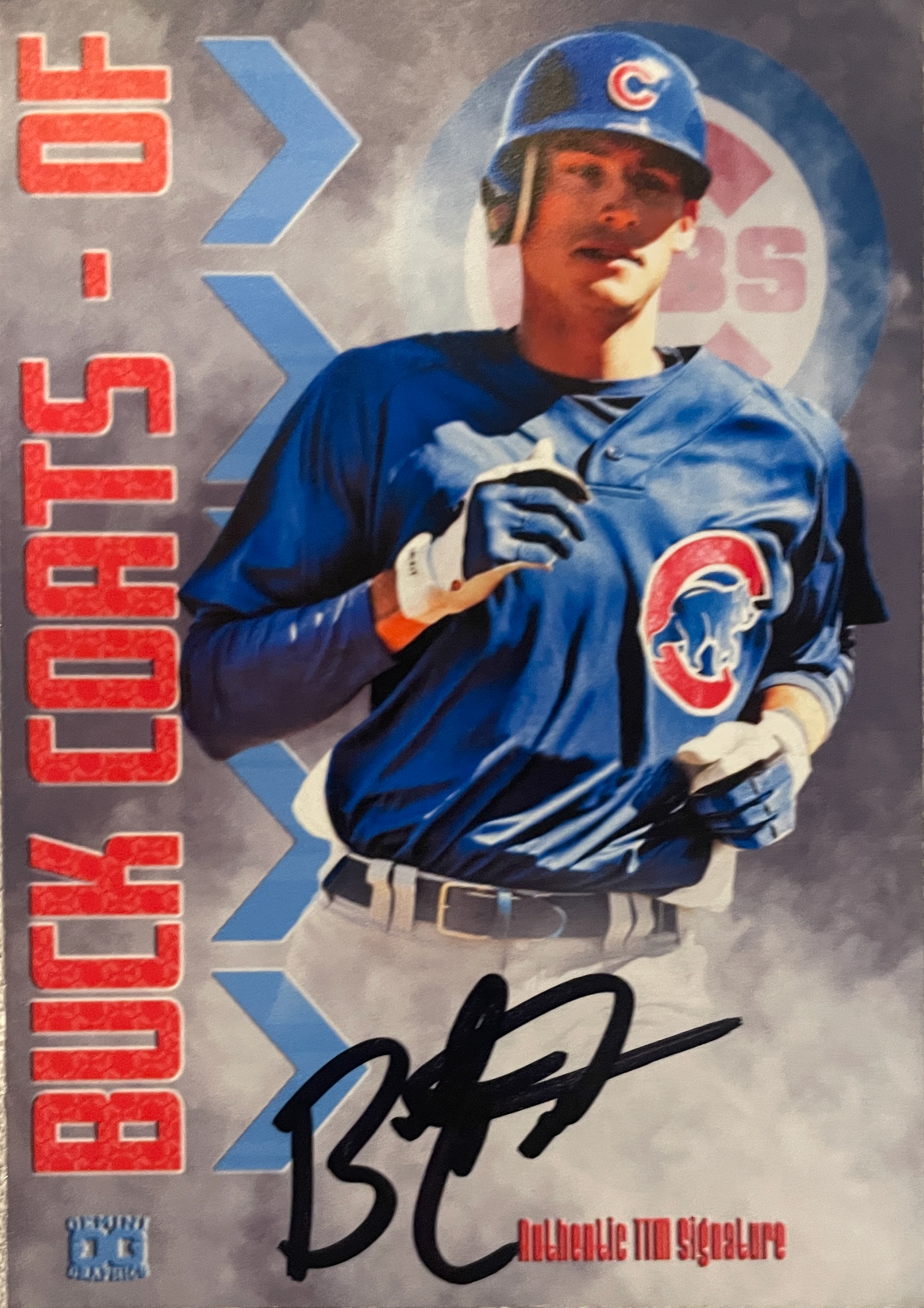
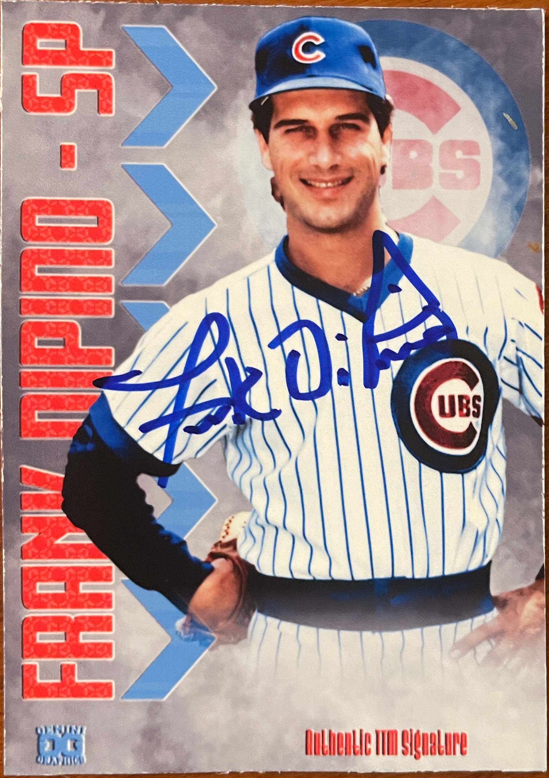
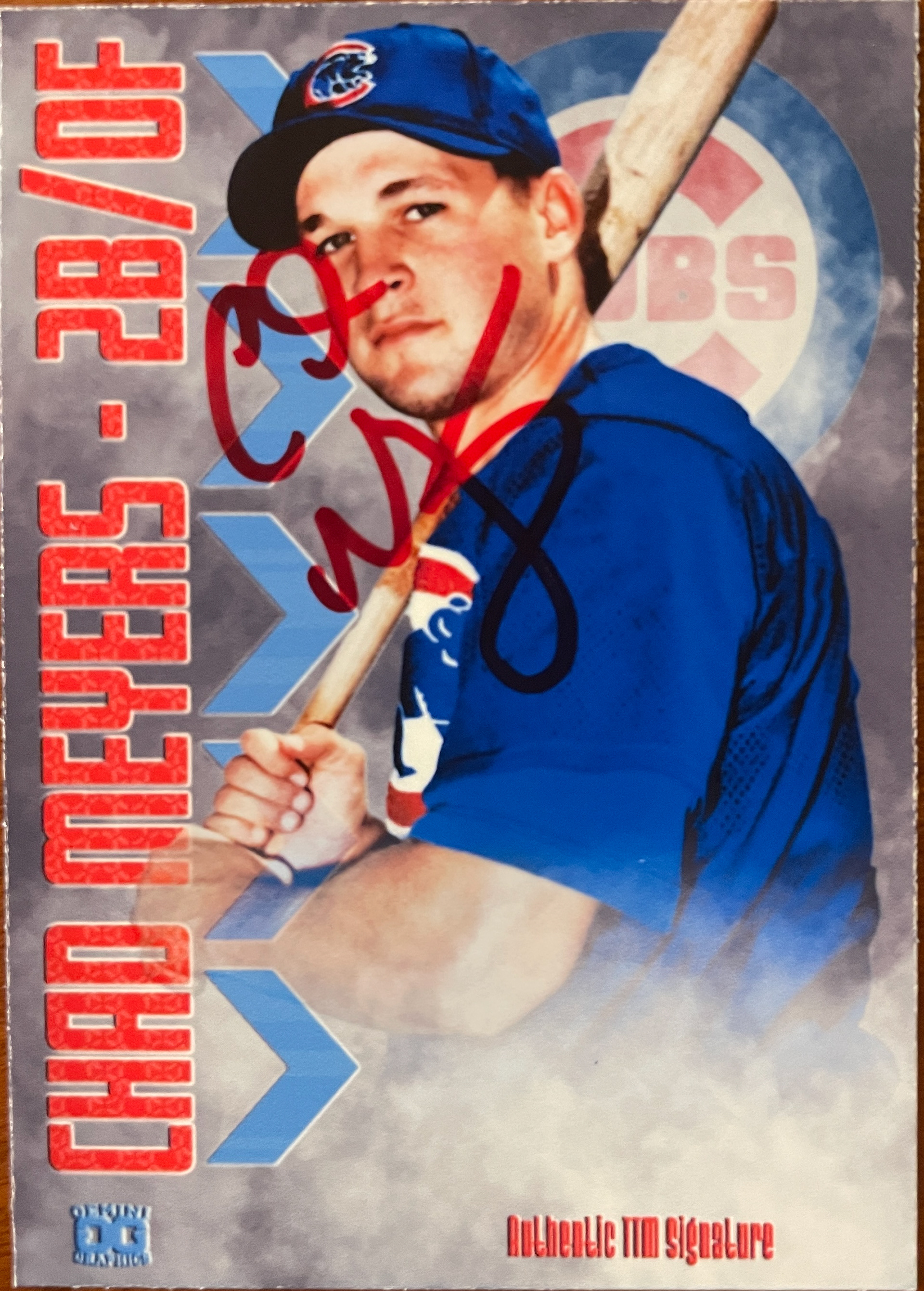
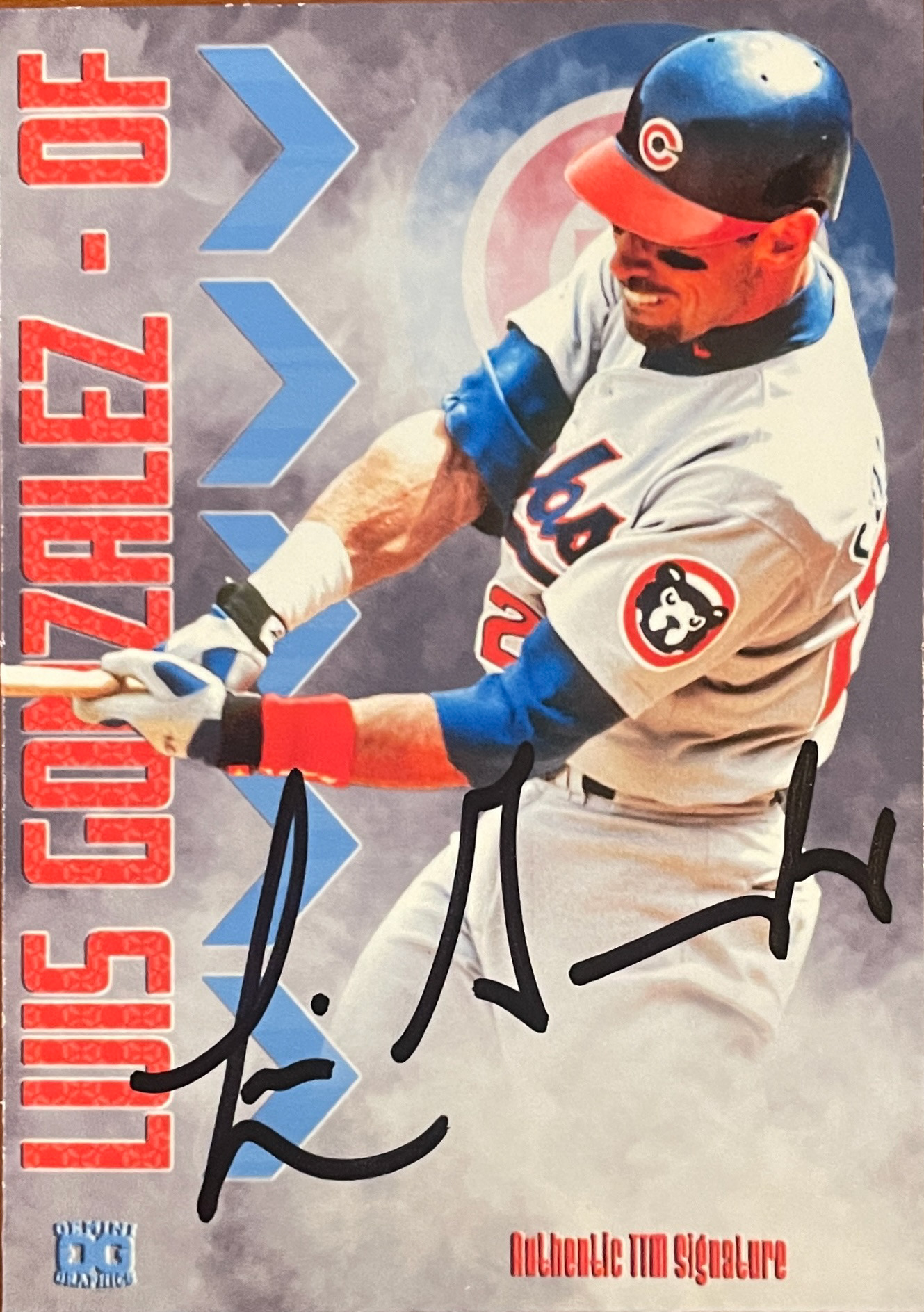

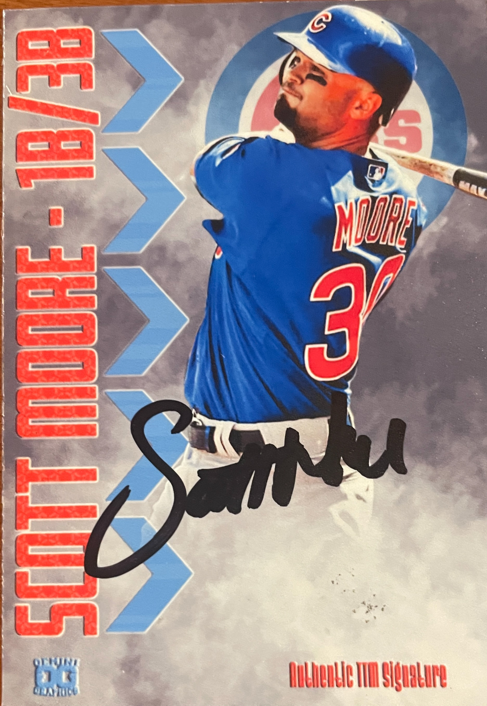
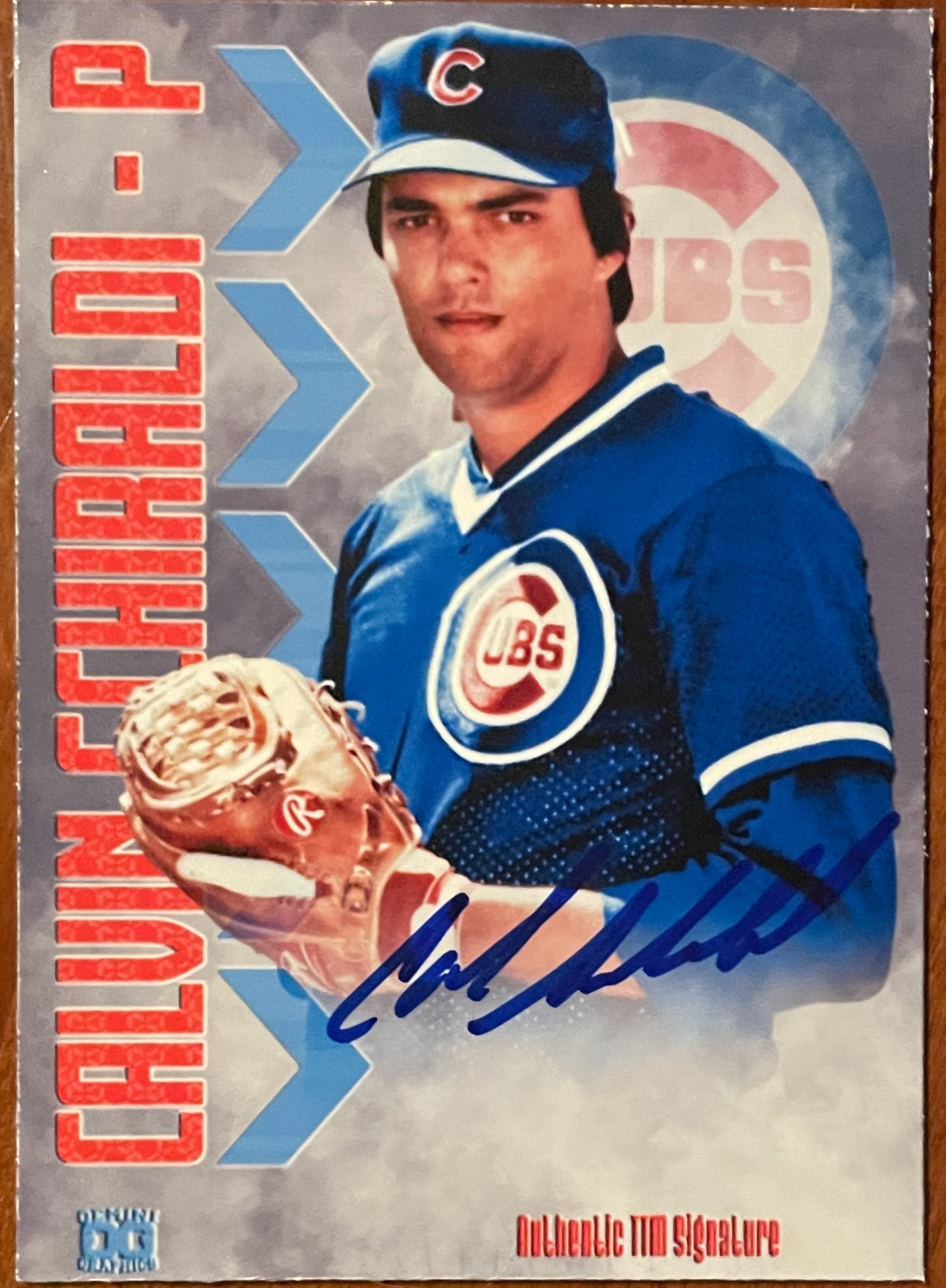
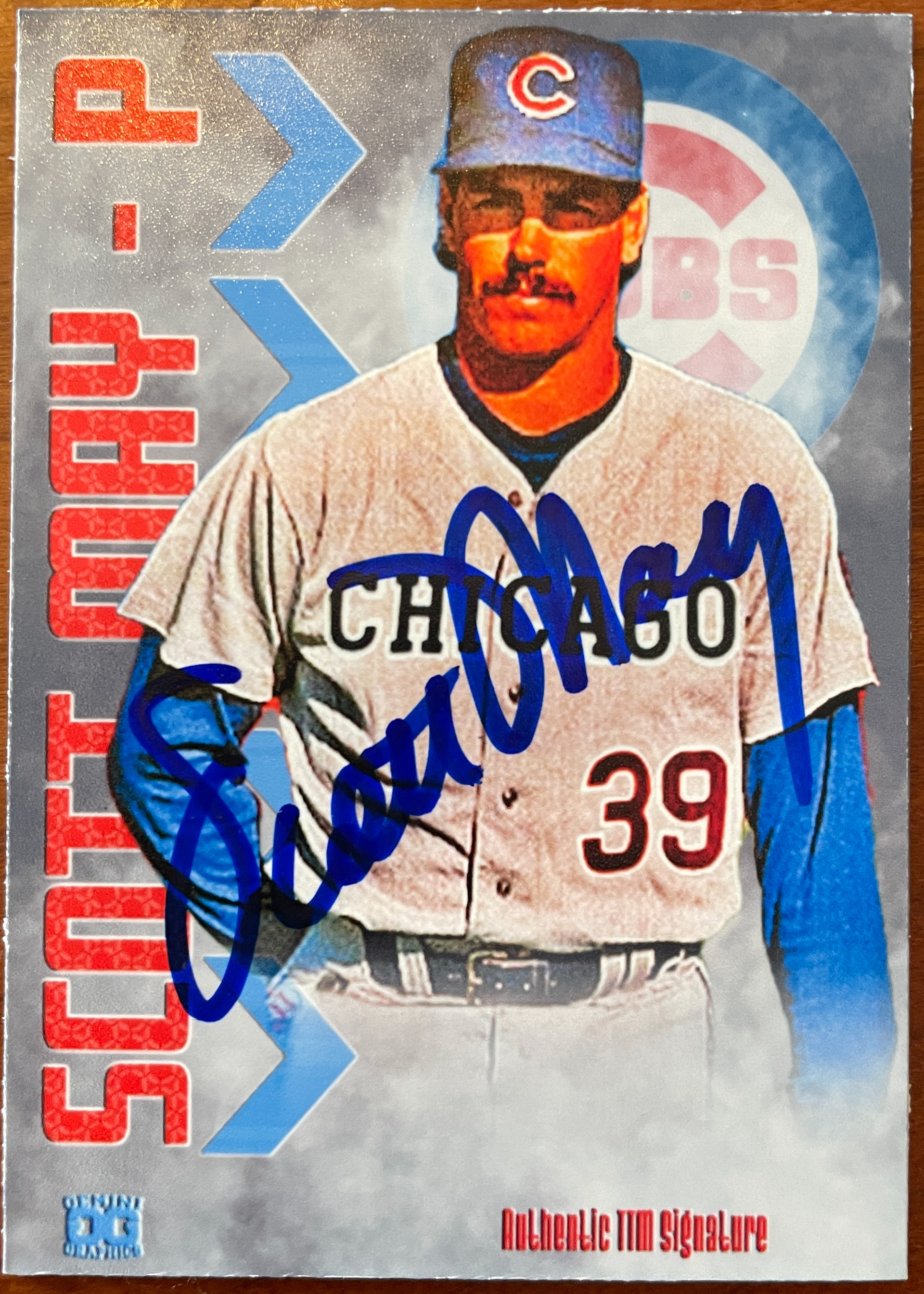
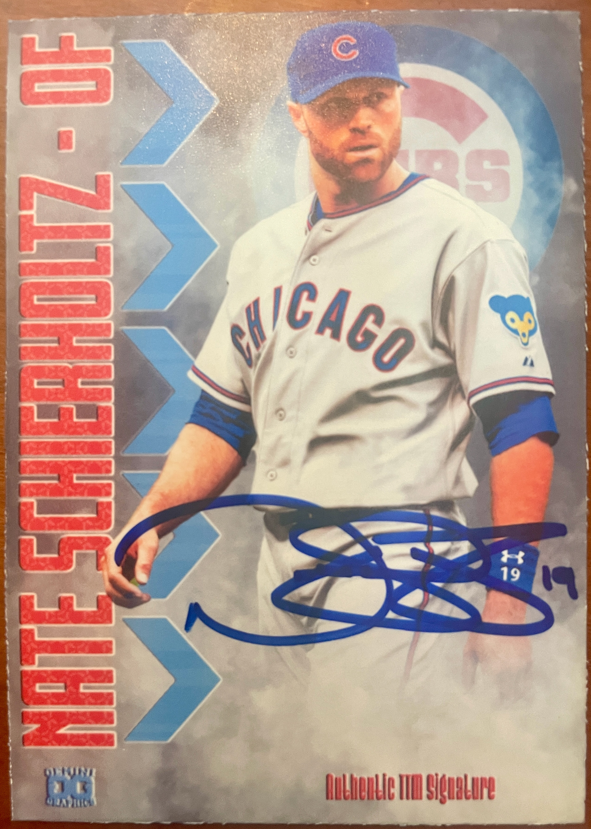
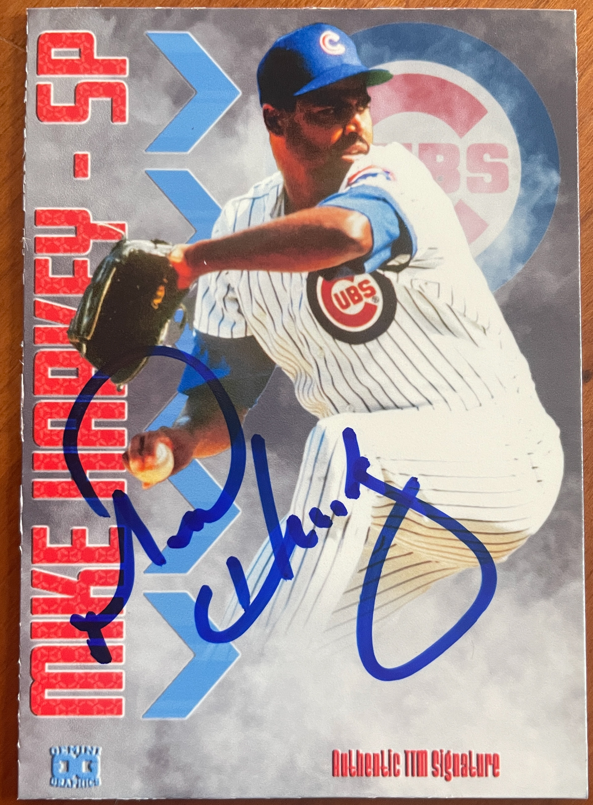
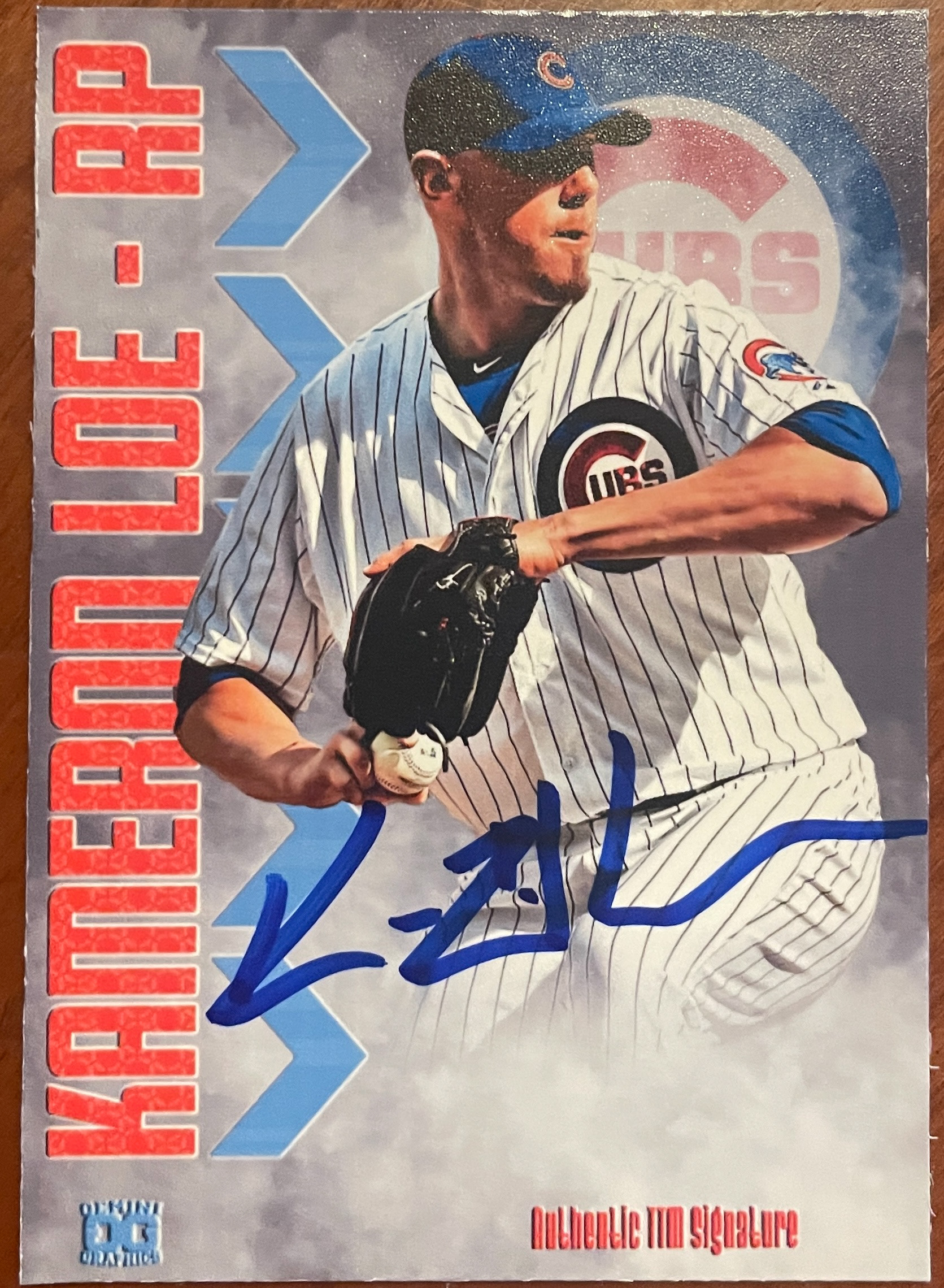

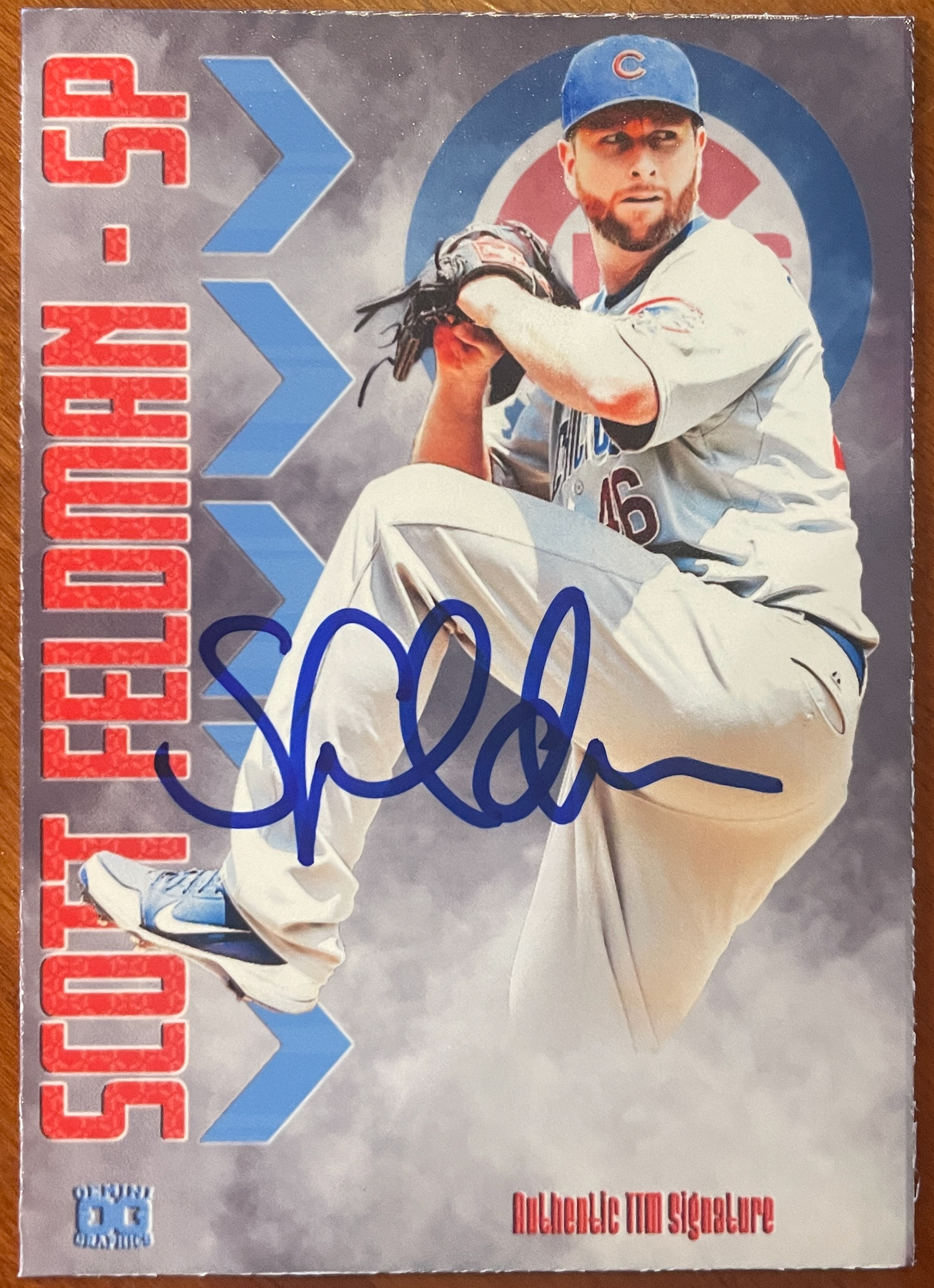
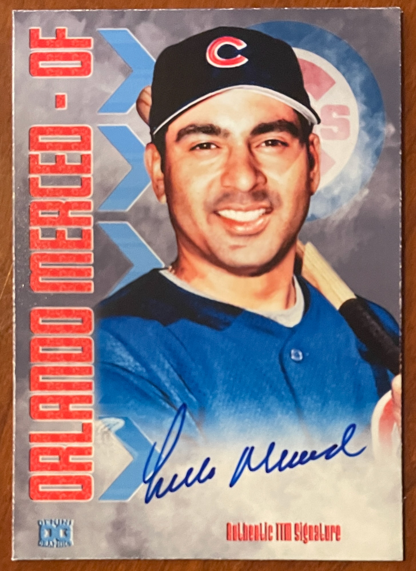
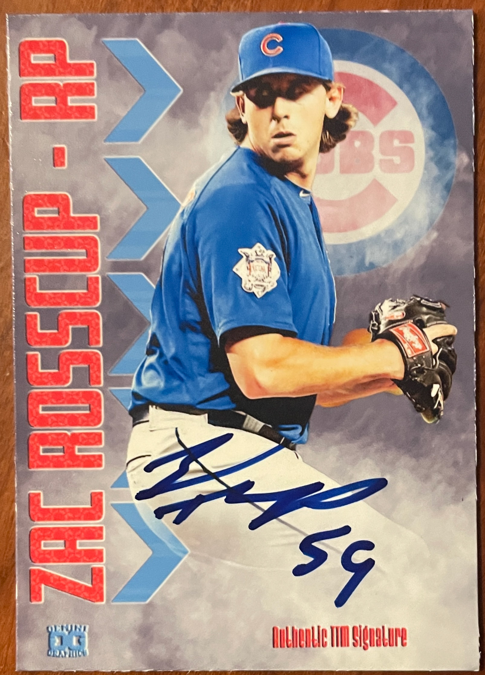
2024 Version (V.12.0)
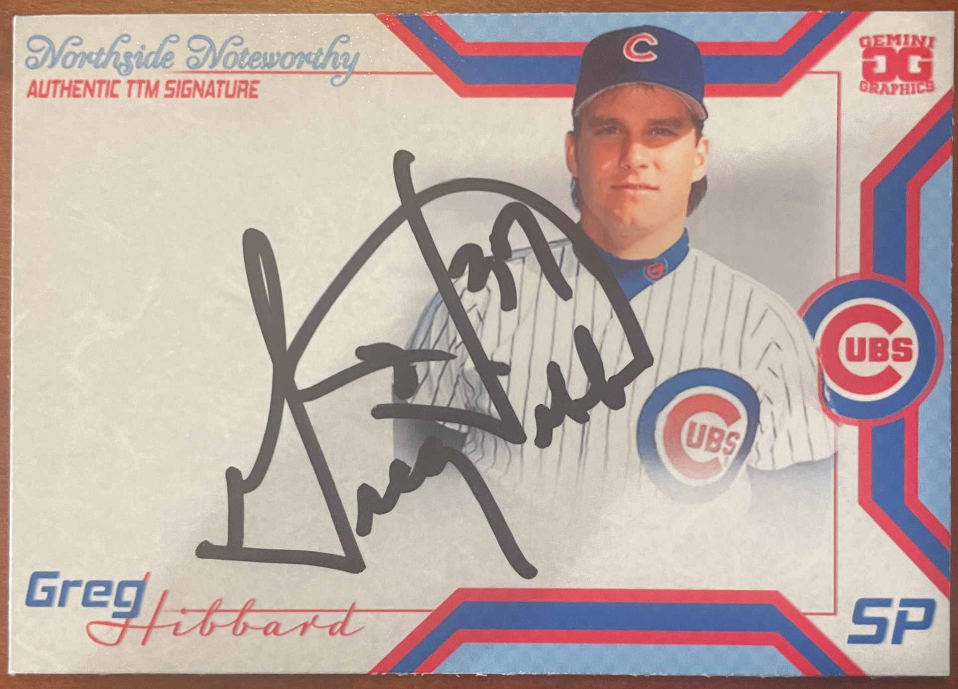
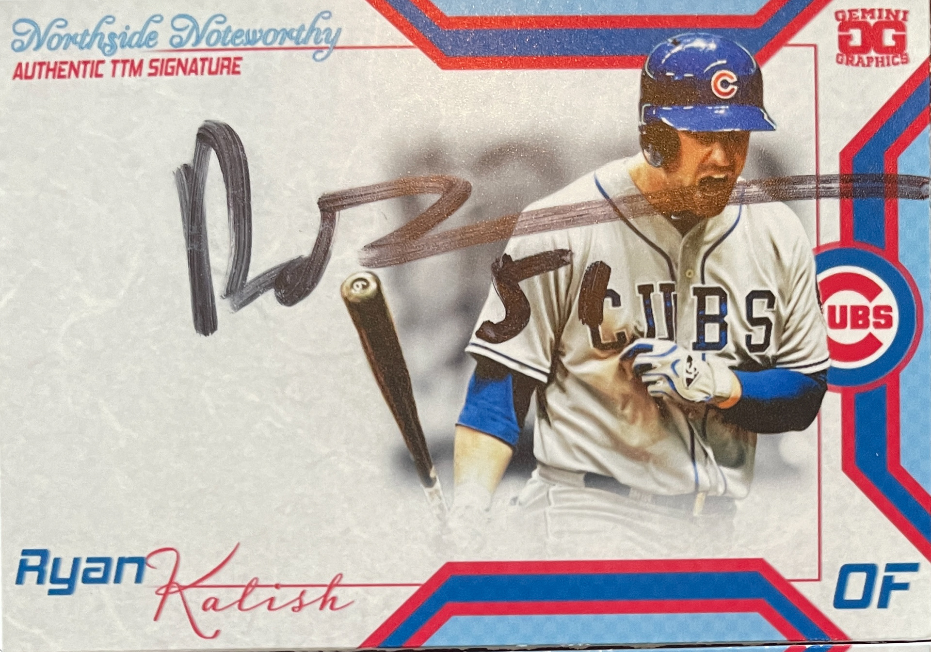
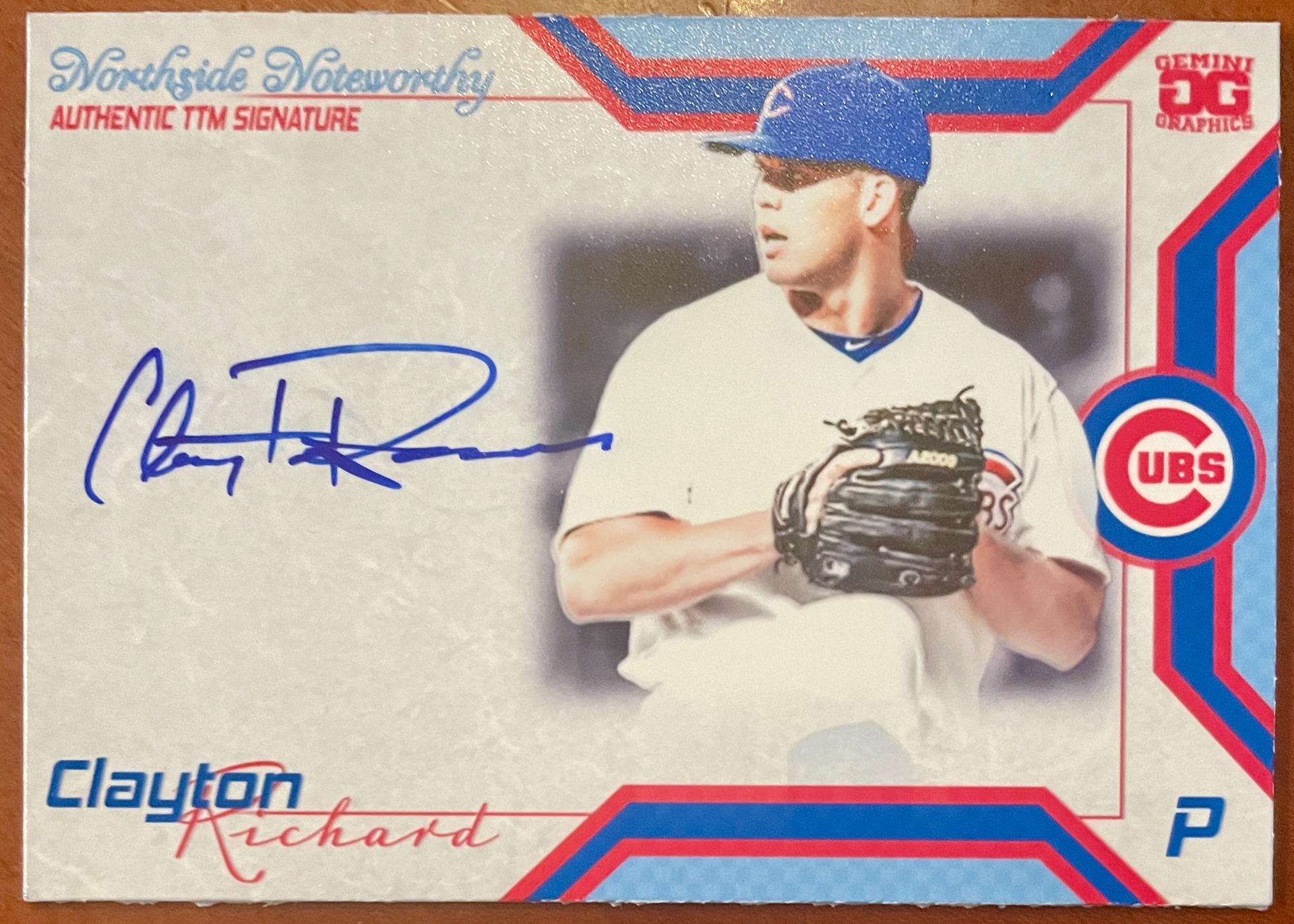
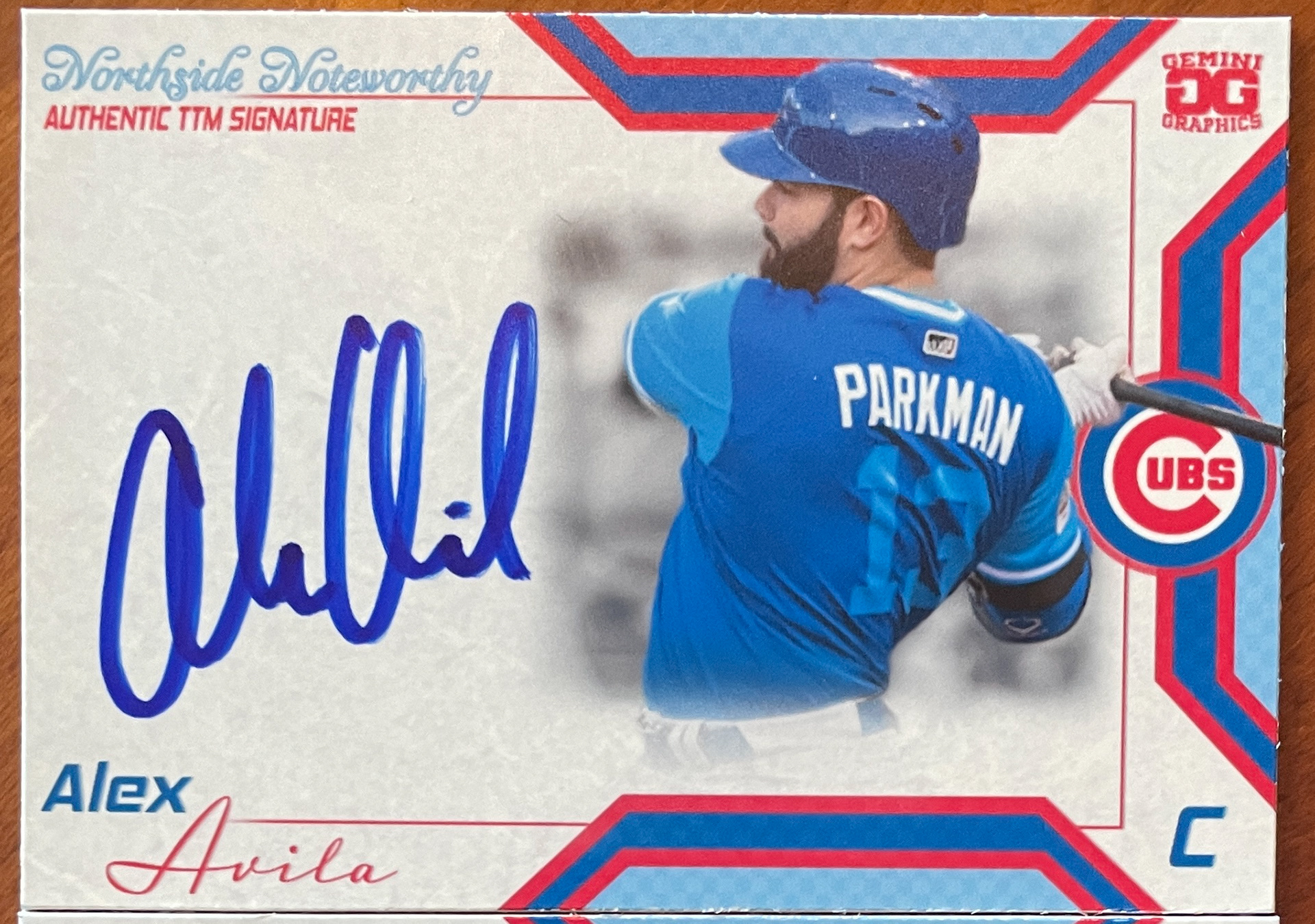


2024 Version (V.13.0)
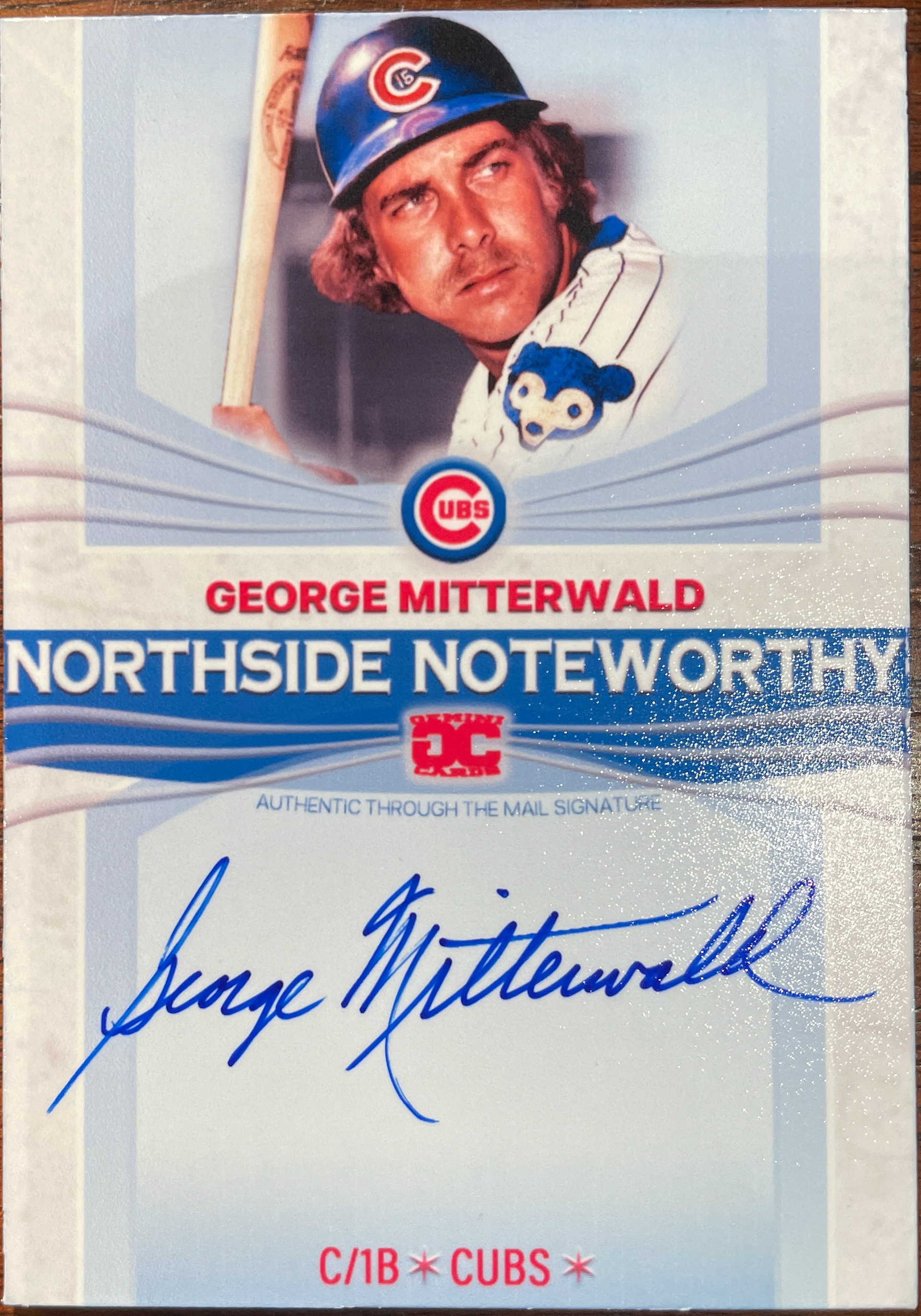
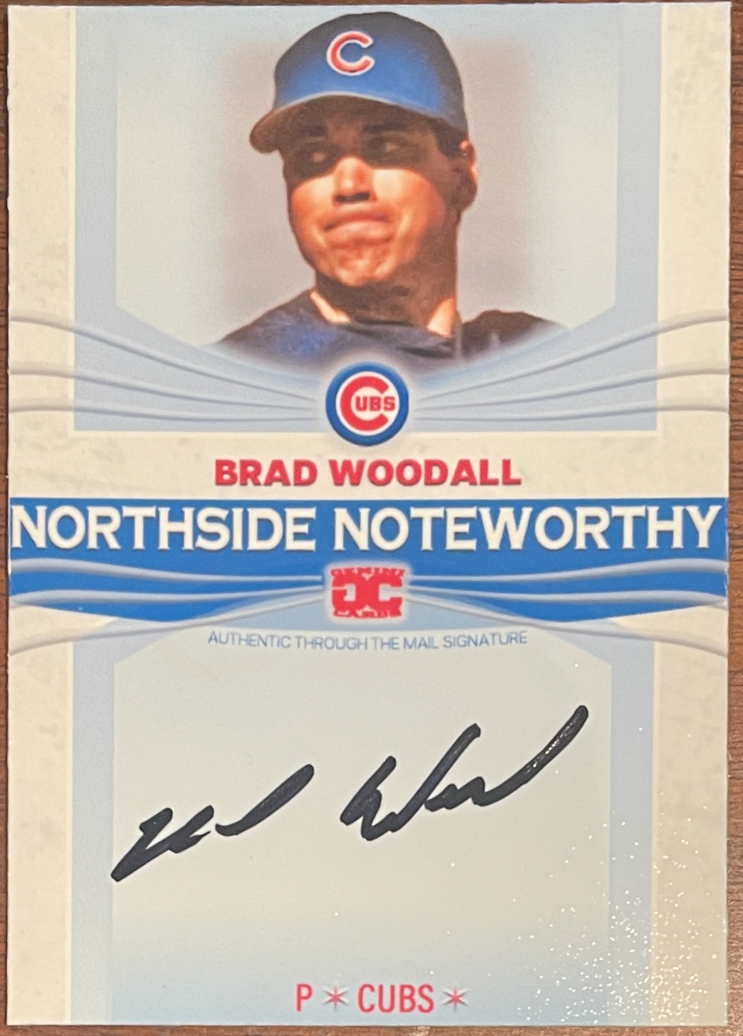
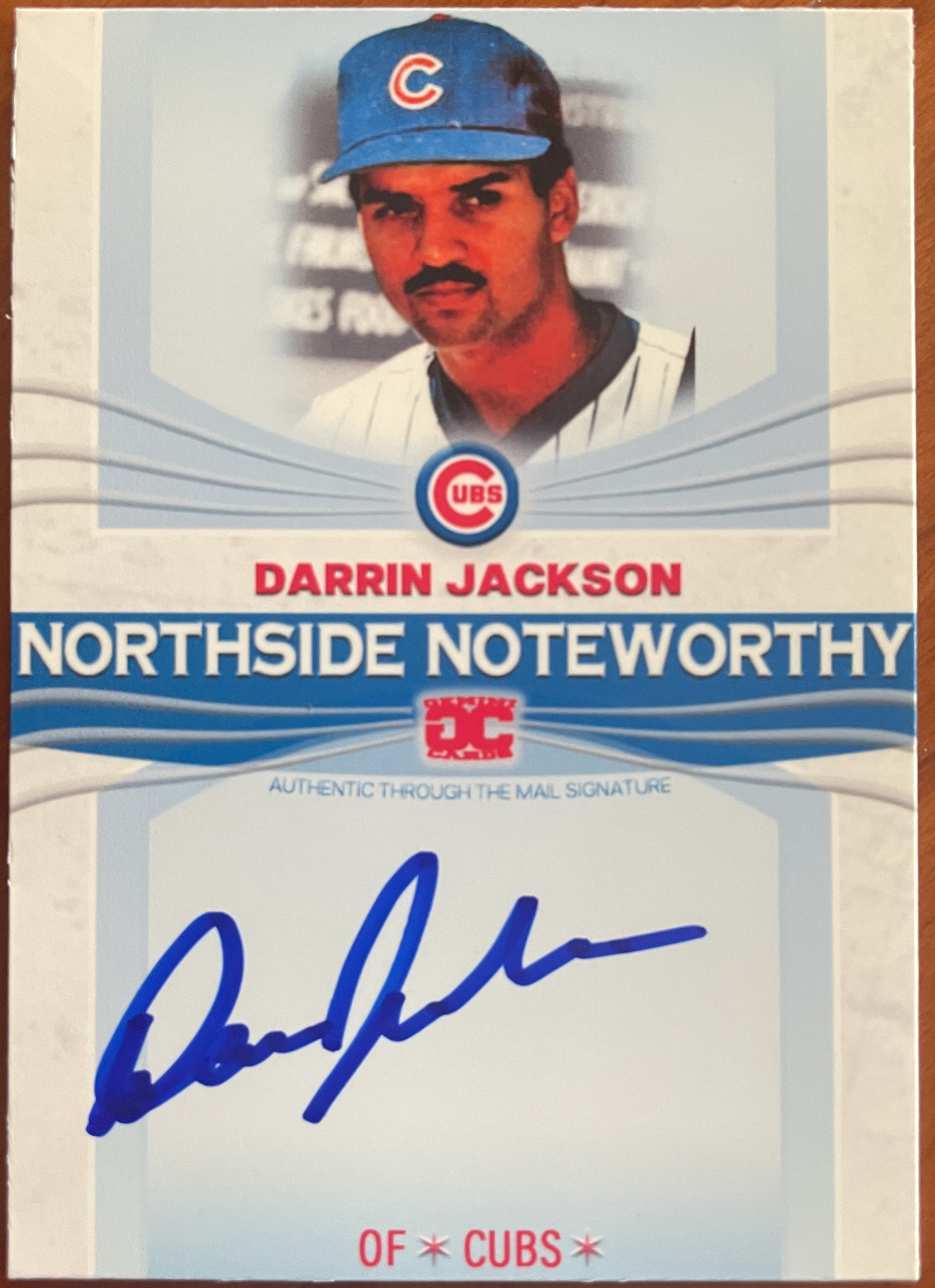
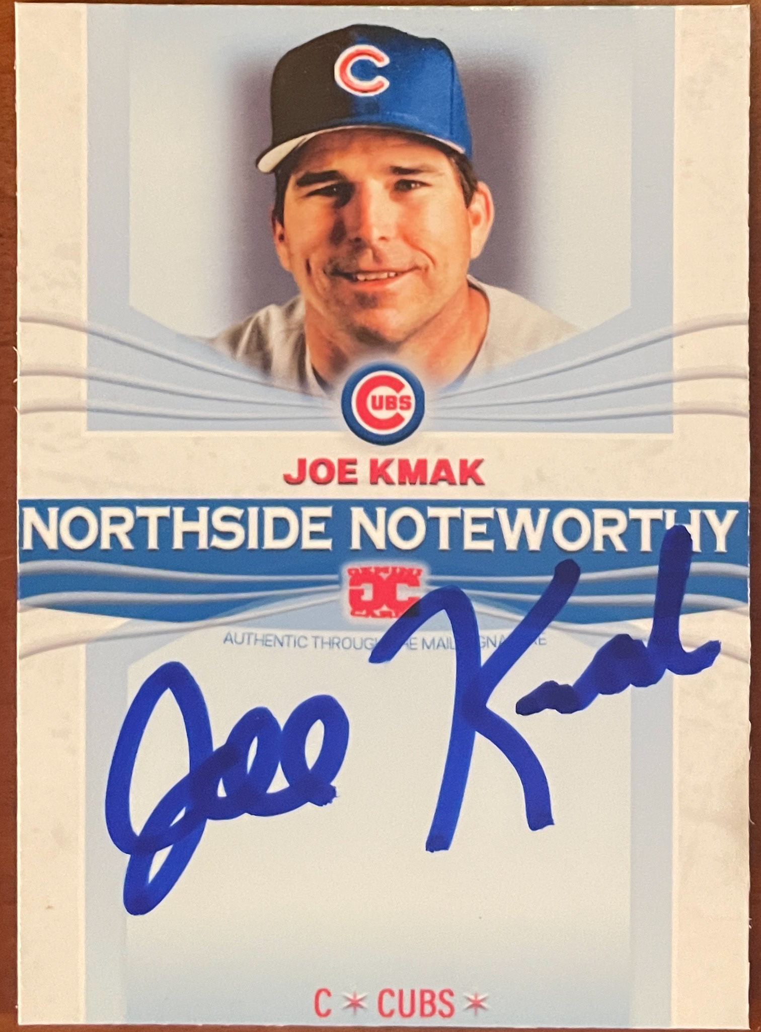

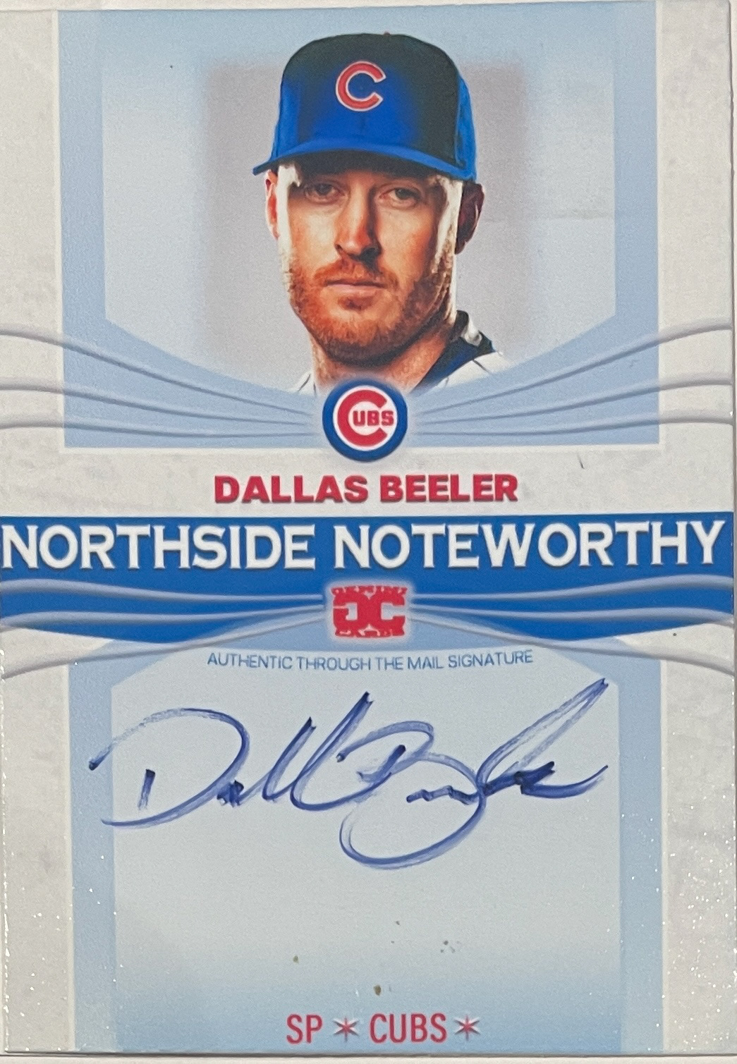


2025 Version (V.14.0)


2025 Version (V. XV)


Mid 2025 Version 3 (V. 17)


Mid 2025 Version 4 (V. 18)


